Boxballet
- Year
- 2020
- Duration
- 15min
- Director
- Anton Dyakov
- Country
- Russia
- Style
- Hand-drawn + digital puppets
Annecy is a huge annual animated film festival, named after the French town where it takes place. It’s the biggest festival of its kind, and its awards confer a ton of prestige, so it sucks in more or less all the major arthouse animation. Naturally it has a bias towards French/more broadly European film, but it’s also a good way to discover things from further afield that might otherwise pass me by…
It also seems to have a pretty tight connection with the Gobelins animation school, who produce a handful of delightful little idents every year.
Well, this year the 60th one dropped! Big anniversary! I bought the 20-euro online ticket, because I’m too poor to go to France, which got me access to all the short films in the festival, but not the feature films. So I sat down with some friends and gave them a watch! And now I’m challenging myself to write about every single short film I watched…
I’ve never really attended a festival like this before, even virtually - the closest I got was perhaps watching the Japan Animator Expo, which was kind of an online film festival like this. I bet going to Annecy would be mindblowing IRL, and I hope I get the opportunity one day! But even seeing all these films from home turned out to be a really good time…
The Annecy films were organised into categories. Firstly there were the competition films, all shooting for the Annecy award - there were 44 of these and very few misses in that set. Then there were special categories: ‘Off-limits’, for more experimental films which proved a bit disappointing; ‘Perspectives’, which seems to be like films with a very overt social/political Message; some of these were really good, others were a bit NGO-core. There were student graduation films - quite a lot of these! - and then various non-competing collections, including several different collections of African animation, notable films from past Annecies, and so on.
At this point, I’ve watched all the main competition films, all the Off-Limits, about half the Perspectives, a handful of student films, and one of the African animation collections (the edgy newgroundsy Mshini TV, which was hit and miss but in many cases a delight). Unfortunately, my access to the films closed while writing this article, so some of them I have to reconstruct from memory…
Since there’s a lot to cover, I’m going to work through these in the same 10-film batches they’re presented on the website.

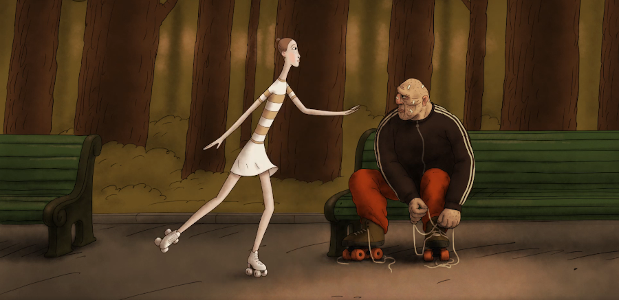
This one was a charming start to the festival: straightforward but well told. It’s one of those dialogue-less films that leans entirely on the strength of its animated character acting, which means each shot must be very clear in its structure and message. It does some very French-style stuff with exaggerating forms: the long slender limbs of the ballet dancers, the exaggerated squashed up faces of the boxers…
With its fifteen minutes packs in a nice little romance arc—hetero but like, not in any sort of obnoxious way, and the characters do seem to genuinely like each other which is always welcome. Both the dancer (who is, as is all to endemic to ballet, being routinely sexually assaulted by the manager of the ballet troupe) and the boxer (who refuses to cheat with hidden bolts in his gloves, and takes a pummelling) ultimately reject their current lives, giving up hopes of painful fame, to live (apparently happily) together in a log cabin. At the end of the film, we see the fall of the Soviet Union announced on TV. Parallels~! (Which means if we go by history, they’re not exactly in for a life of domestic bliss over the next decade.)
The storyboards of this film put it almost universally in side- and front views, rarely ever a 3/4 shot, making everything seem more abstract/graphical. A lot of it seems to use puppets, but occasional shots are more fully animated. The drawings are… how to describe? In some respects, such as the shading, they seem deliberately rough, but they’re clearly created with a pretty astute sense of shape and caricature. The shots emphasise very quick, direct motions, that tell the relevant story information with no funny business: a dance move, taking a pummelling, a reaction shot to a painting. But within that, there’s a lot of nice little small touches—I was particularly taken with the heavy breathing of the ballet dancers after they finish their routine.
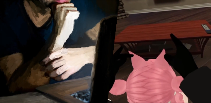
This one was by contrast the first major disappointment—luckily, one of the only disappointments. At first we were pretty excited: a film made in VRchat? Painting-rotoscoped shots are intercut with scenes from various games, mostly VRchat. But then the credits dropped a little bomb: all of the game clips were taken from the internet with a new dub! Suddenly the whole thing felt rather cynical.
Given the pandemic, there are a fair few films along the lines of ‘European normies experience severe isolation for the first time’, and it’s a little tricky to work up too much sympathy there. Overall, we were all left pretty cold by this film. The paint rotoscoping was very pretty though.
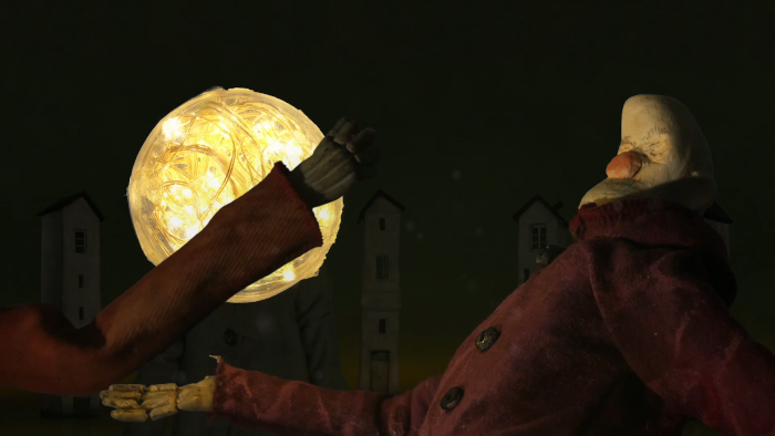
This one has a great little parable style premise: the residents of 12 houses surrounding a dark lake get into a fight over a glowing orb that surfaces from the lake. It has an effective escalation as the residents work out means to traverse the lake without swimming (mostly by dropping suitcases), and while you can kind of see the ending coming a mile off (they all die! except the writer who stayed out of it and implicitly created the film), the execution is very fun so it’s a big plus in my book.
The lake is very gloopy, the lighting atmospheric, and the tall thin bean shaped villagers with their droopy bulbous eyes and rough textures and little nervous twitches are delightfully shitty devious little guys to carry the film, especially with the acting of them tottering about on their suitcases or ruthlessly killing each other. Big props to the sound design too: the ominous whale-like groans help sell the vague menace of the lake.
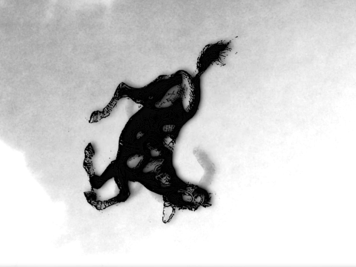
This one didn’t really lodge in my memory, and rewatching it, I can kind of see why. It’s a series of spooky photo manipulations to the sound of breathing, with lots of rapid cuts and scratchy/ominous textures. Which means all it has to carry it is the editing and choice of images to create the intended sense of anxiety and dread. The editing is, to be fair, pretty good! But that’s about all I can say! What else… the voiceover could almost pass for an ASMR video.
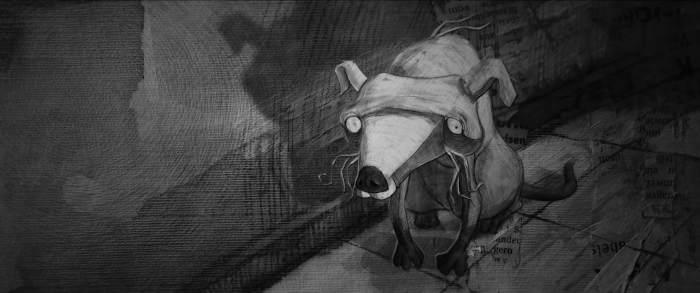
This one on the other hand absolutely blew my socks off! The director/animator is a Syrian refugee now living in Germany, and this film portrays being trapped in Damascus during the civil war while others get to leave. (This is also the first of a large number of films to prominently centre a dog. Very dog heavy year!)
Visually, the film seems to have been made using drawings projected as cutouts in 3D scenes, with everything in greyscale with occasional red accents, all surfaces covered in pencil textures resembling hatched shading or torn-up newspapers. Maghout is incredible at drawing: characters’ faces are very angular, with a tremendous sense of shape language and design; the flickering shading helps build up the overall sense of dislocation and constant danger, where the only connection he has left is the dog. And the dog, just look at that, poor little beast. The layouts kick ass with bombings inducing extreme distorted perspectives. It all adds up to a very distinctive style, and it’s kind of amazing that one guy managed to handle this entire pipeline with the exception of sound. And it gradually escalates into more surreal scenes of morphing and creatures as the protagonist goes to pieces. (And so does the dog, tearing up its toy as the protagonist stares grimly.)
I guess it’s especially brought home in the second-last scene, where the protagonist faces his two friends who are leaving Syria. He can’t look them in the eye, and this is conveyed by covering their eyes with tears or distorting the eyeline, whiled projecting real mouth movements so you can’t help but look at their teeth. Then the whole short’s bookended with scenes of water and drowning; the protagonist watching his dog at the surface of the water as he slips further down. Overall it’s just an intensely atmospheric and compelling depiction of a really horrible experience.
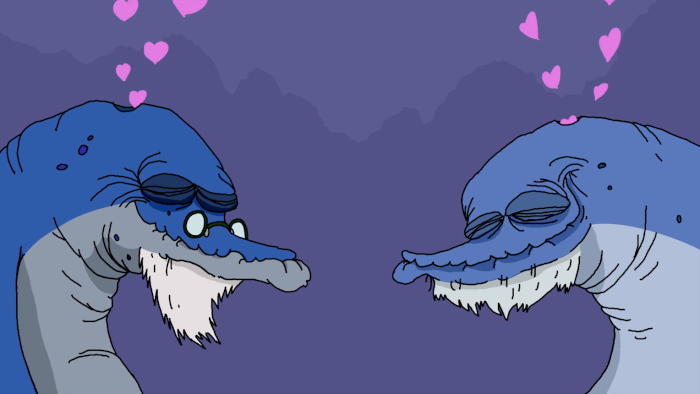
This one was… all right? A little girl delivers a lecture on how same-sex sexuality exists in nature, as illustrated by various short comedy vignettes of animals doing something gay (e.g. male bird dancing for male bird). Overall it feels a bit cutesy, and doesn’t really touch on the whole next level of complexity of how humans even go around assigning concepts of ‘sex’ to animals! …but that might be asking a bit much.
Really my gripe is that it’s very clearly aimed at straight people who’ve barely thought at all about the idea of a gay lion, and the jokes are feel like they’re trying a bit hard to be wacky, so it leaves me rather cold. A bit like the ‘comedy’ quests in FFXIV.
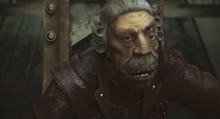
I’ve never seen an Armenian animation before this, but now I would love to see what else is going on over there, because this one was pretty great. I’m not exactly sure what the point of it was (though the title and description resemsuggests it might be an adaptation of a Kafka story), mind, but in terms of imagery and dream logic, starting off on a fine body horror note with the protagonist unscrewing plates from his face. The CG style is non-photorealistic but detailed, with textures resembling paint, and exaggerated wrinkles and eyes.
Since it’s a series of images connected my dream logic, let me mention a few: the ant girl army who summon the protagonist to court with paper whose writing is all flies (insect girl rep at annecy!!), the sewer of science tubes (love a science tube), the three judges with their long tongues and exposed brains and coughing-based musical number… the final sequence in the desert of giant eyeballs held open by threads… the turtle guy who eats and causes the protagonist’s limbs to disappear… honestly I’m naming most of the scenes in the film at this point, but that’s because it was a great time.
He’s fine in the end btw, just riding a beetle through the eyeball desert. They manage to close, sparing him from insomnia maybe? It probably means something. Whatever it is I want more. Please keep it coming David Babayan! :O
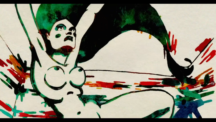
This is pretty much what French animation looks like at its best—I would be shocked if the animators of this weren’t Gobelins grads because it’s so much their general tone and style. The storyline is broadly that a young artist, preparing for her first exhibition, has a nervous breakdown trying to get her material to the gallery on time. She ends up in hospital, and reconnects to art with watercolour paintings of squirrels and the view from her window.
Of course, it’s all in the presentation—and this one nails it, with a powerful depiction of anxiety, and a whole lot of art history nerdery as the protagonist’s world becomes more hallucinatory, most of which flies over my head. So the film’s style shifts a lot: the hospital is stark black and white with chunky, gesture-drawing esque lines; the outside world and art galleries are lush by contrast, rendered in various styles of vivid painting that become more stark and primary-coloured as the protagonist starts to hallucinate.
Naturally artists know how to portray someone making art, and all the shots of the protagonist making art (sketching people on the street, painting in her studio) are very true to life. But it’s also like, “we have done a million figure drawings and we are going to show you”; while the framerate is pretty low because of all the vividly painted oil paintings, it’s full of complex 3D movements and the MC getting naked and realistic bodies.
Portraying fictional artworks is tricky because you have to synthesise something that fits a particular set of narrative criteria, and it’s pretty hard to pull one out on demand. So props to the artists for making the protagonist’s development convincing, especially in a mostly dialogue-less film (only the gallery owner and nurse speak; the protagonist’s feelings are conveyed through the film itself).
That gallery owner character is a little surprising actually. A lot of stories about artists lean on the experience of failure and rejection, but here, he generally gives pretty useful positive feedback; when the artist surprises him by going even further, ahe doesn’t hesitate to put up all her paintings. Later, he sends her some paints in the hospital along with well-wishes. I guess that fits: it’s not a film about how the art world is a hostile machine, but the drive to create or something more like that?
Anyway, even if it is in some ways predictably France-core, I liked this one quite a bit. Hopefully my own attempts to get good at drawing and painting won’t put me in hospital tho ><
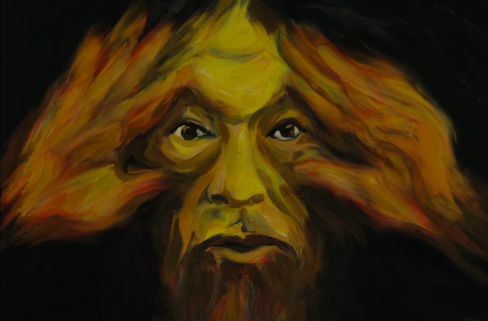
This one is basically a Bukowski poem being read over a series of transitions between different paintings. It’s not a bad little poem, an encouragement to continually ‘reinvent yourself’, though the filmmaker citing Banksy as an inspiration does make me giggle. The transition effects are pretty neat but it doesn’t do a lot for me as a film. Nice little breather though.
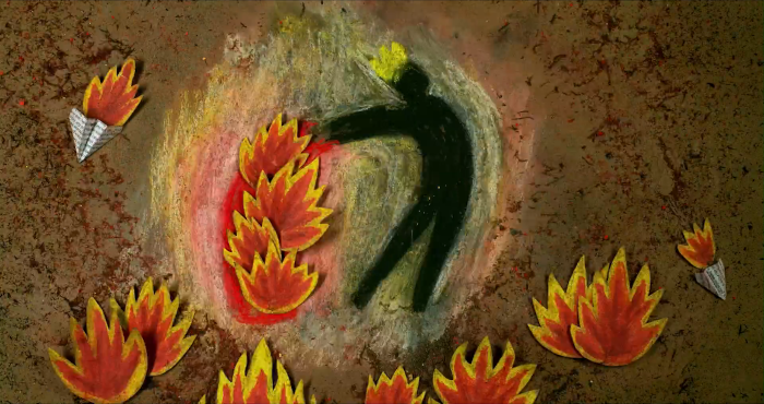
This one’s got a very cool device, showing the animation process and drawing repeatedly on the same sheet, so that the trails of previous frames appear as a kind of debris and mess under each drawing. The narrative is a little specific, portraying an artist trying to get their work into a series of film festivals including Annecy, dreaming of appearing in front of a large audience, only to mostly face rejections. The metaphors are fairly predictable but the style gives it a lot of charm; the simple pure-silhouette character design allows a lot of different kinds of expressive action. So it’s a cool little film.
There were two of these in the competition for some reason! They were both really short though. Basically a bunch of video clips flying around and edited together for flow. People joked that this was basically a Youtube Poop, and they’re not exactly wrong, but the editing was pretty slick!
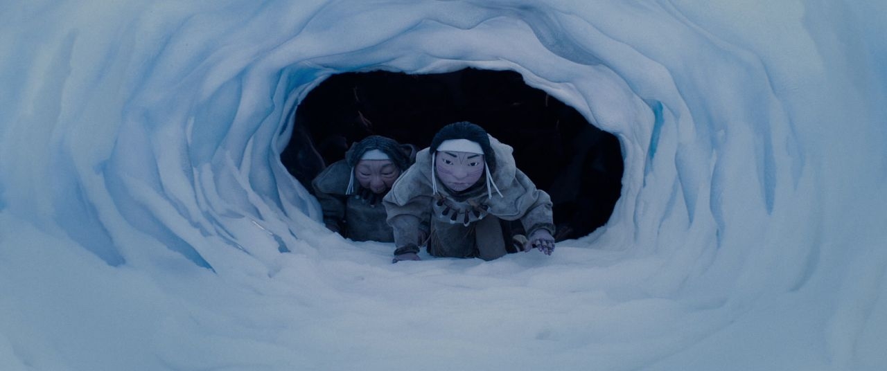
Now we’re really talking! I’ve seen one film by Zacharias Kunuk before: Atanarjuat, the Fast Runner, an adaptation of an Inuit legend and the first film to be produced entirely in Inuktitut—something he kept up in his subsequent film Maliglutit (Searchers). To my knowledge, this is his first time working in animation!
It’s a very tense film, with some gorgeous images—I love when the main characters descend into the spirit world, leaving behind their ghostly skeletons, and the general atmosphere of dread when dealing with these events. The old shaman has a great energy, and there’s cute little supernatural playfulness: her pisspot is left in the snow, but reappears outside their house under the strength of the shaman’s certainty. The dog puppets have a wonderful fluffiness to them, and the snow effects are fantastic. The puppets can move their jaws, and expressions are handled by rapidly swapping heads—you can see the swaps by subtle changes of shape but this only adds to the appeal really.
Inuktitut has obviously been subject to a long term policy of settler colonial suppression in ‘Canada’, so this film is part of the effort in more recent years to defend it. The story sees a hunter fall ill: a journey into the spirit world and meeting with Kannaaluk reveals to the shaman and her apprentice that the reason is a moral offence; he broke a taboo by setting his dogs on a bear. This allows the hunter to make amends and recover from the illness. I had some trouble parsing the young shaman’s own arc; I feel like she learned something by the end of the film but I’m not sure I caught the lesson. Sadly it is too late to rewatch.
Another one about colonialism; concerns three of the four Yaghan or Yámana people kidnapped by Captain Robert FitzRoy of the Beagle on ‘Tierra del Fuego’ (as the colonists called it) in 1830, in retaliation for the theft of a boat. Fitzroy decided it would be inconvenient to put them ashore, so instead he would try to assimilate them and turn them into missionaries. One of the four, named Boat Memory by the colonists, died of smallpox; the other three were assigned to a missionary, who taught them English while showing them off to various nobles. Their names were, per uncited wiki, El’leparu, O’run-del’lico and Yok’cushly; the colonists renamed them York Minister, Jemmy Button and Fuegia Basket.
We only have the Europeans’ account of what happened to them, which is nakedly from a colonial worldview which regards their abduction and attempted indoctrination as ‘civilising’. The three were taken back to Tierra del Fuego on the next voyage of the Beagle, in 1831, which became famous thanks to Charles Darwin’s diary. O’run-del’lico apparently rejected the European clothes he was given and an offer to return to England. In 1859 he was accused of killing a group of missionaries and showed up in a colonial court on Keppel Island to deny it.
So this film is essentially a wordless, image based account of these events, and at the end, briefly showing the genocides that took place on Tierra del Fuego (which killed off nearly all the Selk’nam people; the Yaghan people were meanwhile largely forced to convert to Christianity, at least according to the missionaries. The Yaghan language survived, though its speakers declined, with Cristina Calderón the last remaining native speaker.
It’s tricky to review this film. It’s Europeans from one country making a film about the horrific colonial crimes committed by Europeans from a different country; it did lead me to learn about the story of these three people, which is mentioned rarely when we learn about Darwin in this country! (Darwin described the un-indoctrinated Yaghan people as ‘miserable degraded savages’, and considered them a stark contrast to ‘Jemmy Button’.)
Technically, the film uses a lot of long slow shots; it contrasts the greyscale Europeans against the more fully coloured Yaghan. The shot where the camera flies into Tierra del Fuego, repeated twice, is quite impressive. Whether the portrayal of their village is in any way truthful, I’m not sure. I believe the three Yaghan characters are painted after the sketches in Fitzroy’s notebooks; I can’t say if any surviving Yaghan people were consulted on the story but I would presume not.
As an indictment of colonialism, it is… not all that clear in its aims honestly. The festival description says:
The return of three Anglicized native people to their country, or the beginning of an encounter with the modern world that will destroy them.
So it would be all too easy for it to be read as a tragic inevitability, rather than an act of genocide, though the film itself creates more of a sense of loss and confusion, attempting I guess to show the POV of the three Yaghan people, who mostly sit stoically throughout. Overall, I have… mixed feelings. The strength of this film is mostly in pointing to an unfamiliar episode of history, but having learned about that… it’s certainly not bad on the level of Pocahontas, but it’s not great either.
This one was a delight, enough that we watched it twice. Two shapeshifting plants, one in a top hat and the other in a bowler, essentially have a wizard battle, transforming into a huge variety of animal and object shapes as they fight over a fly; there’s a constant sense of visual invention, even if it occasionally cuts a little close to the bone like when the plants turn into Hitler and Stalin. Inevitably one of them kills the other, only for it to turn out that they were both part of the same plant.
The illustration style is very detailed, taking after old woodblock prints; the actions mostly consist of transitions between shapes but there’s a tremendous sense of timing. Honestly I’m not sure I have much to say short of trying to recall all the different sight gags; it was just a really fun little film.
This one’s so abstract it’s a little hard to follow what it’s getting at. I remember being a bit zoned out by the time we got to this one, so I can’t really write a meaningful review. The distorted perspectives were quite striking.
This one was a cool tense narrative short film; straightforward but strikingly lit. A boy makes the mistake of messing with a shrine, sending him into a mine for children; he attempts to rescue one of the children from the mine, only to discover when he reaches daylight that the boy was a skeleton alllll along! …which turns out to be a message about the number of children killed by cartels in Mexico every year, which was something of an ‘oof’.
Once again, I struggle to remember much to say in detail about this film. This is no fault of the film.
Another wordless film, in which a dad reminisces about his old, abandoned love of ice hockey, which he abandoned to take up drawing (in a rather silly scene where he’s compelled to destroy his hockey stick to make an easel by his teacher). He buys a hockey stick for his son, and together they play hockey. If the dad represents the director of this film, I guess he eventually got to fulfil his love of ice hockey by drawing an animation of it.
Mostly this one did not make a huge impression any particular way.
A weird masked humanimal llama like creature makes its way through a greyscale forest. It emerges into a room where it finds its creator who is struggling to design a better version of it. The creature intervenes to turn itself into a kind of mercreature.
This isn’t as surreal as Dream of Kafka, but it’s not bad. It’s impressive for being entirely the work of one guy as well. The ‘message’ must surely be something about the creative process, but mostly it was cool to see a pretty neat looking beast. And I can only support mermaid aspirations.
Not every French film activates my ‘this was made at Gobelins’ instinct, but this one certainly does. A girl runs from a group of mounted hunters and their dogs, while watched on TV by many hidden cameras. I wish I had the chance to watch it again, because mostly what I got the first time was “wow it would be fucked up if a girl was hunted for sport”. There’s a very impressive shot at the end when the girl’s presumably-dead body falls onto a huge stack of people and horses. Also she meets a cool bug.
This film’s gimmick is that each frame is drawn on a subsequent page of a book; there’s also a pixilation (stop motion using humans) bit, but I don’t really remember it. I think it was another coronaviruscore one but it didn’t register as strongly as most of the ones in this block.
I have never seen King of the Hill, but this definitely made me think of it the first time I saw it, and at least one other person made the comparison so I don’t mind repeating it. Two Dutch teenagers get into various mishaps while attempting to steal some birds from a Chinese restaurant. It’s very low-key; not a lot of emotion; it certainly conveys a sense of drained alienation in a place where there is very little to do. The kids are not especially sympathetic characters on the face of it, but that does get you invested in them. I don’t personally find a lot of appeal in this style, but I think it hit the notes it was going for and it’s a nice little slice of character drama.
This one was quite a lot of fun. A bunch of weird little flag shaped creatures move in various patterns to music; regular but still a bit messy. It’s pretty mesmerising and varied enough to not get repetitive. I have no idea what it was about, but apparently it shows
Crowds of people, individuals, individuals in a crowd, partition walls, buildings, bugs, an intruder, the battle… The beginning or the end of a non-systematic system.
What is a non-systematic system? Whatever it is, it looks like a kind of abstract animation that proved quite appealing.
This is one of those “monologue with animation” shorts, in this case the recollection of a mortician; not allowed to see the body of her grandmother as a child, she now finds a lot of purpose in preparing the bodies of the dead for their families to see. As these things go, it was an affecting monologue, and the animation illustrated it quite nicely; but it is definitely an illustrated monologue more than a film.
Now this one was fucking hardcore. It tells a story of a torturer named Ingrid, working for DINA (Pinochet’s secret police). At first it seems like just a story of a woman going to work with her dog; now imagine something like this monologue “it’s a bit weird how she gives the dog a seat at the table, but oh, wait, she’s dreaming about beheading the dog, oh no… wait is her job to… let me look this up… ok fuck. they used dogs to rape people!???, continuing escalation, wow the dog’s going down on her, goddamn this film is intense”.
Eventually she gets shot! It’s a lot! Overall a very effective film, one of the ones I very much wish I could watch again to comment in more detail! I remember the porcelain standing out as an unusual form of stop motion, accentuating Ingrid’s stony expression; the dog is also very sweet, despite the, well, you know. It’s a very effective portrayal of a period of fascism and the total dissociation that comes with it.
Another really strong one; a first-person story about a girl who has been inexplicably taken to an adult party where her mother really does not want to deal with her. Early in the film she is given a fish to eat; she imagines it talking and chases it around the room, getting in the way of various adults, tottering about on counters, at one point diving into the bin to receive the fish… I’m at risk of overusing the word surreal at this point, but the collage-y figures certainly create a powerful effect. Definitely a film that grabs your attention and holds it tight, we all enjoyed it a lot.
And then we hit this one. Where to even begin! This film left me feeling totally blown away; I had no aesthetic touchpoints to understand what it was doing.
This film is, I later learned, essentially an attempt to translate the art of reclusive artist Daīchi Mori into an animated film by a French artist who became obsessed with him, after a chance meeting with his grandmother on a trip to Japan to film a documentary about pets.
Mori works in emaki manga, 3m long scrolls with continuous panels flowing into each other. If the film represents his work accurately, these are full of vivid images of animals and the human character constantly having his face torn off by animals who covet it, such that we never see it. This is all narrated by a couple of animals in Japanese text to speech; I presume but can’t confirm that the original designs and text were Mori’s.
It’s a weird one; Nieto has many bizarre Orientalist ideas about Japanese art, including some absolutely nonsensical ideas about art history that seems to view Japan as a bubble untouched by ideas of the West with its ‘primal’ valuing of patterns; yet his film is as bombastic and overwhelming as he promises, as the boy fights off tigers and fucks an anteater and everything is so red and overwhelming… I hope Mori liked it. Because there’s another wrinkle: all the information about Mori comes from his grandmother, and Nieto has never even met the guy! I presume he at least approved his involvement in the film, but there’s something very odd about all this.
So what actually happens? The protagonist survives a car accident in Manchuria, and finds himself wandering the jungle; the animals go crazy with human vices and try to steal his face, so he always appears with his face bare of skin, the skin flapping around with some animal’s claws in it. The turtle floats around nearby narrating the story. The camera drifts along the scroll; the various panels are animated and there’s a lot of flowing, flapping and similar effects. It was a real spectacle and I hope I get a chance to witness it again.
This one was a very curious one, and I believe it did well in the competition. It’s set in Hong Kong during the protests, but they only appear briefly in the background; instead, it focuses on a widower called Mr Lam undergoing an exorcism by an old Taoist lady called Ms. Meng. The dialogue is all in Cantonese.
The insects refers to the fact that, well, pretty much throughout the film there are bugs flying everywhere. We see some establishing shots of Lam going through the motions of a life, working in a pawn shop, and visiting a restaurant only to forget that he’s already eaten his meal, then cut to the exorcism in media res. Lam seems pretty much as confused as we are by all the rituals, not to mention his memory loss… but going by Meng’s word, the insects appear to be some kind of curse afflicting Lam, taking advantage of his grief.
There are a lot of cool images: Meng cuts the head off a stuffed tiger causing a swarm of bugs to fly out through the room, and Lam acts more and more animal-like, attacking her and crawling on the wall on all fours as his face gets more bug like.
The puppet animation allows for quite sophisticated lip sync, but the actual acting possile with the models is pretty limited. However this creates a pretty compelling alienating effect, and they manage some pretty complicated sequences. It’s got this almost sepia-toned colour pallete, with brief snatches of colour. The backgrounds are largely real video with a filter or CGI.
As the film procedes, the panic passes from Lam to Meng, as her jiaobei balance impossibly rather than telling his future. The next day, they return to the restaurant, Lam feeling a lot more together thanks to her intervention. And they sail together on a boat.
I feel like there is probably a lot going on in this film that is going over my head—how this old school couple relate to Hong Kong at large and the protests that pass in and out—but it is in any case a very compelling little film that grew on me with successive watches. It leans a lot on hints and you drawing connections yourself—it was only on my third watch that I figured out what was going on in the opening scenes—but also I was pretty blitzed out when we got to this one lol.
This is one of those very abstract ones I have difficulty figuring out what to say beyond describing what it is. What does it mean to mix these old movies with plants growing? I can’t really say, but these four minutes must have taken a lot of effort to look after all these plants. Buster goes from the plant zone into more of an aquatic zone, and footage of people on horses rolls up or flies up like rockets, and there’s an old guy I don’t recognise who ends up looking up at the stars.
I don’t really get it but it looked neat for those four minutes?
Around this point I lost the original order these films were presented, so I have to discuss the rest alphabetically.
This one was excellent, one my absolute favourite films in the competition. Seems like Joanna Quinn has been animating this character Beryl for a long time (35 years!!) along with writer/producer Les Mills, making episodes to show at successive film festivals, and she’s really honed her style in that time: each frame looks like an expressive charcoal figure drawing. I’m really desperate for this film to get a public release… I hope it will, since the others are on Vimeo, and I’m sure it’s been to most of the festivals by now.
The film concerns a woman named Beryl giving a rambling monologue about the obsessive interests of her various super autistic relatives, and while this could very easily be quite mean, there really seems to be no particular judgement. Beryl herself is an aspiring visual artist, and gets her husband to jump down the stairs so she can draw him; her relatives include her son Colin, who has a lot of intense special interests including screw threads and a whole affair involving a cat whose details I cannot remember; and her sister Bev, apparently a recurring character, who goes from a taxidermy nerd to a hollywood star who has extensively modified herself with plastic surgery. Beryl just chattily relates all of these, before returning to her own artistic efforts, which finally pay off and get her recognition.
Since I was very curious after watching this film, here are the earlier entries in the Beryl series, courtesy of this interview with Joanna Quinn:
The first one, which sees Beryl go out with the girls to watch a male stripper, was apparently edited together by Quinn’s friends behind her back and sent to Annecy, and she was amazed to receive awards. But she was already doing some very creative things with perspective and full-figure animation, even if she was leaning a lot more on loops and sound effects at this point, and a lot of her stylisation feels more conventional. It’s cool to see how it evolved and got more expressive, even if the general interest in like, portraying realistic bodies with fat and hair, and transformations, and of course rambling narration in a working-class accent, remains…
This one is based in a Japanese-owned factory, which for a while was apparently a major thing in Wales. Quinn describes the production of this one as more organised than the first:
JQ: It was also the first film that had a budget, so for me it was difficult because the idea of being professional – well, I’d never even thought of it! I’d made Girl’s Night Out intuitively, just playing around really, everything happened to work perfectly, I remember in the edit when we added ‘The Stripper’ music it ended just at the right time, and I remember thinking ‘Gosh, next time I make a film I’m going to make sure everything is timed’ It was all fluke!
This time around, Beryl’s harassed by a factory manager who thinks he’s hot shit, and also her fellow workers who give her shit for not dieting. There’s a very strong musical montage showing Beryl’s efforts to exercise for a cabaret night… and then it ends with Beryl doing a whole rap sequence over… a kind of muscle tf dance while she talks about how bodies shouldn’t have to fit a specific form? it’s really something to behold all right. Anyway this one has p much the most overt fat acceptance body positive message, and manages to do it while holding onto a specific character too, even if
Some time later, Quinn got involved with Channel 4, who got her to make a series of shorts that got edited together into this video. This time around Beryl’s obsession is with film, which she’s pursuing by making a wedding video, which is more like a vlog than anything, as she walks around with a camcorder narrating for us. You can really see Quinn’s animation has gotten more naturalistic, moving very easily between different perspectives… even if the unifying theme the first few videos is the dog shitting at times it shouldn’t and people getting dressed. I respect it honestly.
Anyway the film goes to a really weird place when Beryl attempts to carry out a tracking shot as in Triumph of the Will, illustrated in the film by Hitler pulling a cart with a very Beryl-like Leni Riefenstahl whipping him on?? Beryl attempts to accomplish this with a nearby injured man’s wheelchair and charing down the aisle. Anyway then it goes really abstract and she meets Jesus in a vision. There’s a bunch of other references to old films: Beryl namedrops Lotte Reiniger, Rescued by Rover and Sergei Eisenstein as she starts to experiment with different techniques like strapping the camera to the dog. It’s ultimately a fun little slapstick short.
So that brings us back round to Affairs of the Art. I guess the thesis of this film is like, all of these people are as delightfully obsessive as Beryl. Cool little universe, and it’s really cool to find out about an independent animator with a really strong voice from this country y’know. Maybe there’s hope for me yet. I would love to see more people do this kind of charcoal traditional animation, though matching the line quality frame to frame must have been absolute hell.
This one is mostly a monologue over relatively limited animation of a POV of train tracks, in which a train driver relates the six times people have killed themselves by jumping in front of his trains. It does a much better job of ‘monologue over abstract footage’ than some of the films in the ‘Off Limits’ category. My friend Elaine, who was watching these with me, was very struck by how recognisably the film described the train lines near where she used to live. It’s a dark subject of course—I once considered suicide by such a method, and one of the reasons I did not go that way was fear of traumatising a train driver like this—but from what I recall, it handles it pretty well, if inconclusively.
So the story behind this one is that the animators spent a yeaer or so visiting a retirement home, drawing the people there, and then picked out certain scenes to turn into shots in this animation. There’s not an overarching narrative, but there is a sort of emotional climax when we see the staff and residents reacting to somebody dying.
It is naturally quite an atmospheric film… and provokes some fairly heavy thoughts as an illustration of the place we send people to die. Apparently it resonated so much with the judges of Annecy that they gave it the title. Yet outside of the death, I struggle to remember anything that happened in it…
One thing I do recall is that the nurses are presented very abstractly, without faces, focusing the gaze on the residents. This contrasts with one of the films we watched in the Perspectives category which deals directly with the struggles of a nurse. Care relationships are fraught with all kinds of complicated power dynamics in both directions, and so it was interesting to put those films side by side, intentional or not.
Mostly I think this film troubled me on a level of, trying to work out how I would feel if I knew my death was going to be used by some visiting animators to build their career at an international film festival. Of course, the same would perhaps go for the train driver one, assuming that monologue is real…
The dark elf sex one! This one is another of my absolute favourites in the competition. Basically two black figures with blueish hair and pointy ears meet while hunting a rabbit in a forest painted with these lovely textured blue colours, crawling on all fours. The soundtrack is really intense, drums and flutes… and it has this really cool way of showing arousal with heavy breathing and bright red veins spreading fractally over a character’s body… they chase each other around in the forest, and then fuck, there’s a lot of licking involved, and occasionally they’ll transform into abstract images of veins or fluids or snakes or something… and then the music starts to really fucking go as the images get more abstract, fire and skeletons…
…and they snarl and run away.
I love this for several reasons. One is that it’s a really beautifully edited short film that just captured my attention completely, another is that you can apparently just put elf porn in annecy if it’s arty enough and that’s #goals tbh.
This film got the Best New Director award. There’s an interview with the creator here, though we have to make do with autogen MTL subs:
It’s hard to make out what she’s saying with the MTL, so if anyone can understand French and would be willing to help me figure it out, I would really appreciate it.
You can find Robert-Tourneur’s vimeo here, she’s got a lot of other really cool looking films with similar command of editing and imagery, for example Looper (2014)
This one follows the prison stay of a murderer who killed a guy more or less on a whim. Unfortunately I struggle now to remember every detail, but I remember finding it compelling in how banal and ordinary it made the act of doing a murder and living in prison feel—events like the guy learning to play guitar and his family attempting to get him a music deal but… he isn’t that good actually. He gets out, has trouble adapting… at the end I recall it being implied he was about to do another murder and go back to prison.
Prisons are evil things and must be abolished if we’re going to live in anything like a just world. But day to day people just… live in them, adapting to the rhythms of an existence where the state has decided to seal you away for a rather arbitrary period of time. The protagonist of this one was very dissociated… he doesn’t seem to feel particularly strongly about his murder, or his existence in prison, he’s just going along with it.
I wish I could watch this one again and come up with something better and more concrete to say.
This one I was a bit out of it by the time we got to it, so I couldn’t concentrate on all the details, which is a shame because it seems like a style of donghua that is pretty new to me: neither the anime-influenced modern style, nor the traditional Te Wei ink wash style, but taking influence from a different tradition of Chinese art. Which unfortunately I don’t know enough about to give a name.
Anyway, this is a neat little parable: gold shows up, everyone across the whole cross section of society wants it, they all basically end up dead by the end. You could read it as just like, “avarice: bad in fact” but “structuring your society around hierarchy is bad” is my tepid spin.
Cool film, hope I get to see it again some time.
This one is sadly one of the few films on the list that made a largely negative impression. A wife feels neglected by her husband, and gets increasingly angry that he only cares to watch TV, so she builds a wall through the middle of their house… except for their son’s room. Of course it goes poorly and they fight over influence on the son, until he also walls itself away. But then it has a bizarre non ending where they break each other out of the walls and all just drive away from the fucked up house, with nothing really resolved thematically.
The metaphor was predictable and rather heavy handed, and all I’m left thinking is like… are the heterosexuals, like, okay? They really don’t seem to be having much fun.
This one was cool, if seemingly optimised for motion sickness! Essentially the actor stands in about as close to the same position as he can manage in each shot, but moving around the room, creating the impression he is sliding in a circle. Gradually, furniture moves around, the wall is painted, and different things appear out the windows as he whirls faster and faster. It’s a really cool effect. The line painted on the wall has waves in it that make sure the motion is still conveyed… by the end the background is going so fast that it’s hard to still watch.
The description of this film says:
A dancer as filmmaker refrains from superfluous movement in a villa in Brittany, giving way to an individual as well as social state described by the French philosopher Paul Virilio as “polar inertia”.
I don’t really know what Paul Virilio had to say but if this film is any indication, it’s probably a vibe? … “the logic of speed that is the foundation of technological society” yeah ok this sounds about like what this film was getting at.
I’m sad to say I’m rather drawing a blank on what this one was like. It seems to be like, an abstract one based on the experience of riding on a Japanese train, with paint-rotoscoped scenes of a crowded train interspersed with images of manga and Hokusai prints… but that’s really just off watching the trailer just now, I don’t remember the actual film well enough to comment properly.
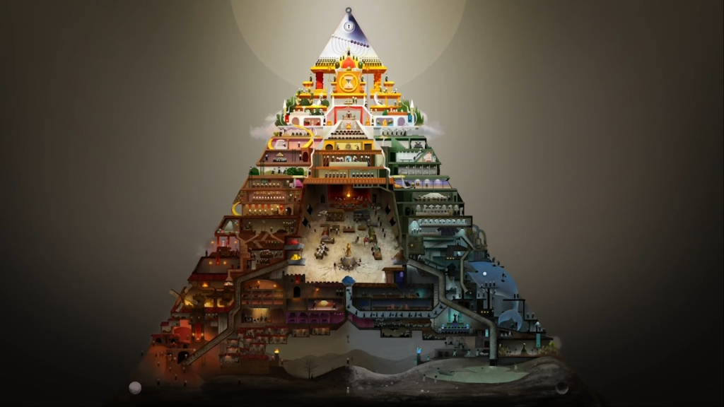
This one was also incredible. Originally conceived as a wall-sized installation, it’s a sort of giant fresco of a social pyramid with lots of little guys running around the different levels to make the society run, staging uprisings and wars, living and dying… there’s so much going on. The Annecy version has a camera which gradually pans over the pyramid, drawing our attention to different parts. The whole thing loops, and individual parts loop on different scales, but before long a change may propagate from a nearby area. Really incredible, and I can only imagine how cool it would be to see it at full scale.
I found an interview with Erick Oh here; the interviewer doesn’t ask especially interesting questions but Oh gets to talk a bit about the creative process:
As such a broad social allegory, it’s necessarily pretty abstract with its metaphors. What I appreciated most was how interconnected it felt: the meat of the giant whale would go up one way, bodies from the funeral another; characters would move in and out of different rooms. I don’t especially want to imagine history is as cyclic as this film imagines, because that rather precludes the possibility that things could ever be better, but as an update of those Renaissance frescos it is really quite amazing in its clockwork intricacy.
It’s hard to work out how to describe this one. OK, on one level, it’s pretty simple: much of it is lots of abstract shapes morphing into each other while flashing different colours. You can get a pretty good impression from the ten second trailer there.
I was curious about the author, and I found this video also by him, titled cumcumcumcumcum everybody about how group masturbation is nowt to be ashamed of:
So yeah he uses a very childlike drawing style, though with such styles it’s worth remembering there’s actually a lot of control and diligence required to inbetween them. Unfortunately I don’t feel like I’m on firm footing here. This kind of style emphasises big shape design and texture, rather than the more traditional skills. It’s chaotic, but obviously deliberately so. There are animators with rough drawing styles I really love—e.g. Jonni Phillips, Vewn—and this doesn’t exactly scratch that same itch, but I don’t want to tyranically impose some sort of art school orthodoxy about what shapes it’s good to draw. I just wish I knew how to better comment on this kind of style.
Not gonna lie, none of us were expecting the Croatian trans film. It’s fairly standard trans only-just-transitioned concerns: she wants to get with het guys and they’re dipshits. But it didn’t do any of the stuff I find egregious about that format, it was decently executed… mostly I think my pretty-much-all-trans audience were surprised by it.
This did feel rather like—appropriately, given the context—a Trans Film for cis audiences. I feel like there’s more interesting things to say once you manage to create that vital break with gender and heterosexuality, but also I imagine they would fly over the heads of an Annecy audience. Anyway, it’s good to see another trans girl getting into Annecy. Another ‘hope for me yet’ type of thing.
This one definitely struck me as an odd concept. From what I recall, the camera brings us in to visit the a severed head in an eagle nest on an otherwise deserted island; he talks for a bit and then we see a dance he would have choreographed if not for the predicament. Apparently the inspiration was video footage of dancers focusing on their heads; the whole framing device came later. So that explains a bit about where that came from…
Another very abstract one. Lots of morphing transformations; I don’t really remember the overall narrative, or indeed if it had an overall narrative, so I don’t think it made the strongest impression ><
Look, I don’t know what to say about this film, because I don’t know why it was in the competition at all. Not because it’s bad or anything, but like, Annecy is an animated film festival… and this is just a live action film with a few special effects. Anyway I think Austrians ran around in costumes, there was a BDSM club involved somehow, also a robot? I don’t really recall. This was the last one on the schedule and we were all pretty tired and mostly just sitting there like… so when is the animation gonna start?
It didn’t.
Which was a suitably baffling note to end Annecy, honestly.
I don’t have the energy to review all the other categories in such detail, but let me make some brief notes.
The more abstract films in the main competition were generally speaking engaging and well paced, even if I couldln’t always figure out what they were getting at, and often created some cool atmospheres. They also had the sense not to last so long that you get bored. The same can sadly not be said of the ‘off limits’ category, which housed films too experimental for the main category. These often took the form of ‘monologue over very slow pans’ (such as the first one on a terrorist attack, which was kind of dire), or just showing off a visual effect the creators had discovered (one applied some kind of video filter over what could sort of be recognised as disaster movies, making it look like a lot of colourful beads moving in patterns.)
Panic just put paint on actors doing various kinds of Body Things, like lactating, but it was incredibly short. Cause of Death was kind of interesting, though calling it animation would be a stretch… basically an edit of archival footage of women accompanied by a poem on the theme of misogyny and femicide. I’m not sure where they got the archival footage from but it’s a lot of black and white anthropological videos of people dancing in traditional costumes. The overall thrust seems to be women get killed for being women; the rhythm of the voice starts to fall into the cadence of the ‘boots going up and down’ poem they play to marines during torture training. I think as a meditation on how fucked up history is it’s all right, but it doesn’t really introduce any new insight into the relations of power that it’s obliquely addressing…
The winner was ‘tunable mimoid’, which was a demosceney one with a kind of scientific experiment framing device. Not a bad choice, but it felt like a much weaker field than any of the sets of films in the main competition.
This category is basically ‘social issue films’. Some of them were made by NGOs, some were political… so expect a whole lot of lot of films about motherhood. Inevitably that makes for a mixed bag but there were definitely some highlights that could stand with the main competition.
The one that left me most taken aback was I am Chuma, consisting of about half interviews with a homeless South African lesbian artist, and half animation based on her work. She tells the story of how, after experiencing a lot of misery and sexual violence, she started drawing and even made it into art school. For the most part it felt like… “rather inspiration porn, but if that’s how she wanted to tell her story I get it”… but then it emerged that after her scholarship was withdrawn she ended up back on the street, and did not seem to have any creative involvement in making this film, and at that point I was like, “what!? you just left her there?” Like, an animated film has funding to pay the people doing the drawing, couldn’t they have given Chuma a job in making this film? It seems incredibly exploitative.
The good highlights included La copla fellz del edén which was a dreamlike sequence on the death of Salvador Allende and the ensuing fascist violence in a compelling painty style; Swipe which seemed like it could have been a Pakistani take on ‘kids be on their phones’ but managed to do a decent job of capturing the sense of random stochastic violence on strangers that becomes possible on the internet; the child protagonist starts voting for executions for increasing trivialities until inevitably of course they get his family, and of course it’s about vigilante murders that actually happen.
One very interesting one was La prima cosa, a Spanish mockumentary-styled vector animated film about an Orthodox Christian Arab Israeli clown, who works with the Israeli state to care for children who need to be entertained in Arabic—such as, in this case, a refugee girl from Syria who forms a lasting connection. A premise like that could go any number of ways, and I’m not sure how I feel about this one. It certainly has some very compelling and vivid sequences, like the stained glass segment where Rikoo imagines the figures in the window slaughtering civilians, and the part where Kookoo Rikoo walks through a dusty refugee camp. At the end, it cuts to live footage of a man in sitting in what is presumably a refugee tent wearing a ‘Kookoo Rikoo’ nametag. I was curious whether ‘Kookoo Rikoo’ actually exists, and it seems that there really is a Christian Arab Israeli clown who works with children at a hospital, though his name is actually Johnny Khbeis. I end up feeling like ‘giving a handful of Syrian refugees free medical treatment with clowns as a quirky human interest element’ definitely works in the propaganda interests of the Israeli state, considering how many Palestinian children they leave injured in similar ways over in Gaza.
Prayer for Belarus is another compelling one, an music video whose song is like ‘what if Deliver Us had an EDM beat’. Most of the work in this one is being done by the song rather than the animation, but it was attention-grabbing to say the least, and the animation, while rough, has some strong shot compositions and images. The context was the violent power struggle in Belarus around the 2020 election, representing the government suppression of protests—though it seems like it was actually produced in advance of the protests. I don’t really know enough to give any sort of meaningful comment on the political context, but as a piece of protest art it’s very strong.
Lolos (Boobs) was a fun little one, mostly rotoscoped but representing boobs as like, pasted on bits of paper and various other abstractions like birdcages. People swap them, manufacture them in a photocopier, use them to fish for mermen… unfortunately we did not end up watching most of the rest on the second list in this category so I may have missed some good ones.
There was also a huge collection of African animation, and sadly I only got the chance to sample one part of it. That part was very fun, though: ‘Mshini TV’, a pun…
MSHINI TV is a corruption of the isiZulu phrase “mshiniwamahlaya” with “mshini” meaning “machine (gun)” and “wamahlaya” meaning “joke”. Combined, “mshiniwamahlaya” is a pun which means both “machine (gun) jokes” and “joke machine/factory”.
…used to title a collection of ‘fucked up African films’, ranging from compelling little comedy skits through a number of creepypasta-like videos to some really fun little bits of Newgrounds-like animation. Not all of it was great—a South Park-like comedy series took up far too much of the runtime for something completely unfunny—but for the most part it was very entertaining and cool to see.
There was a huge collection of student graduation films… sadly I watched almost none of them in the end. The one I did see was a fun little abstract thing that seemed mostly an excuse to draw sexy minotaurs transforming in various weird, heavily filtered ways. Something about masculinity. He sure did have a big dick, but I’m not sure it did anything on ‘the boundaries of the sexes’…
I am so glad I got a virtual ticket to Annecy—I just wish I’d grabbed it earlier in the week and had the chance to see more of the competition. I don’t think I could just pick one favourite, but if you ever get the chance to watch Swallow the Universe, Hold me Tight, or Opera, they would be my top picks, but honestly, just getting to sample the huge range of ~the medium~ was so fucking cool, I cannot wait for it to come around next year. (Especially if I can scrounge up the money to go to France, pandemic permitting.) There were very few outright bad films, and a lot explored aesthetic dimensions I couldn’t havei magined.
I do wish they had been more permissive in the access model to their videos. There’s no reason not to leave the video platform up for people who’ve bought tickets, there’s no reason they should limit you to three viewings per film… I really don’t think they’re going to threaten other film festivals if they did, or that it would cost that much compared to the festival period itself.
So. Thanks for the spectacle, Annecy! Hope I get to show a film at you one day…
Comments
dereify
Something you might have missed due to only having an online ticket:
At the start of nearly every movie, before the lights turn off, students compete to send paper planes from the rafters to the screen. If any paper plane touches the screen, the whole cinema erupts, it’s quite fun.
When the light turns off, students will make a bubble popping sound for some reason.
If the starting animation has a rabbit, the students will scream “lapin” very loud.
It’s all good fun