originally posted at https://canmom.tumblr.com/post/622551...
This post was inspired by a tweet by a tweet showing an animation background by Telemon, used in a very impressive cut by Weilin Zhang. The painting effectively works as a non-flat perspective projection of the scene:
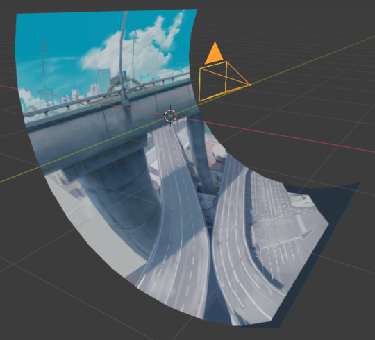
Traditional animation backgrounds are still images, so the natural inclination is to treat it as a camera shot from a fixed perspective. If it’s a static shot, this is the right approach. But a lot of animation wants to have at least a bit of camera movement. So what do we do?
By the last few hundred years of convention, drawings and paintings are projected onto a plane. the logic behind this is sort of that if you put your eye in the exact right position, the perspective drawing would line up so that each ray passes through its corresponding point in the painting. with the invention of cameras, which project images in a very similar way, we’ve taken this as the ‘natural’ way to represent a viewpoint onto a 3D world.
A rectilinear perspective projection could be defined by a viewpoint (in 3D space), a view direction (a unit vector), and a distance to the image plane. This precisely defines the image plane, allowing you to trace rays into the scene and calculate where they intersect it:
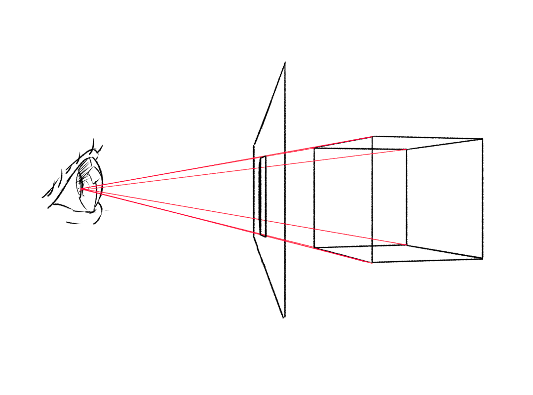
This has some nice properties: straight lines in a scene map to straight lines in the perspective plane, and parallel lines converge to a common vanishing point (unless they’re parallel to the image plane).
However, this is not actually how we look at paintings! The artist doesn’t put the painting behind a board, with a small hole to permit viewing at only the valid perspective angle. Instead, we’ve become familiar with the conventions of perspective drawing - it’s more of a symbolic framework than the mathematical exactness of the ‘illusionistic’ use of perspective would imply. For a wonderful discussion of both the maths of perspective drawing and the whole Zeeman’s paradox issue, I often refer back to this article.
Part of the reason it still works is that, if your eye is near to the ‘correct’ viewpoint but not exactly in the right place, distant objects will still look pretty similar in terms of shapes and sizes, so it’s pretty easy for your brain to ‘correct’ and work out the intended 3D relations in the picture. (After all, your brain is doing plenty of interpretive work already - a line drawing does not remotely resemble the actual lightfield but because visual processing involves a lot of edge detection, your brain is able to very quickly work out 3D shapes that might correspond to those lines).
In animation, though, it’s common to paint a much larger background than the camera can see in one static shot, and move the camera across it in order to represent pans and other movements. If we were being mathematically exact, we could imagine that the background is the projection of the scene onto a sphere, creating a kind of curvilinear (rather than rectilinear) perspective. In computer graphics, this is exactly the projection used by an environment map.
Here’s an example environment map from the free envmap website HDRI Haven, which is in an equirectangular projection from the sphere to a plane:

In this image, each pixel represents a different view direction. This is true in rectilinear perspective too, but this image covers the entire viewing sphere, remapped onto a plane not by a perspective projection but by a more complex mathematical procedure.
It so happens that this looks like a strangely distorted rectilinear perspective in small portions, but if you follow perspective lines, they bend around in arcs. Of course, it’s not designed to be viewed like this: instead I would set it up in Blender as an environment texture:
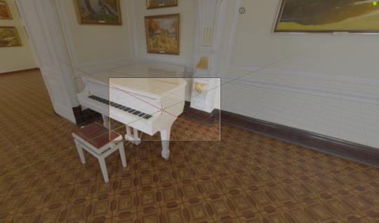
Once reprojected in Blender, it looks like a perfectly exact 3-point rectilinear perspective. If I rotate the camera to a different view angle, it gets reprojected slightly differently: note that the shape of the stool (for example) is slightly different at this angle.
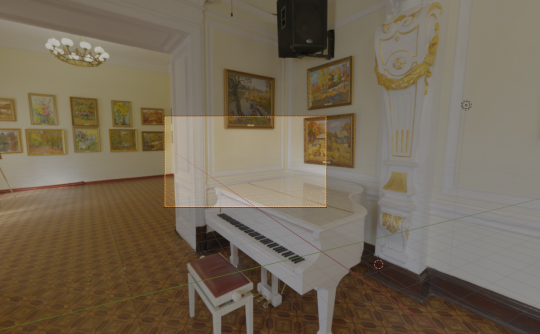
But I cannot move the position of the viewpoint: no matter how much I move the camera, there will be no parallax. I can’t go to the other side of the piano. It is effectively as if this scene is a giant, infinitely far away ballroom, or else attached to the camera so that as the camera moves, so does the ballroom!
In photography, this kind of curvilinear projection is used when creating panoramas. A panorama is simply a projection onto a cylinder, allowing a full 360 degree field of view. However, if we ‘unroll’ a relatively thin slice of a panorama onto a plane, we essentially get a rectilinear perspective with a bit of barrel distortion.
Traditional animation backgrounds are typically not perfectly exact mathematical environment maps which are being reprojected on each frame to create a proper rectilinear image. They’re 2D images, which are simply cropped into the frame! Yet somehow, they work anyway. This is because we can cheat: if we get something close enough, the viewer’s brain is happy to do the rest of the work.
For example…
pans
If we look at the painting by Telemon that inspired this post:
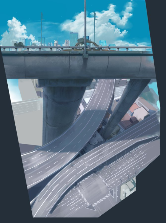
This painting is not strictly speaking a cylindrical projection as I suggested above, nor is it a single-perspective rectilinear painting. Rather, it is two rectilinear perspectives that have been sort of sutured together at the roadway. Above the road, the distant buildings and the cars are basically drawn in one-point perspective; below the road we have a nice three-point perspective.
What ‘sells’ it is the rapid camera movement, and the lack of complex 3D shapes on the side of the roadway to look ‘wrong’ during the motion. The camera very quickly pans from the top shot of the side of the overpass, down to the bottom shot of the distant roads below. The motion is quick enough that you don’t really have time to think like, “oh, those pillars should look different at this angle”. And both the starting point and the ending point are in correct rectilinear perspective, so once your eye settles, it all looks correct again.
tracking shots
On the face of them, tracking shots would be nigh impossible to do in a static 2D background. For example suppose you’re sliding the camera past a box in rectilinear perspective. The box’s outline changes drastically as it gets from one side of the field to the other:
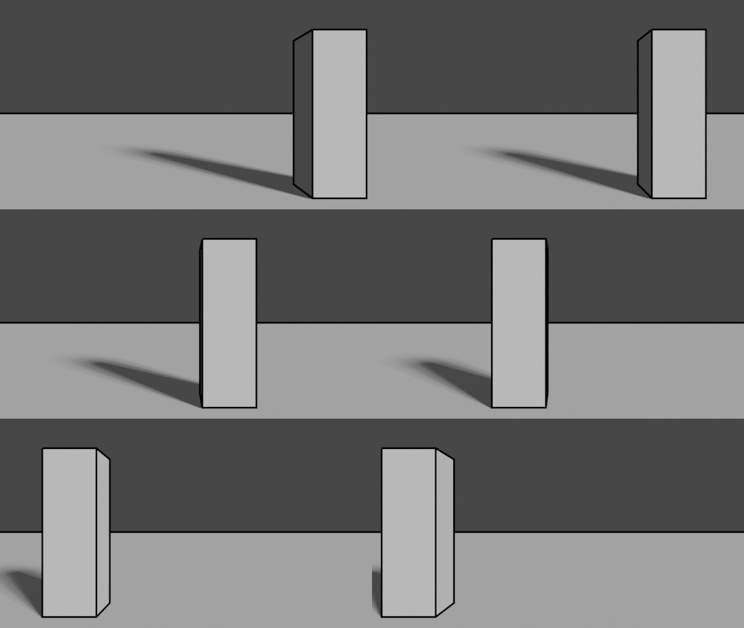
Every object will have to be reprojected as you move the camera around. You’d have to put everything on animation cels, like in one of those Studio Ghibli flying shots.
But that’s not how animators do it. Often they draw one long image and simply slide it along. Why does this work?
Firstly, if something is far away from the camera, the distortion is much less noticeable. Here’s the same box a long way away:
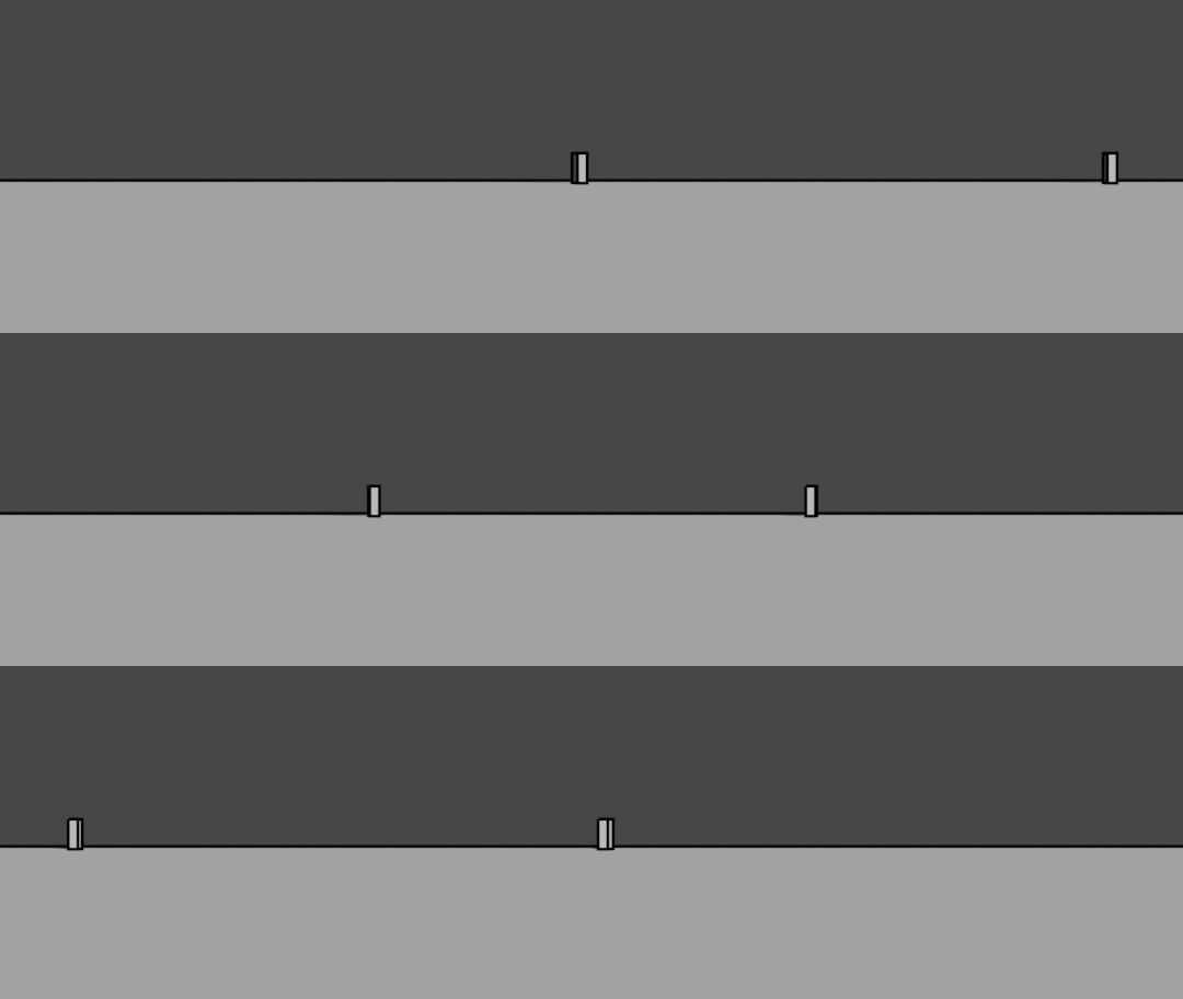
Although proportionally we see about as much of the side of the box in this shot, it’s taking up much less space in the frame! You could easily just paint one box and slide it and it would probably look OK.
Secondly, the profile of round objects doesn’t change profile nearly as much. Here’s a very simple tree with a circular cross-section:
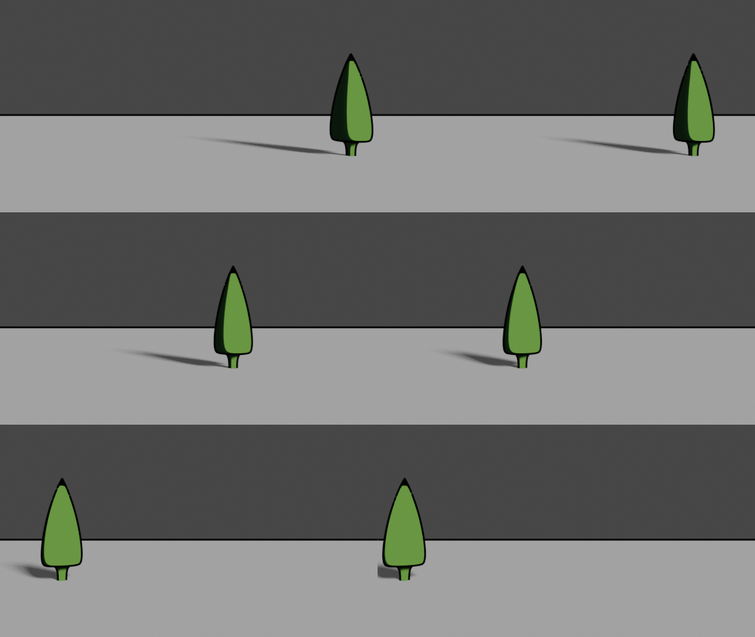
The main cue that this tree is being viewed from different angles is the shadow. If you had a painting of a tree, the shadows would be a lot more complex (and in a background, you can get away without having them) so the tree wouldn’t look particularly ‘wrong’ on either side of the frame. Thus it’s pretty common for, say, a ‘sailing down a river’ shot to have a line of trees simply sliding from left to right.
The third reason is that the viewer is not going to be picking holes in your perspective drawing in a shot that probably lasts a few seconds. As long as whatever’s happening in the background is sufficiently suggestive of the camera movement you want, it doesn’t remotely have to be perfect. For example this shot in AtlA is a brief tracking shot:
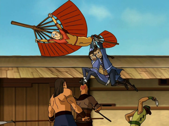
If you freeze frame and look closely, that background’s a mess: no consistent vanishing point, visible seam on the left where it wraps around. But you’d never notice when you’re actually watching because your attention is on the figures in the foreground, not the blurry background! It also helps that there is little parallax to animate in this scene since the camera is moving parallel to the wall.
In scenes with more depth, you can split the scene into layers moving at different speeds: there is relatively little parallax shifting within a layer, compared to what is happening between layers. You’re not trying to make a perfectly accurate perspective tracking shot anyway, you’re just trying to communicate enough information that the viewer can read it as a tracking shot; parallax is a just cue to help with that.
I suspect that part of the skill of a pro animator is knowing when you need to rigorously construct something in perspective and when you can get away with cheating. For example, this shot in Stink Bomb from Memories:
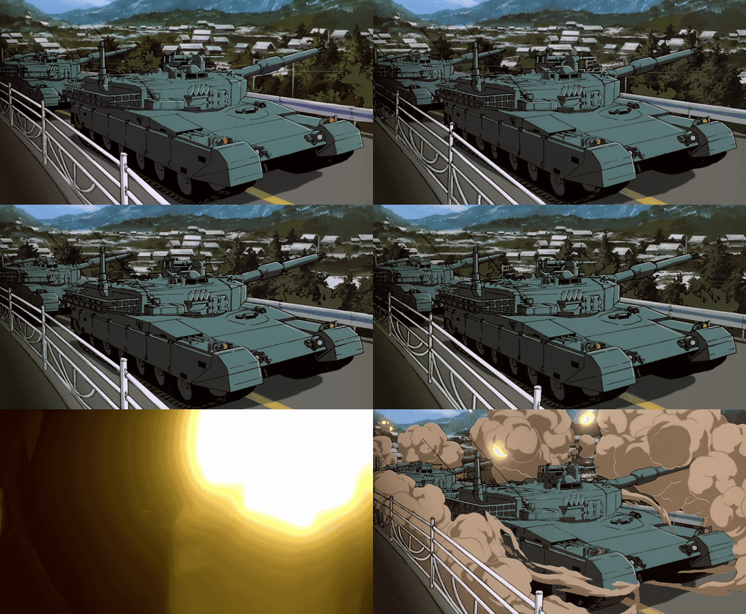
The foreground - the fence, the barrier, the road the tank tracks and the nearest layer of trees - is all animated on cels in perspective. But right behind that is a second layer of trees which is painted, and simply sliding from left to right! Then finally there’s the distant valley which is sliding much slower. In total, you have three levels of parallax speed.
Now, the middle layer isn’t perspective-correct, but you’re not looking closely at those trees, you’re looking at the tanks! and given this shot is only about three seconds long, the motion is more than enough to sell the story, which is that the tanks are firing while driving along the road. it’s also making judicious use of a three-frame loop on the cels, to save the amount of drawing that they have to do. again, you’re not going to be paying close attention to the fence, it just has to be convincing enough when seen out the corner of your eye.
putting it together
A film that makes some downright incredible uses of these kinds of perspective tricks is Otomo’s film Cannon Fodder from Memories, which is animated to appear as if most of the short is one long camera take, with a number of complex camera motions. This is particularly striking in the cannon firing sequence. The camera pans around to different parts of the set, and when it pans away they’ve switched out a different background allowing for a different camera movement. Small amounts of movement in machines can represented with very mild parallax.
Unlike Stink Bomb, which used a lot of cel animation for its tracking shots, Cannon Fodder mostly uses painted backgrounds with the perspective effects baked in. Here’s one of the most striking sequences in the film:
By my count, there’s at least three distinct backgrounds used in this sequence, which together encode a very complex series of pans and tracking shots. The background cuts are disguised by, essentially, match cuts, probably behind animation cels so they don’t have to copy too many details. I would guess that the background changes when the camera pans up to the observation platform on the ceiling, and possibly a second time when it pans past the observation platform on the wall.
The movement is sold by some incredible animation of the character being orbited by the camera - this is the bit that needs to be precisely in perspective. The backgrounds, since they’re very tightly cropped and quite far away, can afford to be a lot looser.
I would love to see what these backgrounds look like when spread out in full, but this is probably one of the best examples of a spherical ‘environment map style’ background painting, since the camera does several 360 degree rotations over the course of this scene.
Anyway I need to wrap this up here because it’s almost time for animation night, but yeah, background art need to be appreciated more imo
Comments
Mouizaa (48d886144c40d7e744d6a5320fd9802e)
What an insane article and what an insane film Cannon fodder is, thanks alot this was exactly what i was looking for.