Recently my wonderful and brilliant girlfriend jackie @baeddel has been teaching herself drawing, and making really rapid progress, and hit the stage that anyone trying to learn drawing hits when you face up to the mysteries of perspective.
Now, there’s a lot of great writing on the subject of perspective. People as far back as Leonardo da Vinci did it. I found Handprint really opened my eyes to the possibilities, but it's rather dry and technical and I now feel overly rigid in some respects; Andrew Loomis covers it in a more practical way in many of his drawing books. However, after doing this for a while and learning about 3D graphics and photography a little, I feel like I’ve ended up with a slightly different angle on perspective drawing which might help make it more accessible.
For better or worse, the only way to really deeply understand perspective is to grind out a lot of perspective drawings or 3D renders and let it sink into your intuition. As you draw a bunch of pictures, you’ll discover for yourself how perspective works by looking at the world, playing with 3D software, and trying out how things look on paper. That’s bad because you can’t just download ‘here is how to perspective’ directly into your brain, but also good because that process of discovery absolutely kicks ass and rules.
All the same, there are absolutely some principles and heuristics we can pull out to guide us from the start, and by thinking about geometry a bit (promise there’s no hardcore maths here!) we can figure out what’s really going on when we draw perspective…
What is ‘perspective’?
We live in a 3D world. However, the way we see it is not 3D, but 2D. To a first approximation, the only information we get about the world from our visual system is the direction, colour and brightness of the light arriving at our eyes.
Light travels in straight lines, so we can generally assume that light arriving from a particular direction tells us something about what’s in that direction. If we see a red light from a particular direction, we know there’s a red thing that way.
Now, just about every part of our visual experience of the world is extremely weird once you start poking at it. We’re constantly glancing in different directions, viewing things at different angles, and when we look in a particular direction, the acuity of our vision varies drastically from the centre to the edges of our field of view. Despite this, our brains can seamlessly stitch all this data together into one general sense of a continuous visual field in all directions. This lends us a certain, intuitive sense of how things work. Faraway things ‘look small’: a nearby small thing and a distant big thing will take up similar proportions of our field of view. This is the basic intuition behind perspective drawing. (We'll investigate the differences between vision and perspective later.)
Roundabout the “Renaissance”, some European guys established a set of conventions for representing a specific view of the 3D world on a 2D sheet of paper (...or other surface, not necessarily flat, but flat is conventional). They weren’t the first people to do this—China had what we nowadays call orthographic perspective a long time before, for example—but they formalised it and their methods were popularised to the extent that it’s become the standard for representational art.
The sheet of paper is very important. A perspective drawing does not represent the inside of our eyeballs, but a projection onto a specific surface that stands between us and the world. Which means that when we look at a perspective drawing, its surface is also subject to some of the same ‘distortions’ of viewing the world through an eyeball as the scene it depicts. So a perspective drawing depends as much on the position and shape of the surface as the eyeball behind it.
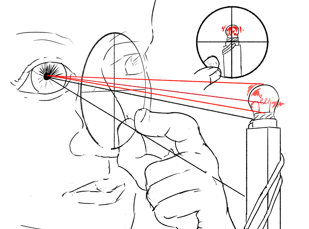
The underlying ‘logic’ of perspective is: if we were place our eye at the exact right position, everything lines up and the drawing matches the (possibly imaginary) 3D world it’s trying to represent. This special eye position is the ‘centre of projection’.
Back in the Renaissance, this dude would demonstrate the power of his new drawing technique by having viewers look at a building through a small hole, then substitute in his drawing, showing off that they matched exactly. However, we almost never view a perspective drawing from the centre of projection! It’s pretty rare for a drawing or painting to only be visible through an eyepiece which forces the exact right centre of projection.
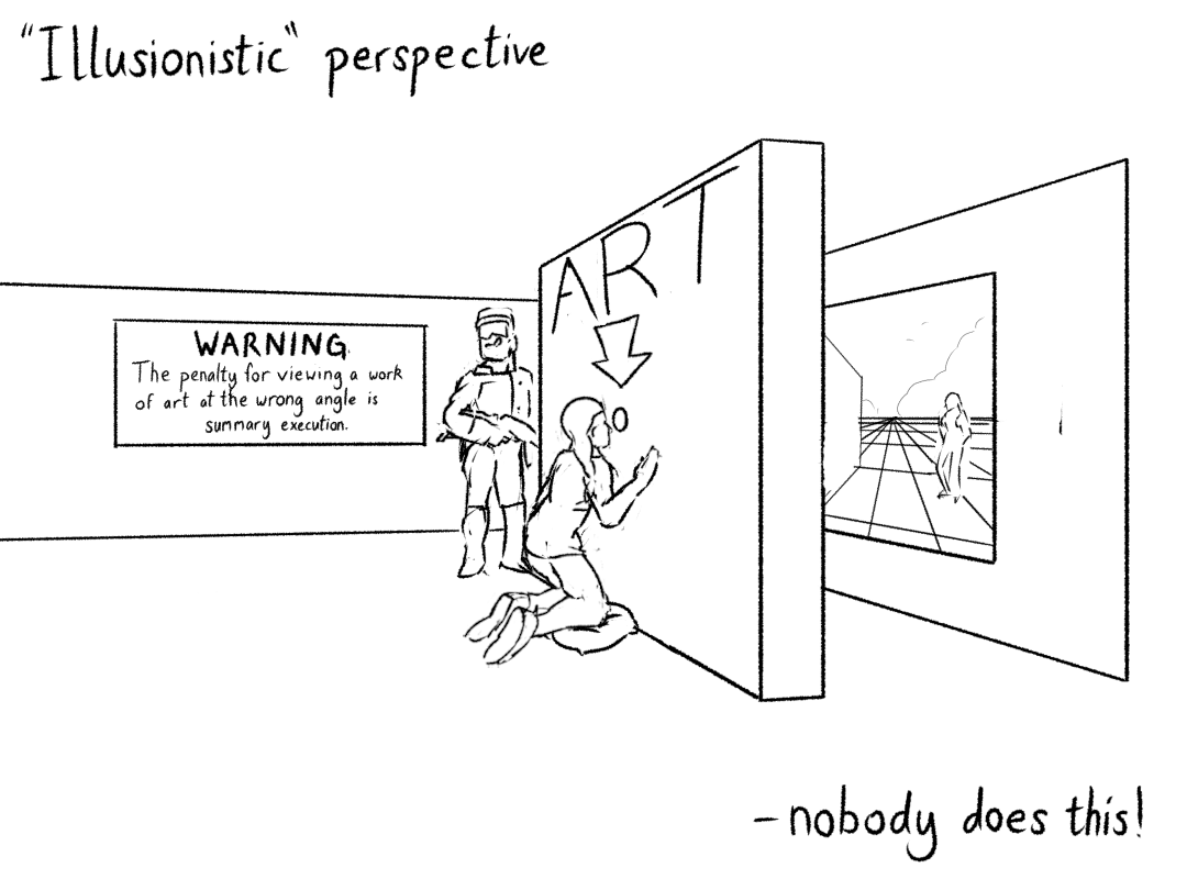
In the present day, I can only think of those chalk drawings by Leon Keer that are designed to create the illusion of a 3D shape (e.g. a big pit) when viewed from a specific angle, and Ames rooms, designed to mislead the viewer about their shape when viewed through a special location. However, almost all perspective artwork is not viewed in such conditions.
This means that perspective is not actually designed to create the illusion of a 3D world. Rather, perspective is a set of conventions for representing depth, which is built around an abstract mathematical construction that is only inspired by vision. This means it is absolutely reasonable to break from the strict rules of perspective for any number of aesthetic reasons.
But if you’re reading this, you probably want to learn how to do it ‘right’ - ‘know the rules, so you can break them’. Whether we like it or not, perspective is absolutely the dominant way to represent depth in art. And that has a lot to do with photography…
Perspective and photography
Back in the Renaissance, the novel idea that drawings should be constructed around a centre of projection was controversial. But it caught on, in part through the use of mechanical aids, such as wire grids which could guide the artist to ‘measure’ how big things looked from a specific point of view. Many of these tools were used at workshops called ateliers, which taught drawing and painting according to a strict, rigid program.
One of the most sophisticated drawing aids was the camera obscura, essentially a room-sized pinhole camera in modern language. This consisted of a dark room or box with a tiny hole in one wall, through which light would shine from outside in a way that created a faint, upside-down image on the opposite wall. The artists could then trace this image onto paper. Camera obscuras existed for a long time, but they became quite popular as a drawing tool in the early modern period.
The camera obscura created a perfect perspective projection, with the centre of projection sitting right in the middle of the hole in the wall. Modern cameras work on a very similar principle, although lenses allow them to gather a lot more light, at the cost of making certain parts of the world appear blurry and ‘out of focus’.
So a lot of the time, when we do a perspective drawing, we’re not trying to trick the viewer with a particular sense that everything lines up ‘realistically’ with their actual vision. Instead, we’re trying to draw on their experiences of seeing photos! This is particularly pertinent to animation, where we’re heavily leaning on our viewers’ experience of live action film. Certain anime directors such as Naoko Yamada will go as far as to simulate artefacts of camera optics, like bokeh and chromatic aberration.

For example, this shot from Koe no Katachi (The Shape of Voice/A Silent Voice) is drawn in perspective as if from a wide angle lens. As well as perspective drawing and carefully realistic cel-shading to give the characters 3D form, it simulates depth of field by slightly blurring the line drawings of the nearer character (who is not in the focal plane), and also simulates chromatic aberration around the bright highlights. Many of the same tricks are also carried out in CGI, even in very stylised films like those of Pixar. So this is a drawing, and it’s not trying to convince us it’s not a drawing, but it’s using live action-inspired effects to open up some of the storytelling possibilities of cinema.
In the cinema, there is no attempt to ‘illusionistically’ use a particular centre of projection. The effective centre of projection in a close-up shot and a long shot is likely completely different (and in any case, even if it happened to lie within the cinema for a particular shot, most of the audience is not at that spot!) Not only that, but directors will actually change the centre of projection for artistic effect. The dolly zoom, where the camera moves backwards while narrowing its field of view, is in effect moving the centre of projection while keeping the subject at the same size.
One reason really extreme perspective, whose centre of projection is in some implausible position, is still considered a reasonable depiction of its subject… is perhaps our familiarity with this kind of photography. As much as we animators may want to break away from the limitations of what cameras can show, as representational artists we still need to lean on some familiar element to convey whatever we’re trying to show. To borrow a phrase from Keep Your Hands Off Eizouken!, perspective drawing is a ‘narrative tool’, one which we can push in various directions. (e.g. a common effect in animation is to drastically push the perspective distortions when a character is on drugs, which keeps things grounded but still makes them look uncanny).
OK, that’s some theory. Let’s get onto the practicalities. How does perspective work?
Perspective distortions and FOV
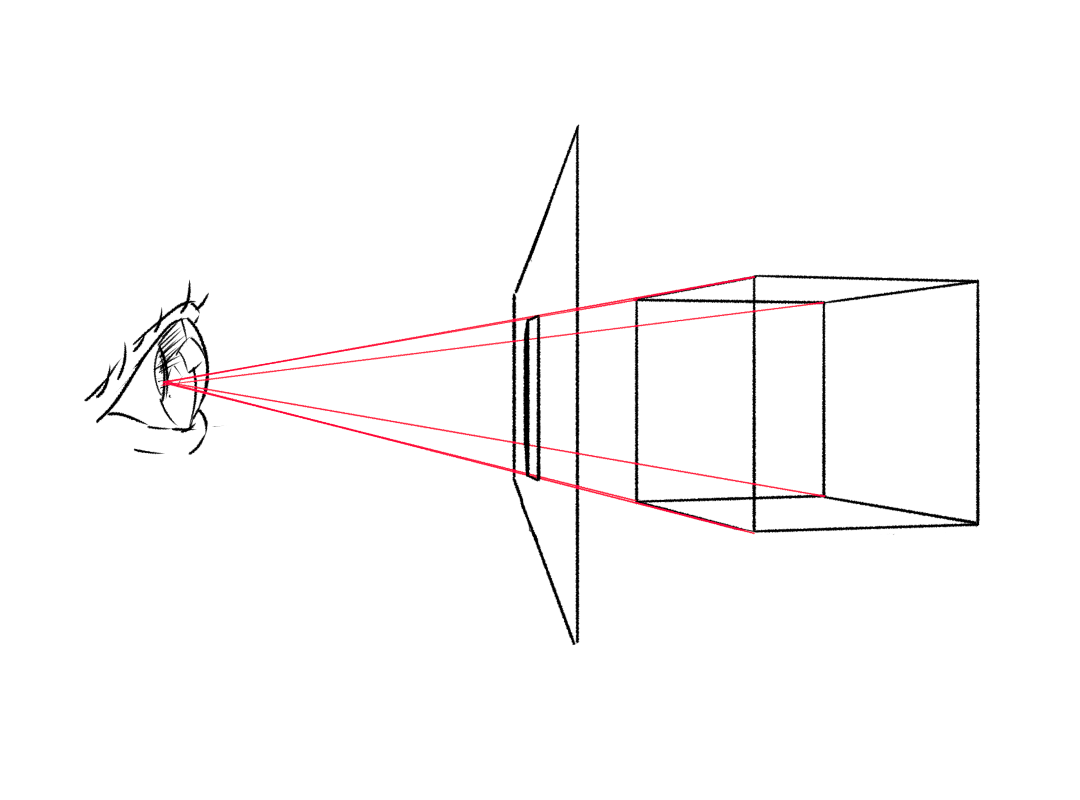
In a perspective drawing, each position in the image represents a different direction, travelling away from the centre of your eye.
In other words, imagine your eye can shoot out laser beams. Each point on a perspective drawing represents a possible direction the laser can go.
Lets grab some language from computer graphics. Objects in the 3D world exist in 3D space. The drawing, meanwhile, lives in canvas space (usually called screen space, for graphics). The angle between directions represented by opposite sides of the drawing is the drawing’s field of view, which is measured as an angle. (We can measure it horizontally or vertically in a rectangular picture.)
As long as the set of view angles represented by a perspective drawing is small enough, it will still look pretty much right when viewed from somewhere near to, but not exactly on, the centre of projection. Once you get to the wider angles, though, it’s much more important to view from the centre of projection. Otherwise, the image will look strangely distorted…
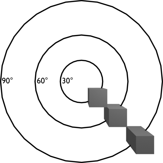
This image of three cubes was rendered with a 90-degree field of view, meaning the angle between the left and right sides of the picture is 90 degrees. I’ve marked each circle with the field of view it represents. (This is twice the angle between that circle and the centre of the image)
The image represents a 90 degree wide pyramid of 3D space, projected onto a square in canvas space. This pyramid shape, with its ends cut off, is known as a frustum in 3D graphics. You don’t need to know that to draw perspective, it’s just a cool word.
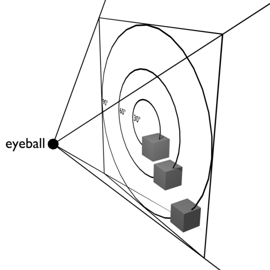
If your eyeball is half the physical distance from the monitor as the width of the image on your screen, the render will look ‘right’: the cube at the edge of your view will look just like a real 3D cube at the edge of your vision. But I doubt your eye is, assuming a 96ppi screen, only 2.8 inches from the screen!
Since you’re not looking at the image from the centre of projection, that outside cube looks really weird. It’s not how we expect a cube to look. This is an example of perspective ‘distortion’: when a correct perspective drawing looks ‘wrong’ because we’re not looking at it from the centre of projection.
Yet despite this, the other two cubes near the centre of the image still look pretty much fine! This is the strange power of perspective drawing, at least for someone like us who’s acculturated to it: even when we’re not at the centre of projection, it gives a convincing impression of how far away things are, drawing on our experience of looking at photos and other perspective drawings as much as our actual experience of the world.
I picked 90 degrees for a reason. If you have two perpendicular surfaces in 3D space, their vanishing points are 90 degrees apart. So a 90 degree-fov perspective drawing could contain both vanishing points of a cube.
Now hold on, what is a vanishing point? Well, let’s get into the actual practicalities of drawing shit in perspective!
Comments
Shit drawer (713dd4d0b2e842c08da62ddeec872331)
I am going to draw the biggest greasiest pile of shit ever its going to be massive and absolute turd