originally posted at https://canmom.tumblr.com/post/624086...
How much light enters your eye, or a camera, in an instant (zero time)? Absolutely none of course. So despite the apparent sense in which a camera captures a specific moment in time, in practice of course it actually sums the incoming light over a (very short) period of time.
Photographers know this of course: this period of averaging is the shutter speed, or exposure time: the very short period during which the light sensor/photographic film is exposed to light. If you increase the exposure, the image becomes brighter since more light can accumulate over time. For very dark scenes, you might even expose the image element for multiple seconds.
With a long exposure, the camera can potentially capture more detail in low light. But it comes with a blatant drawback: the longer the camera is exposed, the greater risk that something move about, which creates the phenomenon of motion blur. This is why night photography without a tripod tends to suck.
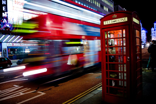
Of course, used deliberately, it can look cool as fuck. [CC-BY-SA]
(source)You can compensate somewhat by adjusting the aperture, essentially slicing off light outside a certain radius at the front lens of a camera (I need to do a post on camera optics at some point, but that’s beyond the scope of this post!) but this has its own implications. A narrow aperture reduces the radius of spatial averaging for light that’s not in the focal plane of the lens system, which means in short that a greater range of distances from the camera will appear to be in focus. Conversely, a wide aperture can be used to create a depth of field effect where only a narrow slice of the image is in focus.
By balancing aperture and exposure time, you can take photos of the same scene in a variety of ways. (A pinhole camera has a narrow-as-possible aperture, meaning that the entire image is in perfect focus and no lens is required, but at the same time this requires enormous exposure times on the order of hours to get enough light into the camera.)
Video cameras, whose exposure is sharply limited by the framerate, also experience motion blur like any other camera. This can be desirable, if the intent is to create a confusing, disorienting effect, but it’s usually unwelcome, so film sets are very brightly lit which allows the camera exposure time to be as low as possible.
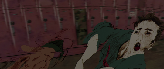
Still, our eyes are quite good at picking up details from a moving scene, and indeed we rely on motion blur as a cue to when things are moving. If you freeze frame a live-action film in an action scene, it often looks like a blurry mess, but you can ‘read’ the shape of objects in motion because you get different glimpses at different times.
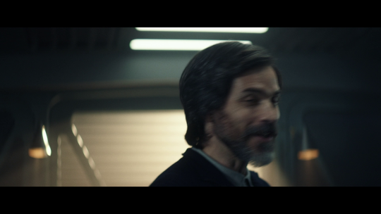
In the above still from Star Trek: Picard (of course the only live action show i’ve got on this computer is sci-fi lol), the actor is rapidly rotating his head. Even though his face is right in the focal plane of the camera, it still looks blurry because of motion blur. However, if you’re watching the film at full speed, you wouldn’t think he’s gone out of focus!
Our eyes are also carrying out this process of averaging, but it’s not nearly so clear-cut between ‘this is the exposure of one frame’ and ‘this is the exposure of the next frame’. It’s a rather more messy: when light falls on our optical nerves, it stimulates them to signal the brain, and this stimulation will have a certain falloff over time, and (I presume) at some point a cell will become ‘ready to perceive’ once again. But this will be happening continuously to different cells, not in unified windows.
Not only that, but every time our eyes move, it will create serious motion blur, as the light from a particular direction stimulates different parts of the retina in turn - much like rapidly panning a camera. To compensate for this, our eyes make extremely rapid movements (called saccades) and then abruptly stop. During these saccades, our brains basically completely discard any visual data from the eye - an effect called saccadic masking. There’s an interesting topic of research in transsaccadic memory: the way our brains take the constantly moving perspective our eyes and make it feel like a ‘stable’ image. But I haven’t looked into it and it’s not super relevant to animation beyond, hey, cool thing.
This effect in the eye is known as persistence of vision, but the actual perceptual science seems more complicated than simply ‘the eye remembers what it saw for a certain period’: there’s two distinct effects rather cryptically named after greek letters, phi and beta. A frustrated wikipedia author even goes as far as to break the encyclopedic tone to say (starting in this revision):
(Unfortunately, that seems to be about as clear a description as one will find in the scientific literature.)
So I’m not going to try and break it all down in physiological detail here. Suffice to say:
- our visual system is constantly performing a time average over a brief, rolling convolution window, which means (for example) a fast enough flicker will be perceived as a constant light
- to compensate for this, our brains have various mechanisms for interpolating a series of rapidly changing visual stimuli as representing an underlying, continuous motion
The trick in making animation ‘read’ is finding ways to activate these mechanisms.
In computer animation, which can smoothly interpolate in the space between frames, there’s usually a motion blur setting in your renderer, which performs time averaging - basically like a simulated camera shutter. A modern, path-tracing renderer is already averaging over a series of samples which bounce rays of light into the scene, so it’s quite a conceptually simple tweak to start some of these rays at different times. Making it efficient is harder, since raytracing acceleration structures intrinsically assume the geometry is the same for every ray, but I’m sure people have found cunning ways around this.
Realtime rendering has less than a sixtieth of a second (assuming the typical 60fps standard) to perform lighting calculations, and so it does motion blur in a simpler way: it keeps the last frame in memory, and averages it with the most recent render output to produce the next frame. (This means that you have a kind of feedback loop effect, but assuming the weight of the previous frame is low enough, it’s not going to be too big a problem and past frames will gradually fade out).
This effect is quite controversial, and we can see why if we think about the logic of motion blur. In film, at a typical framerate, each frame represents about 1/24 seconds of light input - enough to represent a fairly significant chunk of time as far as the eye’s averaging process is concerned. If there’s no motion blur in the film, it will look strangely sharp and subtly unrealistic, as if the CGI object (and only that object) is lit by a strobe light. This is why CGI animation for film adds motion blur: as far as your eye is concerned, the stimulus now looks believably like it’s been averaged over 1/24 seconds, as the eye would if it was watching a moving object.
In a game, on the other hand, you’re (ideally) rendering at 60 frames per second, perhaps even more - each frame represents a very small chunk of time and we can expect that the eye is averaging over several frames by itself! So adding additional motion blur to the frames can potentially over-exaggerate the effect, and make details harder to see. Moreover, games - even the most graphically fancy, ‘photorealistic’ ones - have never looked like actual film, even with motion blur effects. (In first person games, there’s already a bizarre conflation of metaphors - does the game’s renderer represent the character’s eye, or a film camera? [it represents a game camera, is what it represents.])
Still, ultimately it’s a matter of taste and it is good that most games that have it make it optional.
(As an interesting aside, when the Hobbit movies were released with high-framerate film, shot at 60fps, many viewers apparently it actually detracted - the higher framerate didn’t feel ‘right’ for the film, making it feel (ironically) more like a bunch of actors tramping about in costume and less like the fantasy world they wanted. So far as I can tell, that attempt to push a new format fell by the wayside, and film has since stuck firmly with 24 frames per second. Of course, the Hobbit movies’ problems run far far deeper than a dubious use of high-framerate film.)
What does motion blur look like?
That’s how motion blur occurs - but what are its properties? To sum up…
- Motion blur appears when there is significant motion in screen space (the image plane) over the camera’s exposure. (This means for example if a camera is tracking a moving subject, the background blurs rather than the subject.)
- It is not an omnidirectional blur (like the Gaussian blur available in most image editors, or the soft focus of objects outside the focal plane) but follows the trail of motion in screen space.
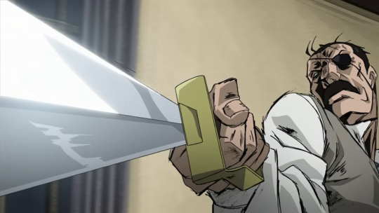
- A small, sharp image feature (such as a bright light) will turn into a line.
- If the exposure does not start and stop abruptly, the bulk of light in a motion blur streak comes from the middle of the exposure, and it ‘fades out’ at the start and end. Conversely if the shutter moves very quickly compared to the exposure time, the streaks will have a sharp start and end (like that bus picture above).
Traditional animation smears
Now let’s actually talk about traditional animation, and smears.
Animation is a curious case, as far as the above concepts are concerned. Even the most film-styled, in-perspective, anatomically realistic animation (a Satoshi Kon film for example) does not look like film, it looks like a drawing. It’s simply impossibly time consuming to like, oil-paint every frame with realistic lighting (though Russian animators have managed to go quite far in that direction, such as The Old Man and the Sea (1999), and the results are pretty astonishing to watch). That’s not what we’re here for, usually - we want the kind of stylisation that drawing gives!
In each frame of animation, what you have is a sharp drawing - typically with a line around the outline, in the majority of styles - representing, effectively, an extremely short exposure. The lines need to read as sharp to the eye, so there’s not much room for applying motion blur. That’s fine, we don’t want to look like film. Occasionally, such as in that ryo-timo cut I wrote about before, a small amount of Gaussian blur will be applied to particularly fast-moving parts of the frame.
In 2D animation, we still have a technique for indicating something akin to motion blur. This is presently known as a smear, but I’ve also seen it called an elongated inbetween, and it’s kind of ubiquitous.
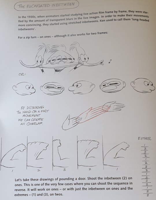
The reasons aren’t exactly direct emulation of a film camera’s long exposure, most of the time. However, they began that way. In The Animator’s Survival Kit, Richard Williams writes a brief history of the technique:
In the 1930s, when animators started studying live action film frame by frame, they were startled by the amount of transparent blurs in the live images. In order to make their movements more convincing, they started using stretched inbetweens. Ken [Harris] used to call them ‘long-headed inbetweens’.
[examples below]
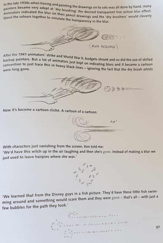
In the late 1930s when tracing and painting the drawings on to cels was all done by hand, many painters became very adept at ‘dry brushing’ the desired transparent live action blur effect. Animators indicated the blur on their pencil drawings, and the ‘dry brushers’ would cleverly blend the colours together to simulate the transparency in the blur.
After the 1941 animators’ strike and World War II, budgets shrank and so did the use of skilled backup painters. But a lot of animators just kept on indicating blurs and it became a cartoon convention to just trace this in heavy black lines - ignoring the fact that the dry brush artists were long gone.
Now it’s become a cartoon cliché. A cartoon of a cartoon.
(As an aside, I find the framing of that comment about the strike curious. Elsewhere in the book, Williams talks about having to fire someone - let’s just say I don’t think he’s a comrade exactly, as much as he provides an abundance of useful advice.)
On the next page, Williams advises against the overuse of speed lines in traditional animation:
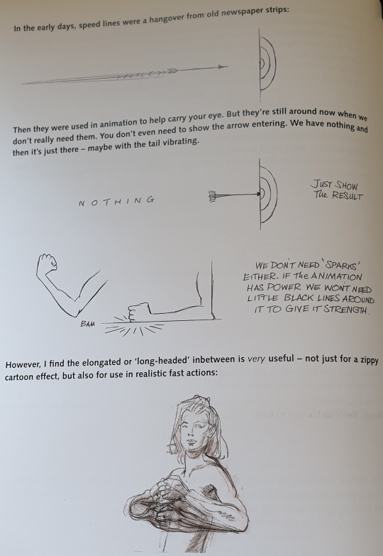
In the early days, speed lines were a hangover from old newspaper strips:
[image of an arrow zipping towards a target]
Then, they were used in animation to help carry your eye. But they’re still around now when we don’t really need them. You don’t even need to show the arrow entering. We have nothing and then it’s just there - maybe with the tail vibrating.
However, I find the elongated or ‘long-headed’ inbetween is very useful - not just for a zippy cartoon effect, but also for use in realistic fast actions.
Again, we’re returning to the original purpose - emulating the transparency of broad, live action blur movements. It’s especially suitable with ‘soft edge’ loose drawings - where the outlines aren’t sharp and enclosed like clouring book drawings.
Smears in anime
But a smear doesn’t exactly emulate the look of motion blur, since drawings are inherently sharp and not blurred. Yes, it would be possible to use modern digital tools to paint blurred frames a lot easier than in the 1930s, but instead we’ve developed some other, more stylised methods.
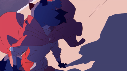
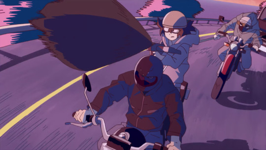
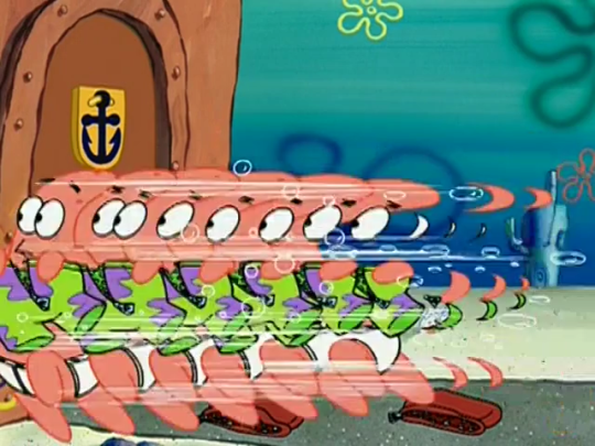
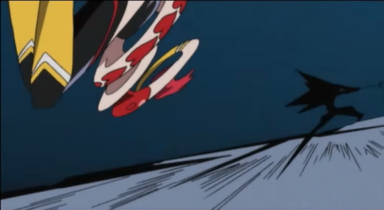
A typical smear frame in modern animation involves painting the flat cel colour outside the lines in a jagged shape. Studio Trigger make particularly exceptional use of this technique to add a ton of impact to their action scenes. Here’s a very brief shot from Brand New Animal which functions as a pretty typical example. It’s a tracking shot, where these characters are riding motorbikes along the road (static within the frame), while the background’s curving past. The camera cuts slightly closer, and a girl shoots a crossbow towards the camera:
Here are the frames I want to focus on:
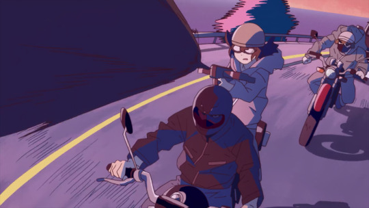
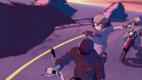
The trees, which were already jagged in the previous shot (where a series of identical trees scrolled past, doing a little stylish wiggle), become even more so in the closeup; the crossbow bolt appears onscreen for just five frames (the first two frames, the drawing is held but the camera pans slightly), and its silhouette and shadow are rough and messy. In the third drawing, it’s more like an afterimage - literally just a smear of lines. The result is that it’s onscreen just long enough for our eye to register that its there, and its disappearance doesn’t feel too abrupt; yet each frame still looks like a drawing, with no blatantly-digital motion blur.
If you want to see more of this sort of thing, the smears tag on sakugabooru has a ton of fantastic examples in all sorts of styles.
Smears for impact
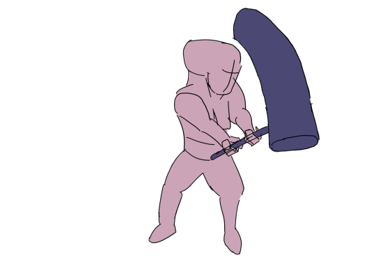
So if not simply emulating motion blur, what is the purpose of a smear? There’s a few reasons. One is the fundamental animation principle of contrast, and squash and stretch. A few pages before, Williams gives an example (credited to Ken Harris, who’s known for animating Wile E. Coyote and other Warner Bros. characters) of how we can increase a feeling of impact with changes of shape within a moving mass, in this case by stretching out its shape before the impact:
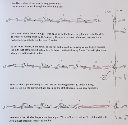
“We won’t see it” says Williams, and this seems to be key for smears in general: they have to be fast. The effect is subconscious. If every frame is smeared out, it instead looks like your character is a funny shape.
So let’s pop open Krita and try the Ken Harris wall splat technique ourselves. Here’s the first version, with a space in between the character getting near the cliff and getting flattened. (Drawn in my style rather than Williams’s, I know these drawings are a little inelegant lol)

This looks weird - it may technically be the output of a camera with a short enough exposure time, but there’s a noticeable gap in screen space between the character getting near the wall and actually flattening against it. For fast action like this, it’s very important that we have overlap to carry the eye across the screen.
Here’s the second version, with an extra frame of the creature just touching the cliff:
This is better (there’s no gap) but it feels quite stiff and robotic.
And here’s the version with a stretched out inbetween - one kind of smear frame:

zzzziiiip! it’s subtle but I think Williams is right, doing this trick does add a lot to the impact and the overall feel of the animation. (And with coloured-in forms rather than lines, it might do even more).
What does this example tell us about doing a smear? In this case, we’re not exactly emulating motion blur. If we wanted to stretch out the fox to emulate motion blur, we’d do it on every frame the fox is moving. Instead, this is connecting the smear to the broader animation principles - in terms of Disney’s 12 principles, it applies squash and stretch and anticipation, but also maximising contrast of forms, similarly to how we might briefly ‘break’ a swinging arm to make the animation feel snappier.
Smears to create overlap
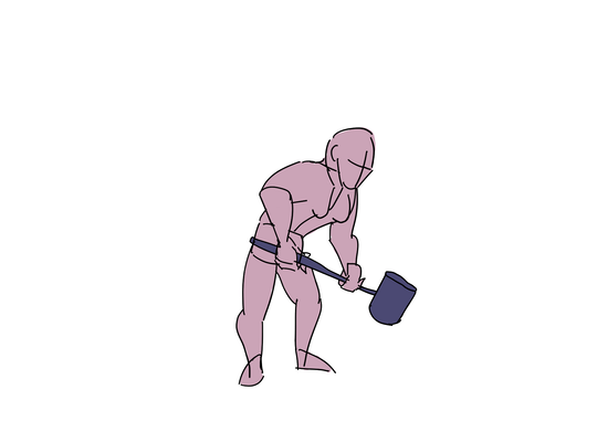
Suppose an art-tutorial-standard maquette is swinging a hammer. (Williams actually has an example very much like this later in the book, but I only realised late in drawing this, and we’ve got a slightly different perspective.) We draw our key poses:
The end of the hammer is making a big movement. We slowly build up to it, having the character draw back their arm in anticipation… but we want the actual hammer blow to go down really fast, let’s say maybe two or three inbetweens. So we draw our key poses like a good little animation bitch:
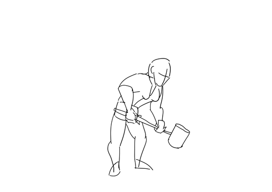
That hammer has got to cover a lot of ground in a very short space of time. Too many inbetweens and it won’t feel forceful. But somehow we have to lead the eye from the ‘up’ position to the ‘down’ position. Perfect case for a smear (and, in camera terms, you’d see a ton of motion blur here. (There’s a lot to do in the anticipation section as well, of course, to keep the animation feeling weighty)
I went ahead and animated the rest of the frames between these three poses. The hammer goes from the fully ‘up’ position (second key pose) to the fully ‘down’ position (third key pose) in just 4 frames. Although this is messy (I would want to do a cleanup pass and redraw a lot of the stuff on the torso which is currently jiggling around like mad), it reads pretty well already:

If I was to spend more time on this, I’d also want to slow down the end of the hammer-raise part of the animation so it feels more like she’s struggling to raise that heavy hammer, and we have a bit longer to anticipate the big whack. But this is just an animatic, and it will suffice for our purposes.
Although it feels like a nice strong whack, it’s hard for the eye to perceive the arc of the hammer blow. We can try to improve matters a little by colouring in the drawings:

This helps reveal some flaws in the silhouette (her right shoulder is absolute chaos) but also helps the overall motion to read. However, the actual hammer swing is clearly missing something - we clearly see the afterimages of three successive images rather than a continuous motion!
There’s a reason I coloured it, and that’s because the smear style I want to use basically involves colouring outside the lines. If we just pop some like, roughly drawn triangularish stuff trailing in an arc behind the hammer, like this:
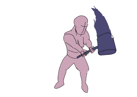
And bam, suddenly the motion is a lot clearer:

We have the exact same lineart, but the motion feels smoother! The eye doesn’t really perceive all the details of the smears, just a vague sense of the texture of the rough lines we drew, which is not the same as a camera’s motion blur but still feels like a ‘smeared out’ version of the image, which is what we want.
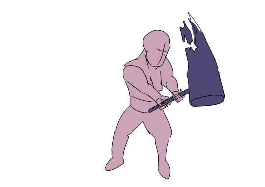
If we felt like it, we could potentially add more smears to the character as well as the head of the hammer (though I’d want to considerably clean up the linework before I considered doing that). That is the approach I took in this animation, adding smears to basically every frame. The result feels, well, kinda messy, since there are few moments where you get to definitely perceive the shape of the character.
Different types of smear
So that’s what smears are and why they’re cool. To wrap up, let’s look at different ways of drawing them.
We’ve seen one way: what I’d call colouring messily outside the lines. Or you can draw messy lines to go with that, for a pretty similar effect, like the Studio Trigger example above.
One advantage of this method is that it feels really energetic. Things are happening that are so exciting that stuff can barely keep its shape anymore! But it still feels stylised, still feels like animation - it’s not trying to be a film camera. This is a great method if you’re animating digitally, when it’s very easy to draw whatever shapes you want with a sharp brush. I imagine it’s harder to do if you’re actually painting onto celluloid, but well, nobody does that anymore!
You have the option of making the lines messy as well, or keeping the lines neat to give the eye something to fix on, but making the colours messy so the forms are smeared out. Here’s what drawing the smears as lines first looks like on our hammer swing:

I actually think this looks worse though that may be because i made bad choices of what shapes to draw as lines lmao.
If you want things to remain clean and elegant, it’s obviously not such a great method. So let’s consider another approach, which I might call sub-frames. Essentially what you do here is draw multiple overlapping drawings on the same frame, like you’ve taken images at a much higher framerate and layered them over each other. You can see some examples in the Williams book excerpt above.
For our hammer example, this approach might look like this:
This feels all right? Could maybe do with a little cleanup?
I think the advantage of this style is that it keeps the forms of the character clear and it helps track how they move through space. It can also be entirely drawn at the lineart stage, rather than requiring the colourist to figure it out, which is suited to a studio setup where the line artists are primarily in charge of shaping an animation.
This is a style used in certain western cartoons, apparently beginning with the Dover Boys short at Warner Bros if this flashy but light on detail javascript article is to be believed. Here’s one of their examples, from Spongebob Squarepants, where Patrick the starfish dashes out over the course of just one frame:
We can notice another trick here: although the frames near the front of the motion are fully drawn, the ones towards the back shrink down into more limited forms.
The other approach to smears common in Western animation is to stretch out forms to create a kind of ‘motion tube’ (if you will).
What we’re doing here is not an exact analogue to motion blur, but it reflects certain of its properties. For example, if we stretch out a circle, we get an ellipse. If we layered a bunch of translucent circles over each other in close proximity, we’d get a kind of extended blob that’s darker in the middle:
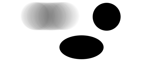
So in terms of density in spacetime (if you will), we can think of an ellipse as a sort of approximation to a circle moving through space. But that’s not really the logic behind it. Instead, this is a purely intuitive effect, that attempts to convey both form (including detail) and motion at the same time, and creating contrast within a form (like the fox above) when the object comes to a halt. In short, it doesn’t really imitate a camera, it’s purely an animation effect.
The above article gives an example from a DC superhero show where Superman dashes into shot over the course of one frame. This is conveyed by essentially drawing him really wide, like the stretched-out fox we drew earlier:
In camera terms, this ‘wide superman’ is reminiscent of a rolling shutter, as if an imaging line was moving across the page from right to left just slightly faster than Superman was sliding into shot. (Most rolling shutter pictures are vertical, but this is what it reminds me of). In any case, what they’ve done is imagined Superman is stretched out along the line of motion. Like the Studio Trigger example, though not to the same extent they’ve also made the edges of the shadows and lines a little rough here. This smear lasts only one frame, so it works on an entirely subconscious level.
If we were to apply this technique to our hammer, we essentially turn it into a little tube. We can also stretch out our little person - and I find the concept of ‘stretching out’ helps with figuring out what to draw.

This also feels pretty good to me! It feels a lot ‘cleaner’ in drawing terms, even though the drawings actually go more off-model here.
The final approach is what the old Disney guys used to do, which is actual motion blur. Essentially taking the tube/subframes approach but blurring them out a bit. I want to get this posted so I’ll add this as an example later, since it’s definitely the most time-consuming approach. (We could probably try endless variations, but if I really wanted to improve this animation I’d think about cleaning up the figure drawings rather than trying yet more varieties of smear.)
The really wild end
So we’ve seen a smear is a brief, distorted image which serves to add impact to a motion by extending (in whatever style the animator sees fit) forms along the line of motion. There are various different ways to do this in drawing that we’ve seen.
But some animators take this to an even further extreme. The ‘big name’ sakuga animators use this technique a lot.
Here for example is a still from the Animatrix short Kid’s Story, in the chase scene animated by Shinya Ohira. You can see the full cut (without sound) here - it’s absolutely incredible to see in motion.
This has a lot of what we discussed: stretched out, distorted forms, colouring outside the lines, multiple subframes in one frame (albeit only as outlines in the case of the hand on the left). Ohira’s style is full of this kind of distorted forms, extreme perspective, people wobblying about, but still feeling flowing and weighty. Recommend checking out this segment of 2013 Anime Central presentation on sakuga which covers some of his work.
Another one with a unique style of distortion which stood out in that presentation is Yoshimichi Kameda, who debuted in FMA: Brotherhood and is now known for his work on Mob Psycho 100. He notably uses a sumi-e brush pen in his linework to kind of roughen up brief closeups, like this (source):
This is only a few frames long, and it’s not even simulation of motion blur here (the cut additionally uses realistic motion blur on the background, and smear frames on swords wipes) but the brief distortion of the lines adds to the intense feeling of the animation.
The one I really wanted to track down though is Hiroyuki Imaishi; here’s the sakuga panel on him.
Specifically, check this inbetween out from RE: Cutie Honey (Gainax):
As the presenter says, ‘between poses she kind of turns into a wiggly noodle’. It’s actually long enough to register to the eye and contains a few frames, but it’s an absolutely ingenious effect, like, how did you even think of that? This is well away from simulating motion blur, and it’s down to a kind of intuitive effect: between these two poses she’s tumbling chaotically, we could make her somersault in perspective… or we could make her into a noodle, for just long enough to register.
I could continue listing sakuga animators for a while here; Takeshi Koike tends to linger a bit longer on some amazing distorted shorts, in particular that one shot used a couple of points in Redline animated by Takafumi Hori, where everything distorts and bends as the car gets a speed boost.
Final conclusions on smears
- they’re a good idea!
- the ‘basic’ smear follows the direction of the motion, like in motion blur. you have a few different options for how to draw this
- keep ‘em brief. you should snap back to an ‘accurate’ drawing before long so the eye keeps track of what things actually looks like. but…
- don’t be afraid to make them really fucking wild
- the main goal of a smear is to connect up fast-moving forms to make them easier to read as continuous motion, and to add contrast within a form, particularly when transitioning from fast to slow motion.
- a messy smear helps to sell a chaotic, rapidly changing scene. just don’t go overboard with it, the major motion still needs to read
- watch sakuga, it’s fun
Comments