originally posted at https://canmom.tumblr.com/post/699651...
OK, more comics comments! Last time we talked about The Incal by Moeb and Jodorowsky! And you can read the rest of this little series here.
Solo Leveling
(2018-2021; original webnovel by Chugong, adapted to comic form by h-goon, illus. Jang ‘Dubu’ Sung-Rak, trans. JJoelle and edited Michelle Kim [official], + various scanlation groups such as Flame Scans and Jaimini’s Box)
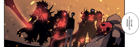
The second comic I read on the plane back from the States, and then for much of the day after, was the manhwa Solo Leveling, which is (deep breath) a South Korean webtoon adaptation of a litRPG reverse-isekai web novel. If you’re not familiar, I’ll explain what all of that means in a minute. Also I’m gonna talk spoilers so heads up.
To briefly summarise the premise: the modern-day world has been changed by the manifestation of a bunch of dungeons, and the bestowal of supernatural powers onto random members of the populace. These ‘hunters’ descend into the dungeons, which are like little alternate dimensions, to prevent their denizens escaping and mine the magic artefacts inside.
The world’s ‘weakest hunter’ Sung Jinwoo ends up in a special ritual chamber which slaughters most of his group, but declares him a ‘player’, giving him the unique ability to grind for levels, which leads to him gradually becoming one of the most powerful hunters in the world… as he scratches away at the central mystery of who created this leveling-up system and what’s the deal with the dungeons in the first place.
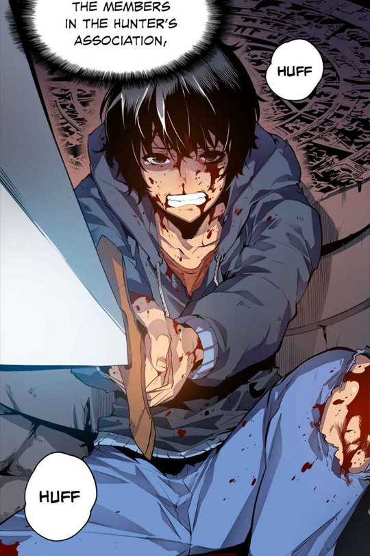
This is… not really a comic I’d normally look at, but it kept popping up whenever I opened Mangadex, and I recently did an animation challenge run by animator Vann Oba who is a very skilled artist with a talent for dynamic compositions, and he had a lot of praise for this manhwa, so I figured I’d take a shot at it. And, certainly, from an art perspective, there’s a lot to write about.
But first let me address the story. It has that compulsive page turning quality of a serial fiction that is regularly dropping cliffhangers, such that I found it hard to stop reading (being shattered after my flight didn’t help). Ultimately, it left me feeling pretty hollow. The bulk of the story sees Jinwoo falling into a series of drastic situations, and defeating a series of stronger guys; midway through the story he gets the ability to resurrect the dead to serve him. The big reveal turns out to be that there’s a war between alien gods, and the whole dungeon thing was a complicated scheme by the angels to prepare humans to fight off the gods, and the ‘system’ was a way for Jinwoo to synthesise himself with one of those gods. Of course, he fights off the bad guys… and then goes back in time to undo the entire plot and make it so that the dungeons never showed up in the first place.
In short, a big old power fantasy. Jinwoo toys with his ‘dark’ powers, and we’re told repeatedly that we should worry about him getting corrupted, but he always remains motivated by the wellbeing of his family above all, and that doesn’t really go anywhere. And that was generally my feeling coming to the end of Solo Leveling: ‘is that it?’ It all felt quite hollow.
Which is… a sign that the genre just isn’t really for me, I guess. I can’t say it was poorly executed, just that the masculine power fantasy - of being cool, handsome, hard working and cunning, and getting rewarded for it - doesn’t really connect with me.
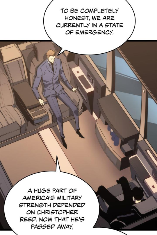
There were some interesting elements to the story, like the geopolitical angle on the dungeon delving - at one point the Japanese hunters and the Korean hunters work together, which is secretly a scheme by one of the Japanese hunters to do away with all the strong Korean hunters and put himself in the big leagues. (In the end, the Japanese guys mostly die and Jinwoo jumps in to save nearly all the Koreans). Wonder what’s behind that one! There’s also a Chinese hunter who recurs throughout the story, always looking very cool, but doesn’t do especially much; there’s an evil Korean hunter who went away to serve the Americans.
I don’t want to read too much into it, like this is just what the author thought would be a compelling plot development rather than some kind of heavy-handed allegory. But it is an angle that’s not present in the usual ‘leveling up’ sort of litRPG story.
The strongest hunters are likened to nations in of themselves, forces that the various countries have no choice but to appease and defer to since they cannot enforce any sort of laws on them. It would be interesting to imagine what might be done with this - some kind of spin on the tech billionaire who has unimaginable amounts of power but still very normal human foibles, perhaps creating their own little microstates where they’re corrupted by their absolute power - but mostly they’re just buff guys who like to fight.
Anyway, enough on the narrative, let’s actually talk about it as a comic!
So, this is a webtoon. That’s a specific format of comics (만화 manhwa) originating in South Korea, designed for reading on the web. You can read a bunch more about them over on the Korean Webtoons Wiki.
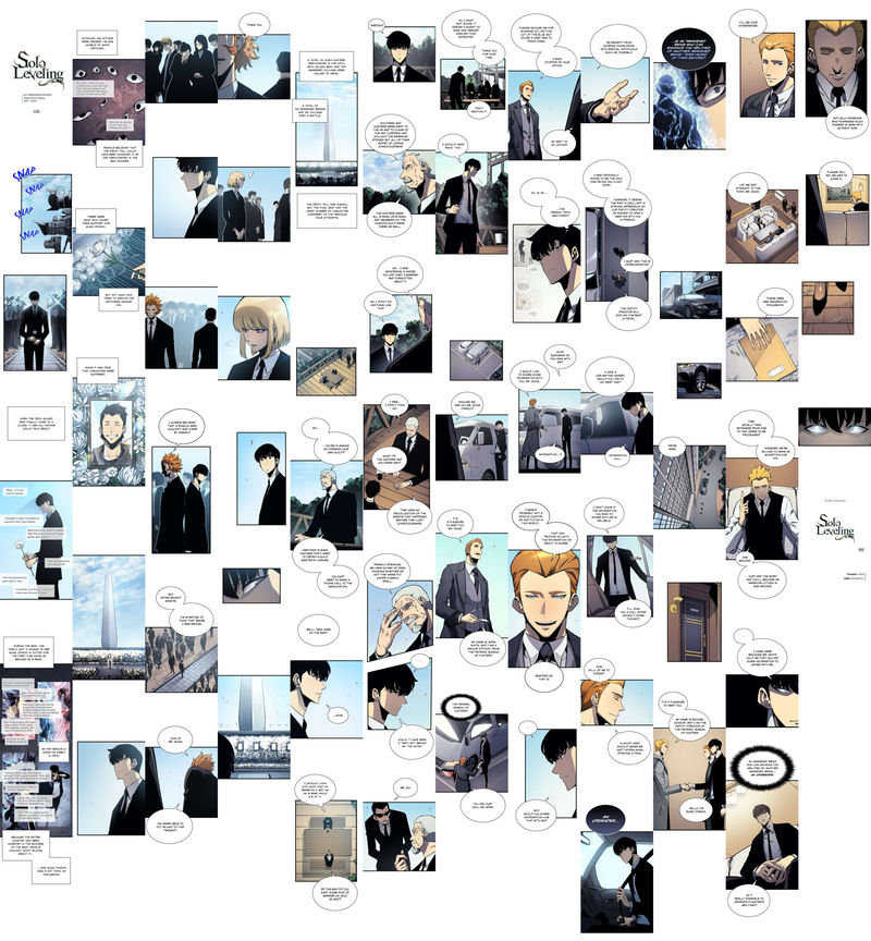
The main difference between a webtoon and a traditional comic is that webtoons present their images in one long vertical strip. (The vertical strip is sliced into subimages, since it’s hard to handle an image that’s over 100,000 pixels tall. This means you need a reader, such as Tachiyomi, that’s set up to handle webtoons correctly, lest you get a slice through the panel every 4000 pixels.)
This is a true ‘infinite canvas’ format, placing massive gutters between just about every panel, and every panel takes up the full width of the page. Dialogue balloons sometimes overlap panels but frequently float in that gutter space between. This format means you lose the dramatic effect of the page turn, or the large splash panel, but you do get the feeling of a continuous, endless flow of images, and it means you’re free to pick any aspect ratio for a panel you like without any concern of fitting around other images. There are also tricks like making a panel small so it’s overwhelmed by white space.
Above, I’ve taken chapter 108 of Solo Leveling and stitched the images together vertically and horizontally. Each of these columns was originally in the vicinity of 12000 pixels tall and 720 wide. The number of panels - 65 in the above example - is probably comparable to a standard issue of a comic. Indeed if this chapter is representative the comic as a whole probably has around 11000 panels in total.
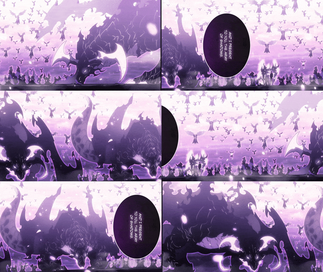
For some panels that want a wide composition, they’re actually rotated 90 degrees - easy to read on a phone since you can just flip the device 90 degrees, a little harder on desktop. These panels get very very wide, so wide that you can’t actually fit the whole panel in a 16:9 screen. Which creates the interesting effect of the image gradually being revealed as you scroll the phone, almost like the scrolling backgrounds in Belladonna of Sadness.
OK, so that’s the layout, what about the art in that layout?
If there’s one word that seems central to just about all of Solo Levelling’s art is ‘dynamic’. It’s an action comic, and to portray action, Dubu pulls out just about all the tricks: really extreme poses, lines dissolving into speed lines, debris and smoke shapes, and as the cherry on top, digital tricks like chromatic aberration and motion blur. Here’s a typical fight scene panel (sorry to have to present this so small, Tumblr’s inline image restrictions are a pain):
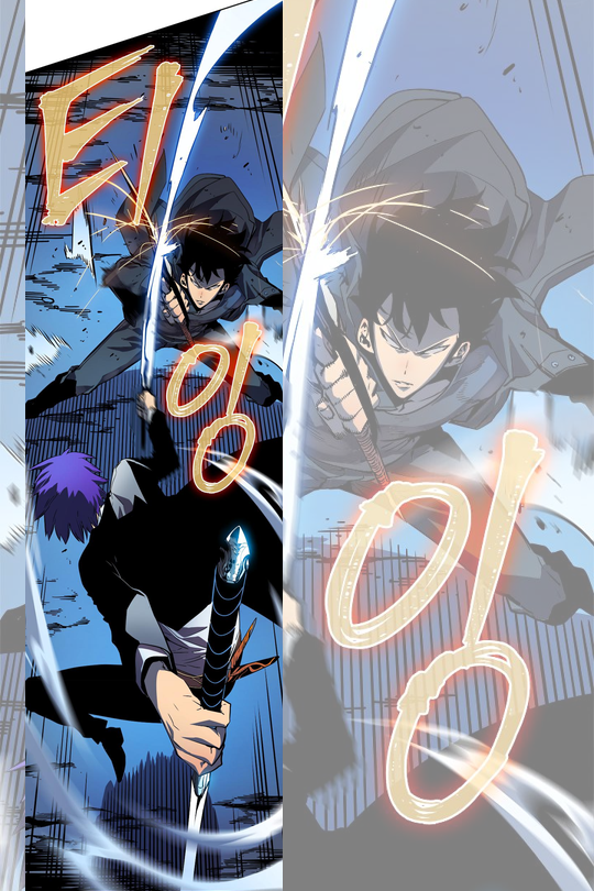
(This version has the Korean onomatopoeia, though the official translation replaces them with English).
This shows a lot of the tricks. The composition uses a combination of radiating speed lines and arcing dust elements with motion blur. (There is a small amount of digital motion blur in this panel, others use it more heavily). The camera is at a high angle, looking down, so the horizon is not visible.
The characters are drawn in an angular style, with off-balance poses and dramatic perspective distortions that make some limbs seem much larger, and a very strong grasp of overlap and foreshortening. The protagonist’s coat is flaring up behind him, again signalling that he’s moving quickly.You have the classic raised knee, with the foot tapering to a point. The figures are made of angular, organic shapes; the foreground character conveys a twisting motion while the cross-shaped pose of the protagonist halts that flow. The shadow under the foreground character is broken up by the speed lines.
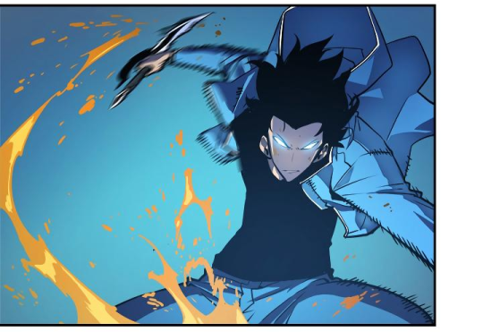
This panel shows examples of the motion blur. It’s also got a great example of splatter shapes. The protagonist’s arm’s shape is distorted by the speed he’s moving - not just by breaking up the lines into hatched speedlines, but also the shape of his hand is longer and pointier.
It reminds me a bit of the work of Mary Kim and TB Choi, or within comics, Fujimoto Tatsuki (though rarely using negative space or hyperdetailed debris in the way Tatsuki does). The effect is very impactful, but it can be so relentless that by the end it gets a bit exhausting, especially in the final battle scene.
Even outside of the fights, this dynamic sense of shape and pose is the defining feature of the comic. Characters mostly wear fairly simple, modern outfits, but they’re drawn with a lot of attention to the nuances of cloth folding. A standing pose will have a powerful sense of silhouette; characters will slouch, lean, or stand in contraposto.
There’s also a ton of love for drawing cool mens’ bodies, with a very strong sense of how muscles go together. (The girls in this story, by contrast, have very diminished roles, and need a great deal of rescuing.) There’s a very strong sense of how to make someone seem imposing.
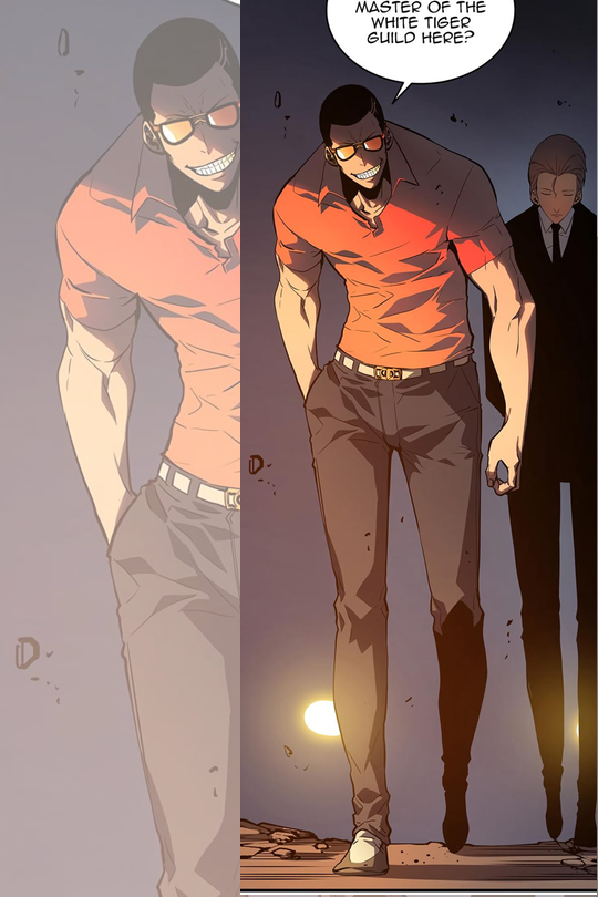
In this panel, for example, we have a pose that heavily emphasises the character’s hulking stature, especially the shoulders and arms (big-medium-small design principle). The horizon line is low indicating a camera that’s looking up, he’s leaning forwards, and his head is very small compared to the body - the character is just over seven heads here but if you corrected for the forwards lean it would probably be around eight heads. The protagonist’s own physique also gradually gets buffer over the course of the comic, although never to this extreme.
All in all, it feels incredibly ‘modern’ as a style. Even more so when you take into account the colouring, which is very overtly digital: a lot of bright, saturated colours and gradients that display well on a screen, as well as the glows, blurs and occasional chromatic aberration to signal psychic effects.
I would be curious to know more about how this style developed, what its precursors are. I know much, much less about the history of manhwa than the history of manga.
Tragically, the artist behind this comic, Dubu, died recently at age 40 of a brain hemorrhage associated with a chronic health condition, putting him alongside Kim Jung Gi and Kentaro Miura as renowned, prolific artists who died young in the last few years. It’s hard to know what to say about that. Obviously it’s impossible to know what would have happened in a universe where he hadn’t spent three years drawing a 179-issue manhwa at a very demanding level of technical polish… but it’s hard to imagine it helped, right?
The modern manhwa industry seems to be as intense and demanding as the manga industry, if not more. There’s a couple of major webtoon platforms hosting a vast body of user-created webcomics, some of which the platform selects to promote, of which only a tiny subset are actually put on the highest level and paid. In other words, to get an actual job making manhwa, you have to do a vast amount of drawing on a spec work basis and likely play the social media game well to boot. Dubu ran a studio called Redice, which specialised in creating adaptations of webnovels, so he probably had a different route into the industry - regardless, to stay on top (and Solo Leveling is apparently the most successful of all manhwa, with tens of millions of readers on official sources, and unknown amount more on scansites), you have to work superhumanly hard. As in, harder than the human body can really handle.
@lyravelocity remarked to me recently, when I was stressing about my own low output, that a lot of the great works of art we admire basically swallowed the life of their creators, cathedral-style, and we have to remember this when we try and measure ourselves against them. She’s right. (And yet…)
I don’t want to imply that like someone was standing behind Dubu’s desk cracking a whip. The mechanisms here are more subtle than that: the draw of accomplishment, standing alongside other artists, fame and recognition, etc. I’m sure he genuinely wished to put his all into Solo Leveling and make it the best possible thing it could be. I can understand that.
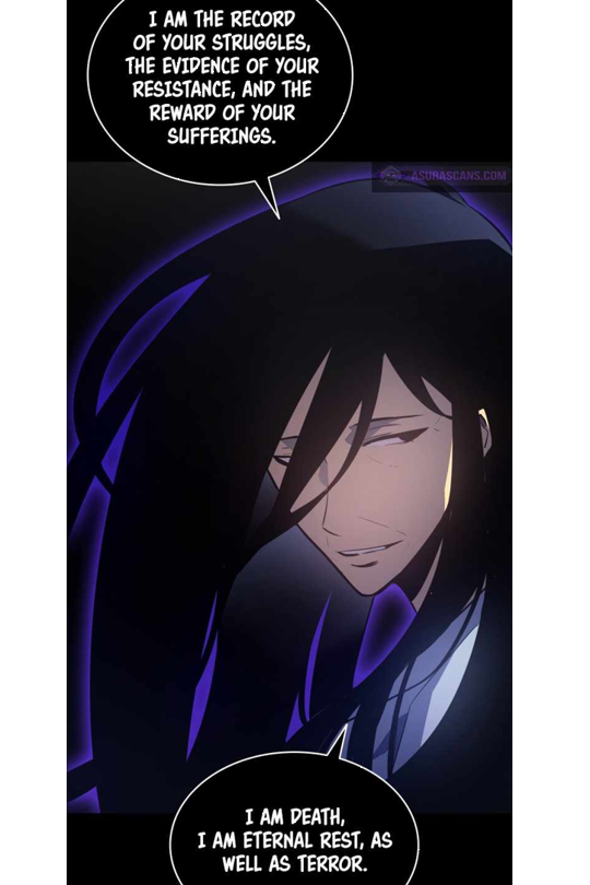
In this comic, the protagonist is selected to ascend to world renown and superpowers by his fervent desire to live, despite spending his life at death’s door. Afterwards, with his second chance, he works furiously to advance his skill (fighting) and ultimately his hard work is rewarded: he becomes the most powerful boy in the universe, saves his mother from disease, protects his sister and adopted little brother figure when they’re attacked, and ultimately gets to save everyone from the story happening in the first place.
In the real world, the result of such intense hard work might be… you die at age 40. And most people who pursue it don’t get to briefly enjoy having a world famous manhwa out of the deal either. Perhaps that’s the fantasy that the litRPG genre is selling: it’s not just the fantasy of being powerful, but of becoming powerful - hard work actually getting rewarded, like they say it should be.
Man, that’s bleak!
…next up we have Animal Man, so I won’t even have to work to turn it into an introspective metaphor for its own creation, Morrison’s way ahead of me.
Comments