originally posted at https://canmom.tumblr.com/post/686973...
So last week we investigated ways of drawing the human head in a realistic way. Armed with this knowledge, let’s see how to stylise it…
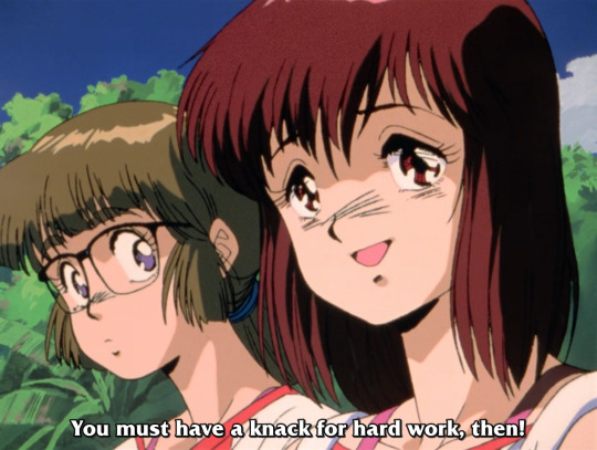
Nowadays, when people speak about ‘anime style’, or an ‘anime girl’, they probably mean a moe design like this:
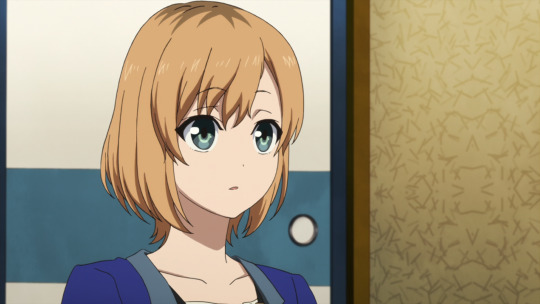
(That’s Aoi Miyamori from Shirobako, designed by Ponkan8.)
Animators learn to draw this type of design, and various standardised symbolic expressions, in books like キャラの気持ちの描き方 (How to Draw the Feelings of the Characters).
Certain features you expect to see here:
- the basic structure is resembles the Loomis head: spherical cranium, jaw coming down.
- the cheek/jaw contour is simplifed and comes to a point (or close to it), with an outwards curve along the cheek. There is no major sharp indentation around the eye socket, but there may be a gentle concave curve.
- the eyes are very large, with a lot of detail put into the shading of the pupil, specular highlights, and the shape of the eyelashes; the face is balanced around these large eyes so it doesn’t look alien.
- the nose by contrast is massively deemphasised to the point of just being a dot in many cases.
- the face has almost no structure or shading, so that it’s almost always a completely flat colour.
- the mouth is also drawn very small, with no shading or structure applied to the lips; a small shadow under the mouth might be applied.
- the neck is very narrow, and meets the head in the centre, so the cranium goes back about as far as the face goes forwards in side view.
- the hair is broken up into roughly triangular locks. (the number and position of these locks of hair is actually part of the settei and the animators are expected to keep it consistent.)
- the hair has typically three layers of shading: midtone, shadow, and specular highlight. the shape of the specular highlight is part of the design and won’t usually be changed based on lighting conditions. the skin rarely has a specular highlight. the eye could easily have four or more layers of shading.
- lines are very thin and even, and may sometimes be broken inside the form - particularly on a closed mouth. the contours of major forms are typically outlined, while shadows and highlights are usually lineless
- generally speaking, characters’ heads are much bigger than they are on real humans relative to the rest of the body.
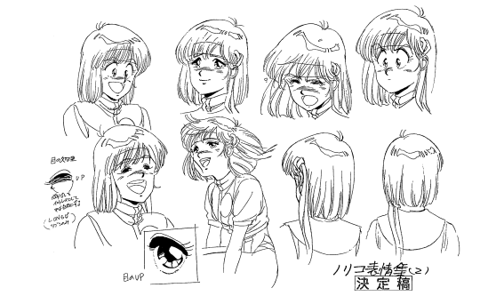
At some point I made a little turnaround based on that book of my best attempt at the time of a moe anime head. here,
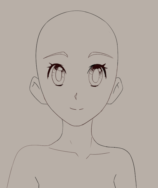
Looking back at this I can see some issues, e.g. with inbetweening the upper contour of the head, but overall this still works pretty well. Maybe soon I’ll try and do a more complex head turn with acting and like… actual hair lmao.
Anyway, this approach to stylisation could be considered something of a ‘default’ in the anime industry, but of course 1. it has evolved considerably over time, and 2. ‘anime’ encompasses a huge range of styles.
We could focus on a number of threads, but in this case, I’m going to zero in on drawings of main character girls in ¾ view - chosen because these are some of the least diverse not the most, since, male characters tend to be more varied in general, either with more ‘realistic’ proportions or more exaggerated and stylised.
Actually, to comment a little further on that. The ‘large eyes’ stylisation is typically applied to characters intended to have a certain amount of cuteness, so in addition to the familiar genus of anime girl, it is also commonly applied to young boys. We can see this in the wildly popular ufotable adaptation of Kimetsu no Yaiba (Demon Slayer), which in classic shōnen fashion has a young hot-headed boy as its protagonist:
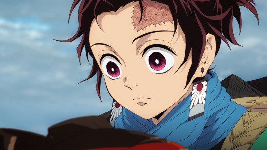
(Tanjiro, designed by Akira Matsushima)
However, as your anime boy grows up into an anime man, his eyes will tend to get smaller, closer to a real size. It’s hard to find another example in Demon Slayer (I couldn’t find anyone scanning the first few episodes) so let’s turn to another anime.
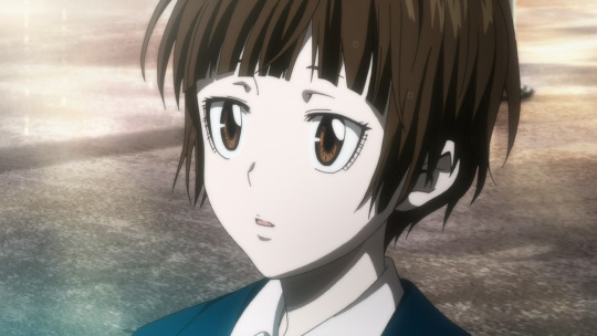
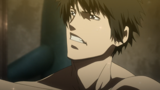
A much stronger of dimorphism example comes in Production I.G.’s anime Psycho-Pass. Here is protagonist Akane Tsunemori, designed by Akira Amano and Kyoji Asano, who has huge eyes with a distinctive shape:
Starring alongside her is Shinya Kōgami, who’s 28 years old, and has much smaller eyes:
and for even stronger contrast, the older Nobuchika Ginoza:
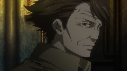
You can see therefore that as a character gets older, their design often (not always) shifts further towards realism: their eyes get smaller, and a lot more lines and wrinkles are added to the face. (The strong shadow under the cheekbone is incidentally a Production I.G. staple.)
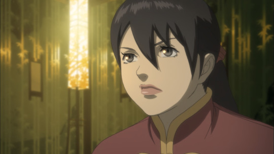
Something similar also applies to women; smaller eyes and more structure tends to indicate maturity. Let’s take a different Production I.G. work, Seirei no Moribito; here is 30-year-old Balsa designed by Gatou Asou:
and returning to Psycho-Pass, here is Jōshū Kasei, the director of the police unit, an older woman:
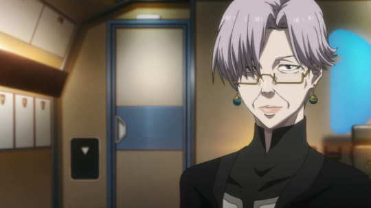
Although the amount of extra face detail isn’t quite so extreme as Ginoza above, we see the addition of lines to indicate the nasolabial fold, and more complex shading around the eye socket.
(Of course, not every anime takes this exact approach. In particular, there are ways of stylising old people which push into exaggeration; Hayao Miyazaki loves doing this.)
Now, this ‘look’ to anime has only been the standard for a couple of decades at most. The styles used in anime of the 1980s tended to look very differen, as you can see comparing Gunbuster (1988-9), with characters designed by Haruhiko Mikimoto…
to its sequel Diebuster (2004-6) a decade later, with characters designed by Yoshiyuki Sadamoto:
This particular shot animated by Ayumi Shiraishi might be a bit looser, simplifying shapes for comedic effect, but one of the differences is precisely the greater willingness to go off-model like this.
Part of the difference is surely the transition from physical, painted cels to digital colouring and compositing, but as you can see looking at the settei above, there is a real difference in feel from the 80s design to the 2000s one. This comes in places like: the shape of the chin, the use of hatching, the general feeling of the shapes (more rounded in the 80s), the bulk of the hair.
So, where did the ‘anime style’ come from? Let’s trace its evolution across the entire duration of anime, in a manner similar to Kimi Rito’s ‘expressionist’ approach in The History of Hentai Manga. Of course, it would be impossible to comment on every anime ever made, but I’d like to find representative examples of most of the major styles used in the industry in their respective eras.
The Very Dawn of Anime
Japanese animation (whether or not we yet consider it ‘anime’) is pretty much as old as animation itself, i.e., started in the beginning of the 20th century.
Famously, Osamu Tezuka got the ball rolling on TV anime with Astro Boy, but prior to him there was a reasonable amount of film animation, and prior to that, short film animation. I believe the oldest known Japanese animated film is Namakura Gatana (1917) by Jun’ichi Kōuichi, a short film about a samurai with a blunt sword, in a cutout animation style looked like this:
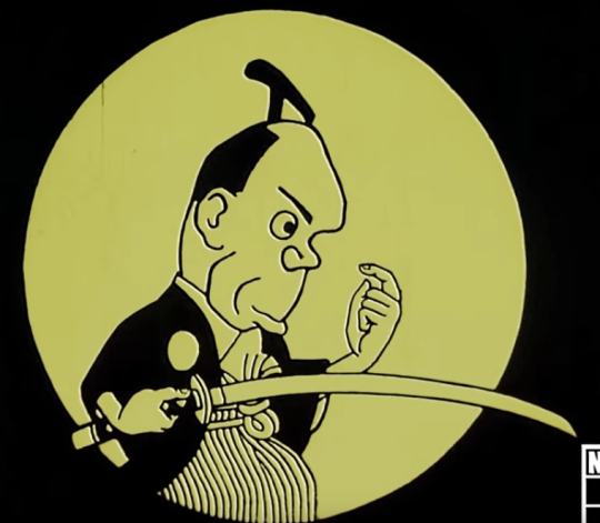
Naturally this has little resemblance to any of the future styles that became known as ‘anime style’. To me it calls to mind a little ukiyo-e artists such as Sharaku, but also presumably shows the influence of international animators like Émile Cohl. We’ll skim over those first few experiments though - please read about them here if you’re interested!
In contrast to later styles of anime we’re going to cover, here the balance of features is essentially opposite with a large jaw and mouth, reduced cranium, exaggerated forehead. I’m not going to draw a study of this one.
1930s
Unfortunately many of the films of the 1920s are lost, so it’s difficult to comment on them. So rolling the clock forward a bit, we can observe one interesting example in Benkei tai Ushiwaka (1939), a fantasy/mythological film that came in a period when animators were largely required to make propaganda films for the nationalist government.
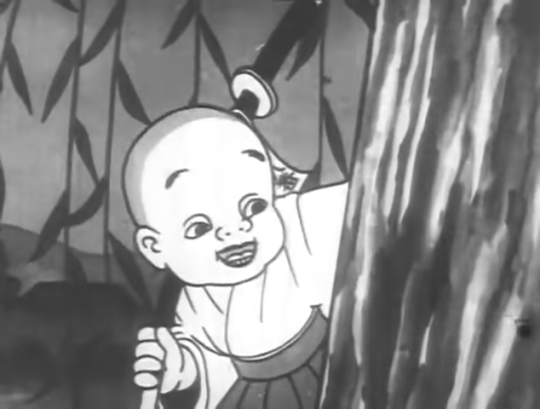
So here’s Ushiwaka (Minamoto no Yoshitsune); there’s no credited character designer but presumably the design is due to Kenzo Masaoka, the director of the four-person team. (He and his wife also did the voice acting.)
What influences this design? It’s hard to say without a much deeper familiarity with Japanese art history at the time. We might see the influence of Fleischer; at the time Japanese animators were competing with foreign productions by working cheaply (la plus change…), but American animations were widely shown, so no doubt Fleischer and their contemporaries would prove an influence - particularly in the animation itself which uses a lot of loops in the same way as Fleischer. And, indeed, in this film, Masaoka was experimenting with pre-recorded sound to follow the American method. Regardless, we’re here to study faces.
So here’s an attempt to copy Ushiwaka; no tracing, etc. I picked this character because he seems the most similar to future anime designs.
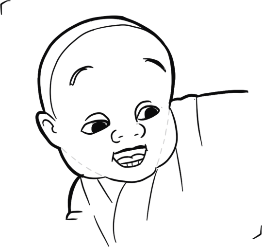
The way I broke this down is a kind of wedge shaped head (like a Loomis head), which I indicated with dashed lines, and then cheek chub added on to make a rounder head shape overall. The overall contour has a slightly thicker line weight. The forehead seems very large here, and the eyebrows faced very high, bc he’s a historical monk etc. etc. The big difference is that the eyes are simple and haven’t been drawn very big, and the way the nose is drawn.
Looking at the designs in this film, it doesn’t look exactly like any Disney/Fleischer characters, but I do think it shares a bit of a design sensibility with Disney of this era (notably Snow White).
Beyond animation, the other major cultural presence of illustration would be kamishibai paper theatre, where performers would show illustrated cards to a accompany oral storytelling. It’s a little difficult to find examples of kamishibai boards dating back to the 1930s, but here’s one I found in this article from a kamishibai called Cry of the Andes (アンデスの叫び), originally sourced from Manga Kamishibai by Eric P Nash.
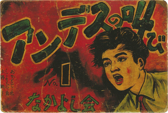
This has a painted style that resembles American commercial illustration in the same period, though notably the face is quite flat and without much shading away from the eyes, or the use of line weight under the nose.
1940s
After Snow White proved that an animated feature film was in fact possible, other countries jumped on in. So the first feature-length Japanese animated film - a propaganda film - came during the second world war.
(In fact, as an aside, Japan’s animators were beaten to the feature film punch by the Wan brothers in Shanghai who completed Princess Iron Fan under Japanese bombs! Animation Night 29 - that film may be watched here on the Internet Archive, though sadly it’s quite a rough print.)
In this period, the fascist government was exerting severe control on art, but also throwing a lot of money at those animators willing to play along and make propaganda films. That takes us to Momotaro: Sacred Sailors (1945), the sequel to the 37 minute Momotaro’s Sea Eagles (1943). It centres on the folk character Momotarō who had been increasingly appropriated as a nationalist symbol, portrayed as a soldier in the Imperial Japanese Army/Navy, since the First Sino-Japanese War.
This one uses mostly anthro animal characters, and features for its time extremely sophisticated animation of war machines, and generally a high drawing count. Shōchiku made a 4K print of it (complete with big disclaimer at the beginning) which can be viewed on Youtube here.
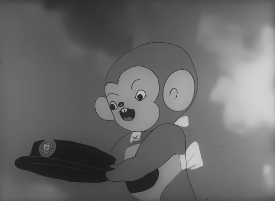
The actual character designs are very simple - perhaps even more so than Ushiwaka above. Very rounded cutesy shapes - an early instance of cuteness being used to promote imperialism and war I suppose. This character is a monkey, but we can look at them a bit like a human still. The face is very flattened: the overall head shape is two curves connected by straights. It’s kind of like a lego head.
Momotarō is mostly relevant because of the influence it had on later animation. Notably, a young Osamu Tezuka saw the film in 1945; Wikipedia writes (unsourced):
He later said that he was moved to tears by the movie’s hints of dreams and hopes, hidden under the appearance of war propaganda.
The staff on the film included Kenzo Masaoka, director of the above discussed Benkei tai Ushiwaka; most of its staff (quite a small list!) had only a limited career in subsequent anime, so it seems more that its influence is on people who saw it in the 40s.
Kamishibai also took on a militaristic tone during this period, such as Kintaro the Paratrooper seen here:
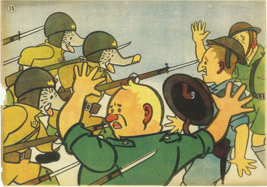
I don’t have the evidence to really document whether the difference in style from the previous example represents a general trend, but these illustrations are a lot simpler and more graphical.
In 1945 of course Japan lost the war and the country came under American occupation. US comics, films and TV flooded into Japan, and this kicked off an explosion of manga creation - indeed, the definition of manga as an art form. So this is where our history really begins.
Next time: early manga, Toei’s films, the styles of Osamu Tezuka and Go Nagai, and the first steps towards more complex designs…
Comments
princesa
very interesting read thank u!! cant wait for pt 2