originally posted at https://canmom.tumblr.com/post/686385...
Hi friends! Remember Animation Notes? Sure been a while. Well, let’s see if we can bring that fucker back, since I would like to level up my art and that means, more studies.
To begin with, I want to look into the question of drawing the human head - one of the few body parts I can be absolutely certain every single reader has! So let’s get started…
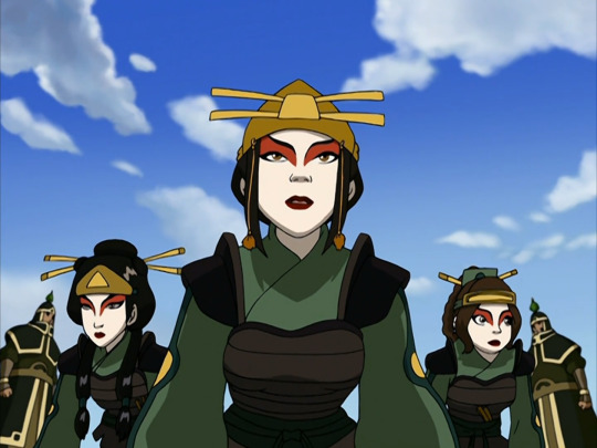
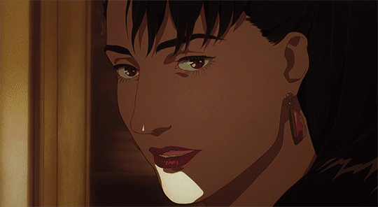
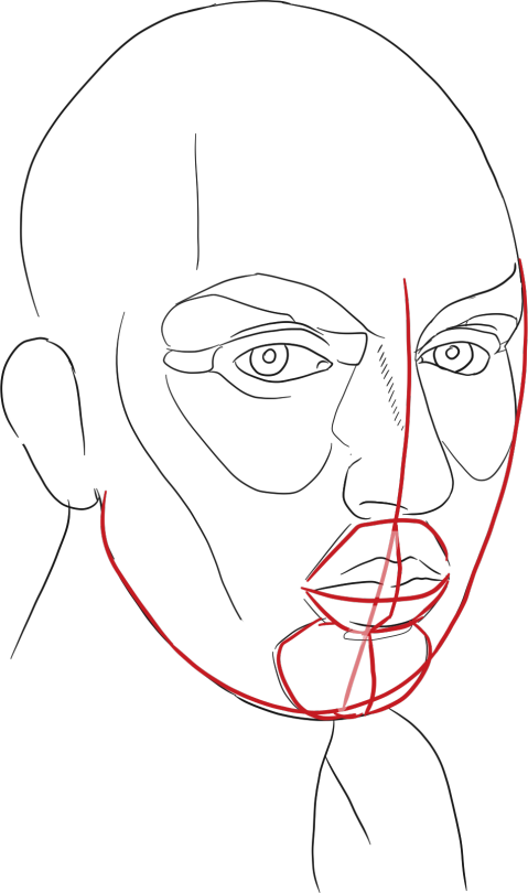
Here’s a still from Avatar: The Last Airbender, a Korean-animated show that in a sense functioned as a ‘sakuga awakening’ for me. In this shot, three villains have disguised themselves as members of a heroic faction called the Kyoshi Warriors who wear face paint and elaborate uniforms. Despite this, we can immediately tell all three characters apart from the familiar Kyoshi Warriors such as Suki, because the face models are just very subtly different.
This is the power level we need to be able to reach!
Human heads, and especially faces are really important. And as such, they’re really finicky. A minute difference in placement of a line can totally change the whole feeling of head. A particular illustrator’s way of drawing heads can act as a stylistic hallmark. For example, if I show you this picture…
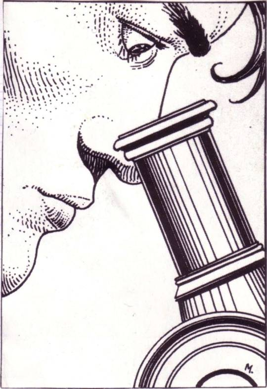
I bet you could tell me at once that it’s by Moebius. Moebius was a very versatile artist who could draw a lot of different kinds of heads, but there are certain hallmarks here - the style of hatching with lines fading into dots, the fairly rounded circular shapes, and the shadow under the cheekbone. But mind you, here’s a crop of one of Moebius’s best-known pictures of his character Starwatcher:
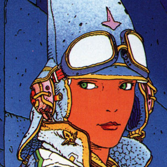
Here, he omits almost all shading on the face - just a little hatching under the chin - and avoids most lines altogether. Only the face contour and hints of line around the eyes, and the asymmetries in the eyes, lips and nose, tell you about the structure of the face. Despite this, the face feels unmistakably 3D.
At other times, particularly in his Western comics as ‘Gir’, Moebius would go for a really hyperdetailed style that’s just overloaded with hatching, as for example here on the cover of The Airtight Garage:
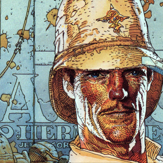
Here an enormous amount of detail in the face structure is shown: you can clearly see the major planes of the face, the wrinkles around the jaw, the shapes of the chin and nose and eyes. So you get the sense that this character is a sort of colonial masculine ideal like you might see in an old movie, a Lawrence of Arabia type of deal - an older authoritative man, who spends a lot of time outdoors. His expression feels thoughtful, perhaps a tad amused, but in a reserved way. All that from shapes and lines!
Moebius’s style might be considered a ‘realistic’ style, in that the proportions and anatomy closely correspond to what you might expect in photographic projection of a real person’s face, and he saves most of his stylisation for the rendering. (He wouldn’t always draw in this style, sometimes adopting a more schematic ligne claire style, but this is the one he’s most known for.)
In animation, it is rare to see this level of commitment to anatomical realism. But definitely not unheard of! The 90s anime ‘realist’ movement, documented in great detail by Matteo Watzky, had similar commitments. Per Watzky, a lot of the driving force behind what would become the ‘movie style’ in 90s anime, was prolific animation director Kazuchika Kise, who while working on the Patlabor films persuaded character designer Akemi Tokada to adopt a more realistic, less cute style compared to the original TV series - a perfect fit which became the standard in Oshii’s later films, particularly Ghost in the Shell.
Satoshi Kon is the other director who springs to mind on this front; I don’t have such clear info on the process for defining the look of Satoshi Kon’s films, but he was known for his meticulously detailed storyboards, and as early as Magnetic Rose you can see him working with the absolute best realist animators - notably distinct from the realism of Otomo, in terms of how subtly it handles its human characters. While Kon was not the primary character designer for all of his films - instead credits list Hisashi Eguchi (Perfect Blue), Masashi Ando (Paranoia Agent, Paprika), Kenichi Konishi (Tokyo Godfathers) - he is credited as a character designer on all of them and no doubt had a big influence on the style.
So ‘realism’ is one strand, and one of the most demanding. But this is not a post to talk about realism. If you want to learn to draw realistic heads there are many resources out there, and you’ll need to study photos as well. We’ll still talk about schemes for analysing the structure of a realistic head in a bit, since they’ll be relevant for the more abstract approaches.
But of course, the vast majority of the time, we’re actually abstracting away a lot of this anatomical precision for artistic effect. The prevailing style in American TV animation these days is to draw a head that’s basically two overlapping oval-like shapes, sort of like this:
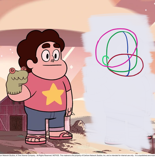
The connection to face anatomy may seem very distant at this point, and yet we certainly see this as a face, and the simplicity allows the animators to push expressions a lot more - and don’t get me wrong, drawing a simple but precise shape consistently is not a simple feat either. On the other hand, it is such an abstract 2D shape that it is rare to see such characters standing in anything other than a ¾ view long shot facing the camera, which is a limit on shot composition.
We’ll cover a lot more examples soon, but let’s first of all cover some preliminaries!
The structure of a head
To draw anything from imagination, you have to have some kind of handle to simplify it. One of the most enduring approaches for drawing human heads is the ‘Loomis head’, defined by the widely influential American illustrator Andrew Loomis who wrote a series of widely referenced books on drawing up to his death in 1959.
In his books, Loomis mentions selling commissioned portraits to families, and drawing for advertising. Back in the first half of the 20th century, colour photography did not exist, nor tools like photoshop, so adverts were almost always painted by illustrators like Loomis. I’m sure you know the type. Here’s one that Loomis painted which I got off the Internet Archive:

Loomis-sensei painted thousands of illustrations across his life, all in what can be described as a relatively ‘photorealistic’ style - although bear in mind that any ‘realist’ drawing still very much involves abstraction and simplification. Given the prevailing social forces in his time, Loomis’s illustrations almost all depict a lot of quite similar smartly dressed white people, in a variety of settings; that’s what he’ll teach you to draw. But that doesn’t mean his insights aren’t useful!
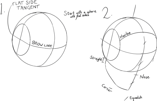
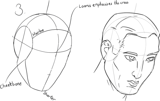
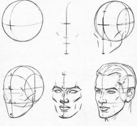
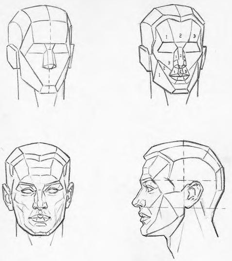
So, the ‘Loomis head’. This is a particular schematic approach to breaking down the head into a few simple 3D forms, which Loomis recommends as the starting point of any head drawing - he advises you on how you can vary the shape of the head by squashing it around, but that the relative proportions tend to be pretty similar. Here’s how he introduces it in Drawing the Head and Hands (1956):
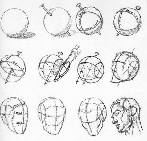
You start with a sphere with the sides cut off, and make sure to mark the centre lines and brow line; the point where they cross indicates the direction of your head in 3D space. So let’s do some studies.
Actually drawing a circle freehand is the most fiddly part lol. I noticed that in Loomis’s pictures, the flattened side almost always touches the outer contour of the sphere at a tangent. Anyway, here’s my go:
From this cross, you drop down a vertical line, about twice as far as the distance from the brow line to the forehead. The centre of this line is the bottom of the nose. To the bottom of this line, you draw a line in three sections connecting to the bottom of the flattened side of the sphere. These sections are the chin, the bottom edge of the jaw, and the vertical part of the jaw connecting to the ear.
Next, you draw the cheek contour, which is a boundary between two planes. This connects to the brow line, but notably there’s a bit of a kink in it, which I believe indicates the cheekbone:
You can then place your features to get your classic 50s advert guy. Though I drew it pretty rough, I tried to follow Loomis’s choices of what lines to draw and how to stylise, with this ref in particular:
…though in my version the downwards tilt to the head and the slightly pouty lips make him feel like more like some kind of yaoi boy lol.
The cheek contour - more on that shortly - is made quite hollow, the more to emphasise the cheekbone itself. Inside the form of the face, Loomis seems to usually place a line indicating the transition from the front plane to the side plane of the head, again indicating the cheekbone.
The great advantage of this method is that by breaking down the head into simple 3D forms, you can easily place it at any angle (modulo your skill at perspective drawing!) within the picture. The features that Loomis emphasises are mostly, he writes, features of the skull; he offers a method for drawing skulls as well:
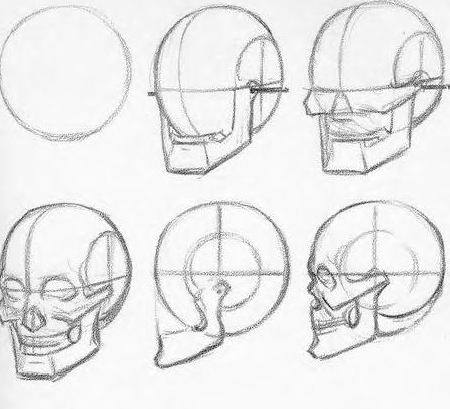
I tried to follow it with somewhat less aesthetic results:
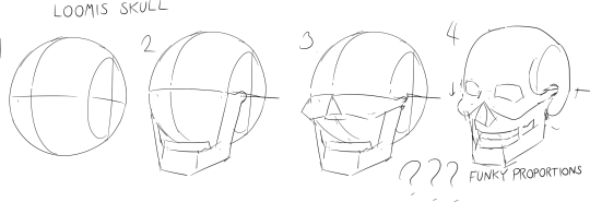
no doubt with practice i’d more reliably get the proportions right, but that would get us sidetracked.
From this basic construction, Loomis elaborates considerably, asking us to look at the planes of the face with increasing detail, resembling the Asaro head:
and offering advice on how faces might be varied from the basic template, on applying perspective etc. I will definitely come back and do more Loomis studies down the line, but we’ll leave it at that for now.
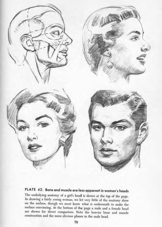
One other thing of note: after introducing men’s heads as the default, Loomis gives sections on womens’ and childrens’ heads. Gender divides are definitely emphasised in his work. In contrast to his male heads, Loomis advises you to eschew some of the planar structure he described before:
Nowadays the main reason to look at the Loomis head is not because you want to make a 1950s-style commercial illustration. Certainly, it’s useful for ‘realism’. But for our purposes, it’s also because a variant of this construction has ended up as the basis for a lot of standard designs used in anime.
For a more modern treatment of the Loomis technique, see Proko’s video:
In contrast to Loomis’s original method, Proko doesn’t have that small cheekbone kink in the line representing the plane change from the front to side plane of the face, nor the emphasis on the cross at the centre of the head as the starting point of the drawing. So don’t assume when someone says a ‘Loomis head’ they’re exactly going to use the method outlined above.
Other ways of breaking down the head
Loomis may have one of the simplest and most straightforward methods, but I would be remiss not to mention other important breakdowns.
The ‘Asaro head’ is a small plastic statue made in the 70s by John Asaro, widely used by painters as a way to break down the planes of the head for light and shadow. Here’s a render of a 3D scan of it:
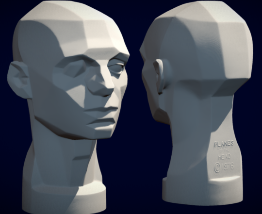
With the Asaro head, we can really clearly see how the front planes of the face form a kind of inverted triangle, narrowing towards the chin, while the back of the jaw is of course much wider. While it’s useful to be aware of these plane changes, they’re mostly relevant at a later stage of the drawing, when we’re dealing with value - although we may choose to mark the plane changes with a line.
Then there’s the Reilly method, which is broadly less popular than the Loomis method, breaking down the head not into blocky 3D forms but a series of arcs and proportional measurements designed to find relationships between features of the face. This is named for another early-20th-century American illustrator and art teacher, Frank J. Reilly, who lived from 1906 to 1967. Here’s a video that breaks it down step by step:
Honestly, I’ve never tried using this method, it looks too cumbersome to be very useful most of the time. But I do feel like it might be useful to apply it at least a few times, to try to get an intuition for the information it gives about planes and structures.
The jaw/cheek contour
All well and good for painters, but let’s assume you are in a flat- [kagenashi] or cel-shaded style; then what does give your drawing structure?
I’ve increasingly been inclined to see the contour of the face as being one of the most important parts of the drawing: the lumps and bumps there carry a lot of information. And this is also the path we’ll be taking towards more stylised heads.
Let’s start with realism, though. I took a photo of myself at a ¾ view and traced the major plane changes and structures:
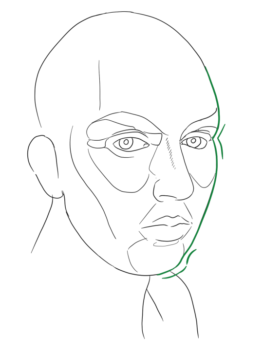
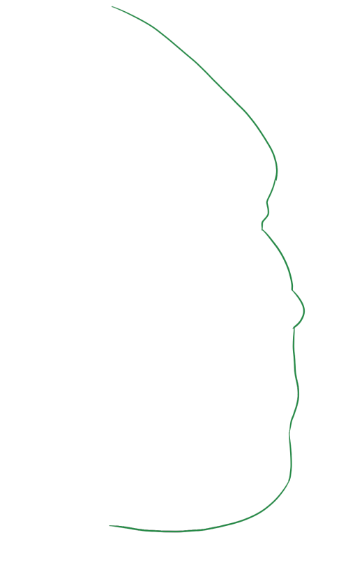
That’s one uncanny looking picture, but let’s now take a look at the green line on its own:
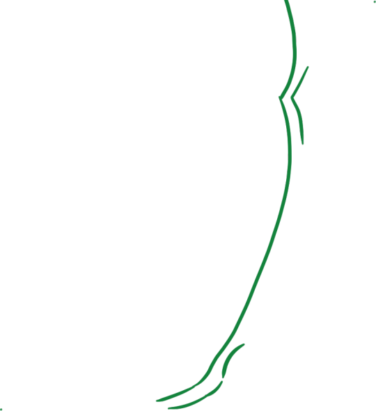
I marked two important points. The first one is the indentation of the eye socket. Depending on angle and size of the eye, this may be less sharp.
The second is the chin bump. We can think of the chin and ‘muzzle’ of the mouth are smaller forms which poke out of the overall simple ‘Loomis head’ wedge shaped structure.
In the case of plumper cheeks, we can imagine a kind of ‘cheek bump’ as well, which has the effect of making a character look younger.
If we view the head at a more oblique angle, closer to a profile view, the bumps become more pronounced: the lips start to cross that contour line and the cheekbone becomes more evident. This time I’ve tried to indicate major plane changes with cross-contour hatching rather than lines, imitating Moebius a little.
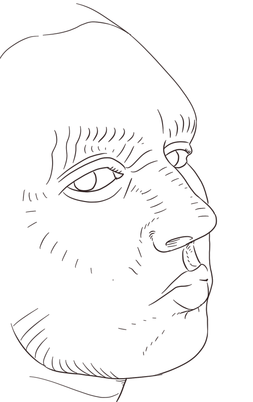
Note that even though the lips don’t outright cross the contour line, the ‘muzzle’ does create a break in that contour line there.
Of course, there’s a lot more to it than that. The size and shape of the main features are also incredibly important, as is the approach taken to light and shadow. But when we start breaking down particular artists, particularly in anime, this concept of a contour line will be valuable I think - I certainly think about it a lot when drawing.
Next time: A survey of the diversity that exists within ‘anime style’, and an account of its stylistic evolution!
Comments