originally posted at https://canmom.tumblr.com/post/712492...
When did robots and cyborgs go from rigid metal to flexible mechanical muscles?
You can blame @centrally-unplanned for this post. He wrote…
The ‘chrome’ designs pioneered by illustrators like Hajime Sorayama (Sexy Robot from 1984, for example) tended to be more in vogue at this time (or just…a hot girl, who is apparently a robot, trust me bro), you don’t see designs like this too commonly until later (ask resident robo-fetishist/animator expert @canmom for details on that timeline).
After a challenge like that how can I refuse? Although the question is ‘when did robots get muscles’, this turned into something of a historical survey of robot designs from the 80s on with a throughline of biomimesis.
(Originally this was just going to be an excuse to talk about Ghost in the Shell… but I gotta be thorough.)
- BIOMIMESIS
- DAWN OF MECHABARE: the nineteen-eighties
- PERFECTION OF THE CYBORG: the nineteen nineties
- A NEW CYBORG MILLENIUM: the two thousands
- I NEVER ASKED FOR THIS: the twenty-tens
This was all brought on from this picture from a 1989 fanart magazine…
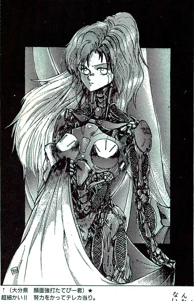
by an artist going by ‘Facepunch Tatebi-kun’ (顔面強打たてびー君). I remarked that it was interesting to see these kinds of ‘robot muscles’ in a picture from 1989, since I thought that kind of design became popular in the 2000s.
On some reflection, I think I gotta revise that opinion! I think ‘robot muscles’ became a thing around the mid 90s in anime; in the West I think it took a bit longer. But you can also see precursors already before that.
BIOMIMESIS
So. One thing artists are super into is biomimetic robots. That is, robots whose form (and perhaps function) is similar to animals, especially humans. The word ‘android’ referring to a human-like automaton dates all the way back to the late 19th century, but the modern ‘android, robot, cyborg’ taxonomy apparently became established around the 40s.
There’s two types of humanoid robot that get a lot of play, especially in anime. One is the convincingly humanlike cyborg, which is the same size and shape as a normal human; the other is a what we call in English a ‘mech’, i.e. a big robot you can sit inside.
Of course, if your androids just act like humans all the time, then there’s not much point having them be robots. To really create the frisson of contrast between human and mechanical forms you have to show the mechanism somehow. This could be because the machine isn’t perfectly human-like, and has visibly mechanical joints - take a look at the works of @sukabu89 for very inventive depiction of this theme - or, the android could be damaged or undergo maintenance.
When you attempt to translate biological forms into a more mechanical design language, the traditional way has been to use hard, rigid shapes, since these make the contrast especially clear. In more recent designs, particularly as we started to see real robots with ‘artificial muscles’ such as the ones created by Boston Dynamics, we get another sort of design language to express ‘mechanical parts’, and robots start having more biological forms with exposed plasticy muscles.
So let’s tell the story. We begin at the end of the 70s.
DAWN OF MECHABARE: the nineteen-eighties
For an early example of ‘mechabare’ (a term I’m applying very anachronistically!), when a robot gets smashed up, we have Alien (1979). This film did a ridiculous amount to define sci-fi design language, and of course the alien itself blends mechanical and biological forms after the designs of H.R. Giger, with its glossy black surface allowing it to seem to melt into the exposed pipes of the spaceship. But let’s focus on the character Ash, a secret android who is broken apart in the second half of the film.

When Ash attacks the human crew and is smashed apart, his insides consist of weird white plastic beads and a milky fluid that seems analogous to blood. It’s not clear what the function of any of this tech is - it’s intended to be vague and mysterious. The outside is biomimetic but the inside is anything but. He has a kind of artificial skin which resembles a latex mask.
The Terminator films are another major touchpoint for 80s science fiction. Late in the film, Arnie starts taking damage which reveals the Terminator skeleton underneath his fake skin.
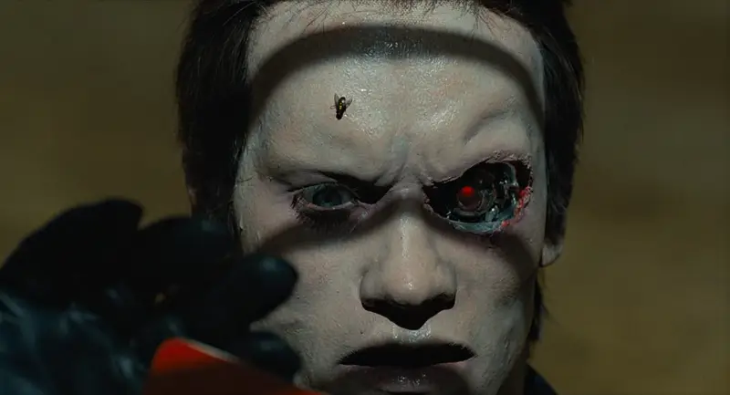
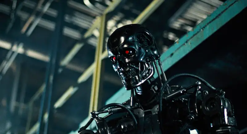
The stop-motion Terminator model is basically designed according to the principle of ‘replace human bones and muscles with hard metal bits’. So you have a metal skull, metal clavicles (which are hydraulic cylinders for some reason, suggesting they can grow longer or shorter, a mode of articulation not available to a human), metal shoulder blades, hydraulic cylinders generally in the places where muscles are. e.g. in the above picture you can see pistons that stand in place of the sternocleidomastoid muscle, and in this picture…
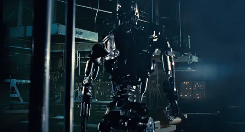
…you can see metal scapulae and hydraulic cylinder biceps and triceps. The vertical hydraulic cylinders along the sides of the body connecting the hips to the ribcage don’t exactly correspond to a muscle, but the closest ones are external oblique muscles. The shoulder joint, by contrast, is built in a very non-human-like way. Also there’s random tubes everywhere lol.
That’s generally how androids are portrayed in the 80s. The ‘droids’ in Star Wars are similar; C-3PO is an arrangement of metal plates with gaps suggestive of underlying mechanical details and rudimentary joints and pistons.
In Blade Runner, we have the Replicants, humanoid robots - but by the premise of the film, they are essentially indistinguishable from humans. So when the Replicants die, we never really get to see their robo-innards.
I HAVE A SPECIAL INTEREST: and now, anime
OK, that’s the big four Western 80s sci-fi movie series; what of anime? Of course, androids in anime go all the way back to Astro Boy. But most of these early designs don’t really focus on mechanical details all that much. Super robot designs are more like tokusatsu suits than anything. There were certainly instances of impressive mechanical animation in the 70s, with early experts including Kazuhide Tomonaga on Space Battleship Yamato. Then there’s Hayao Miyazaki’s episodes of Lupin III Part 2 which featured proto-Nausicaa flying a robot that would later appear in Castle in the Sky. It would be some years before anyone could come close to matching these!
The original Mobile Suit Gundam in ‘79 famously started the ‘real robot’ movement, so let’s take a brief look at how a Gundam fits together.
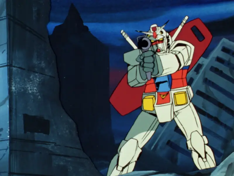
Generally speaking, the way Gundams are drawn in Gundam ‘79 is kind of rough. The methods to animate these rigid mechanical systems in super accurate perspective were just not yet established at the end of the 70s, certainly not on a TV budget and schedule. The actual joints on the Gundam are left very vague, but it broadly speaking seems to move like a human in armour.
But the OVA boom was about to begin, and while it would be a while before we saw the heights of Headgear/Production I.G./Gainax, things were going to change a lot. Mechanical design and animation was about to get much more sophisticated very very quickly.
In 1982, we have Super Dimension Fortress Macross, with robots that transformed into fighter jets. Its robots are designed by Kazutaka Miyatake, who cut his teeth doing mechanical design for Space Battleship Yamato and the Daicon animations. The Macross TV series introduced the world to the animation of Ichirō ‘Missile Circus’ Itano. [AN64] A plane with legs… honestly looks kind of goofy, but Itano’s ambition to have a highly mobile 3D camera that could move in ways that would simply be impossible in live action marked a huge step up in how robots are animated. And this would get refined even further in the film Do You Remember Love.
In terms of design, we’re really moving our inspiration from ‘tokusatsu suit’ to ‘military hardware’ here. A Macross suit has to look like something that could transform into a plane, so its silly little arms and legs have to look kind of plane-like. In any case, we are definitely still in a world of hard and rigid robotics.
Dallos (1983-4) dir. Mamoru Oshii is known as the first OVA, if not the first successful OVA [AN115]. It features a variety of mining robots on the surface of the Moon, which are generally less humanoid, taking their design cues from JCBs…
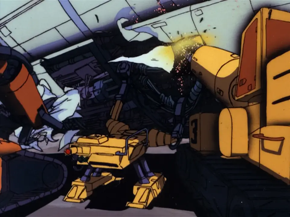
…as well as humanoid robots with fairly clear joint patterns…

…and more humanoid robots too.
The eponymous Dallos, however, is a huge humanoid robot that looks like this…
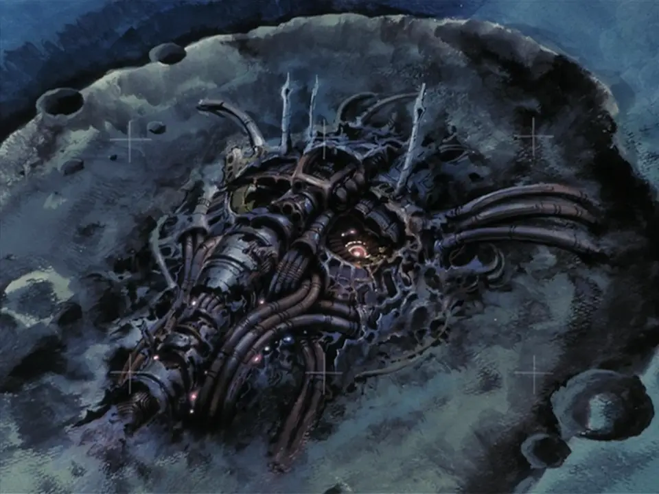
Here we have a pile of mechanical shapes that vaguely calls to mind a human face. It’s suggestive of motifs we’d see later in works like Akira.
A year later in 1985, Megazone 23 really kicks off the OVA boom in earnest [AN 103]. It also has a robot, in the form of a transforming bike that can become a humanoid piloted mech…

You can see mechanical designs and shading have become considerably more detailed; its motion is a lot more complex as well with a ton of indulgent background animation shots. The actual details of the bike -> robot transformation are rather brushed over. But to sort of sum up the design language: we have organic but hard-edged shapes contrasted by inorganic but round shapes. (These terms ‘organic’ and ‘inorganic’ refer mostly to symmetry and a sense of ‘flow’ in the shape.) There are few right angles as such, but a lot of broadly boxy topology. The shapes are broken up by elaborate specular highlights in complex shapes, a motif of the later Kanada school.
OK, but that’s all variants on ‘rigid robot’ so far - what about the androids? What about the more directly biological designs?
In 1984 we have a very important film (for this narrative, and in general), Nausicaa of the Valley of the Wind, the film that created Studio Ghibli. Here we have the ‘God Warriors’, giant humanoid weapons with the ability to shoot a massive laser out of their mouth. Rather than robots, these are very much biological in nature, having to be grown in a kind of cocoon. In the film version of Nausicaa, an incomplete God Warrior is released, leading to an iconic scene animated by Hideaki Anno in which the God Warrior attempts to blow up the oncoming wave of Ohmu.

The God Warrior’s melting flesh is gorgeously animated, bubbling and sloughing off in great big lumps as the skeleton pokes out from underneath. Throughout, Nausicaa is full of beautiful and impressive animation of both machines (mainly planes) and biological (the giant insects), but the God Warriors, as human-made lifeforms, bring the two together.
Miyazaki would continue the Nausicaa manga for many years. The God Warrior depicted in the manga, who becomes known as Arbiter, is more complete, although still decaying—and highly radioactive. Near the end of the manga, Nausicaa ends up entering a vast constructed space with the ability to regrow itself like a biological life, anticipating the ideas of Tsutomu Nihei.
A year later, following the enormous success of Megazone 23 Part I, Toshiki Hirano got the chance to adapt his favourite lesbian cosmic horror hentai manga Fight! Iczer One into a rather more tame OVA which released from 1985-87. In terms of mechanical design, this starts to do some interesting moves towards blending biological and mechanical forms…

Of course it has a robot in addition to the requisite bishōjo and lightsabers. In contrast to the boxy shapes we’ve seen so far, the robots in Iczer-One have a much more curvy organic sort of design language. Still, there is not a lot of emphasis on the precise details of mechanical articulation outside of select shots. (It is however notable for the first ever Obari punch!)
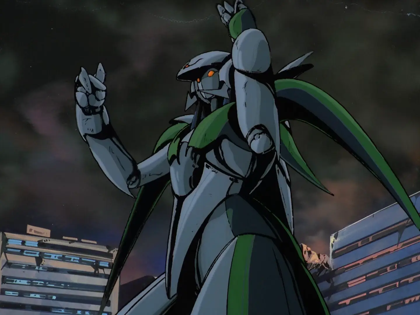
Despite the change in shape language, these are still very clearly animated as metal plates and not yet muscles.
Right, but what about Bubblebum Crisis (1987-91)? That is, after all, the iconic 80s robot girl OVA. It’s inspired heavily by Western robot-related films like Terminator and Blade Runner; here we have ‘Boomers’ (never stops being funny) as androids that can appear convincingly human. Like the Terminator, the underlying metal parts can burst out. Here we have a metal frame designed to resemble muscles, and also metal tentacles.
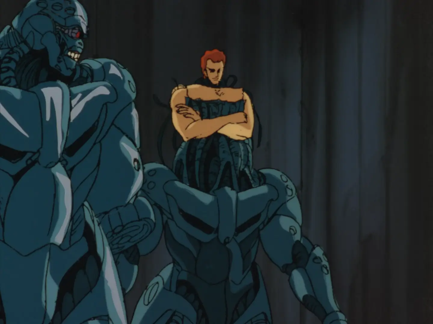

The shapes of these robots are a lot more organic. The robot neck has tubes that sort of resemble the neck muscles, metal plates that resemble pectorals and abs and deltoids and biceps and so on. You’ve even got a direct riff on the Terminator ‘fleshy face falling away to reveal metal skull with glowing red eye’! Under the plates there are clusters of tubes which also heavily resemble muscles. Also you’ve got the classic ‘three small circles’ motif there.
Contrasted against them are the Knight Sabers, who aren’t cyborgs as such but fight in powered exoskeletons which fit the design motifs of robot girls.

These suits are quite form-fitting, with a rubber under-layer and metal shells on top. There is definitely some attention paid to how they’ll articulate around the joints. One very recognisable 80s motif is the sort of extending spike thingies you can see on her hat there; there’s also the jets that extend out behind the suit. And, you have that multi-layer shiny highlighting of course!
Still, the way the characters move in Bubblegum Crisis is still very squarely Kanada School poses; big movements, lots of held poses accentuated by flashing and line boil, not a lot of concern for conservation of momentum or anything like that.
For a contrasting strand we can look at the rise of the ‘Otomo school’ (if you will) of realism. Around the end of the 80s, a pool of talented animators were gathering around Katsuhiro Otomo. Their most famous work is Akira, but I’m actually going to begin with Robot Carnival (1987), a wonderful anthology of short films from 1987. This features a huge variety of interpretations of the concept of robots.
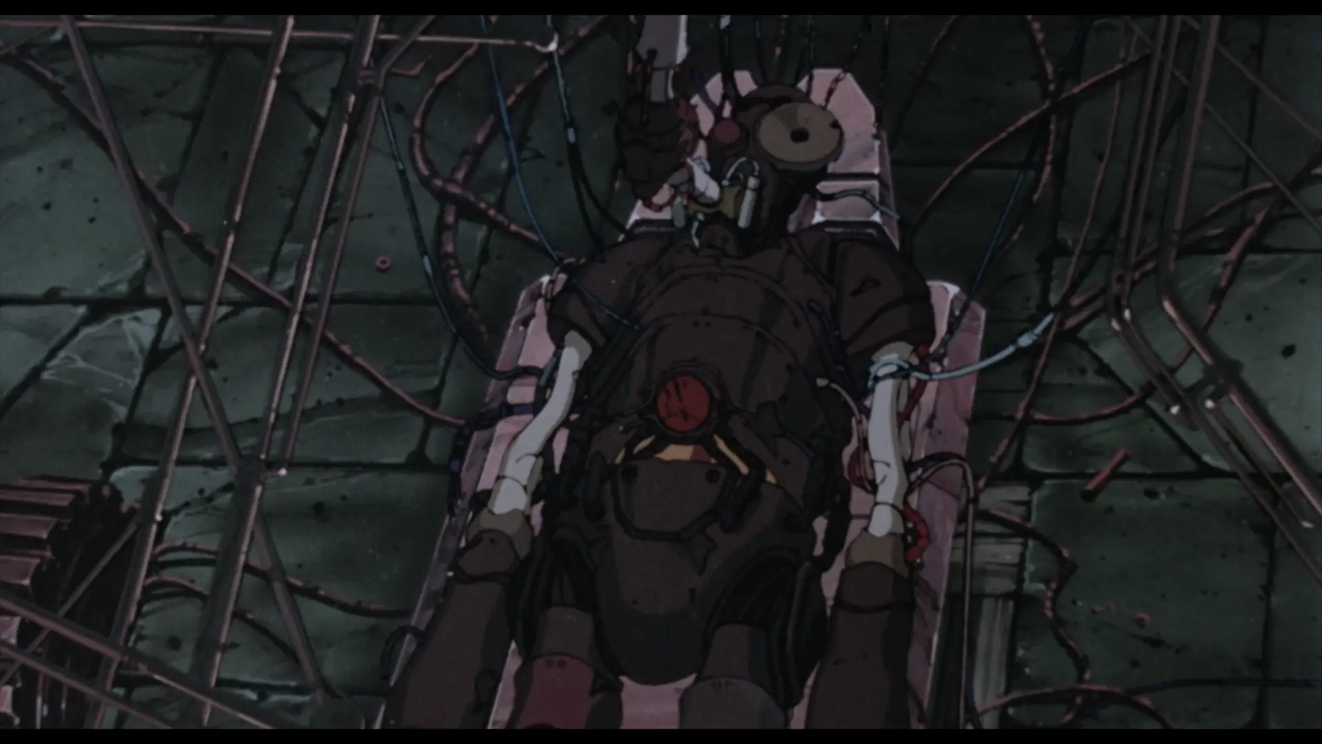
For example, for Kōji Morimoto, later co-founder of Studio 4°C, the robot is a kind of cobbled-together steampunk Frankenstein’s monster. It’s a very cool design with all sorts of asymmetries and exposed parts suggesting its cobbled-together nature. And although all the robot does in this short is stand up and then fall over, a great deal of attention is paid to the little details of its articulation and its movement through space.

Presence, directed by Yasuomi Umetsu, is notable for its steps in the direction of realism - Umetsu’s characters are hyperdetailed and in some ways over-drawn. The opening shots establish this is a world where lifelike androids are common, when an android gets his head kicked off and stolen by children. Here the robot-as-doll metaphor comes in, something that will be increasingly central in the next decade. The robot girl is essentially a human-sized doll in a room full of other toys. Her creator smashes her to pieces with a wrench; later her ghost visits him as an old man. We see the girl attached to a bunch of wires, but she bleeds like a human.

Cloud by Manabu Ōhashi features another humanoid robot, an Astro Boy-like child recognisable as a robot based on his segmented torso and legs and robotic ear… cones. Here the robot is a standin for human emotions, the boy’s struggles projected onto the constantly changing sky as he walks against the wind.
Strange Tales of Meiji Machine Culture: Westerner’s Invasion by Hiroyuki Kitakubo (later to direct Golden Boy, Roujin Z and Blood: The Last Vampire) is a sendup of mecha shows in which two very goofy looking steampunk robots operated respectively by Japanese and Western crews duke it out, laying waste to the city around them. The Japanese robot is basically a big wooden samurai…
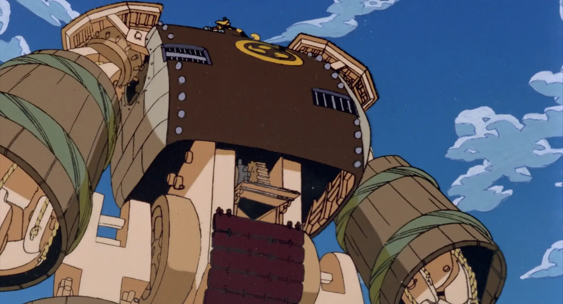
The arms are lashed together planks like a barrel, while its torso is wooden panels in a brick-like pattern covered with a sheet of riveted metal. It has sode (rectangular shoulder pads) and a yellow mon (emblem) consisting of three tomoe (apostrophe-like symbols). The lower half consists of wooden gears.
and the Western (more specifically American) robot is, uh
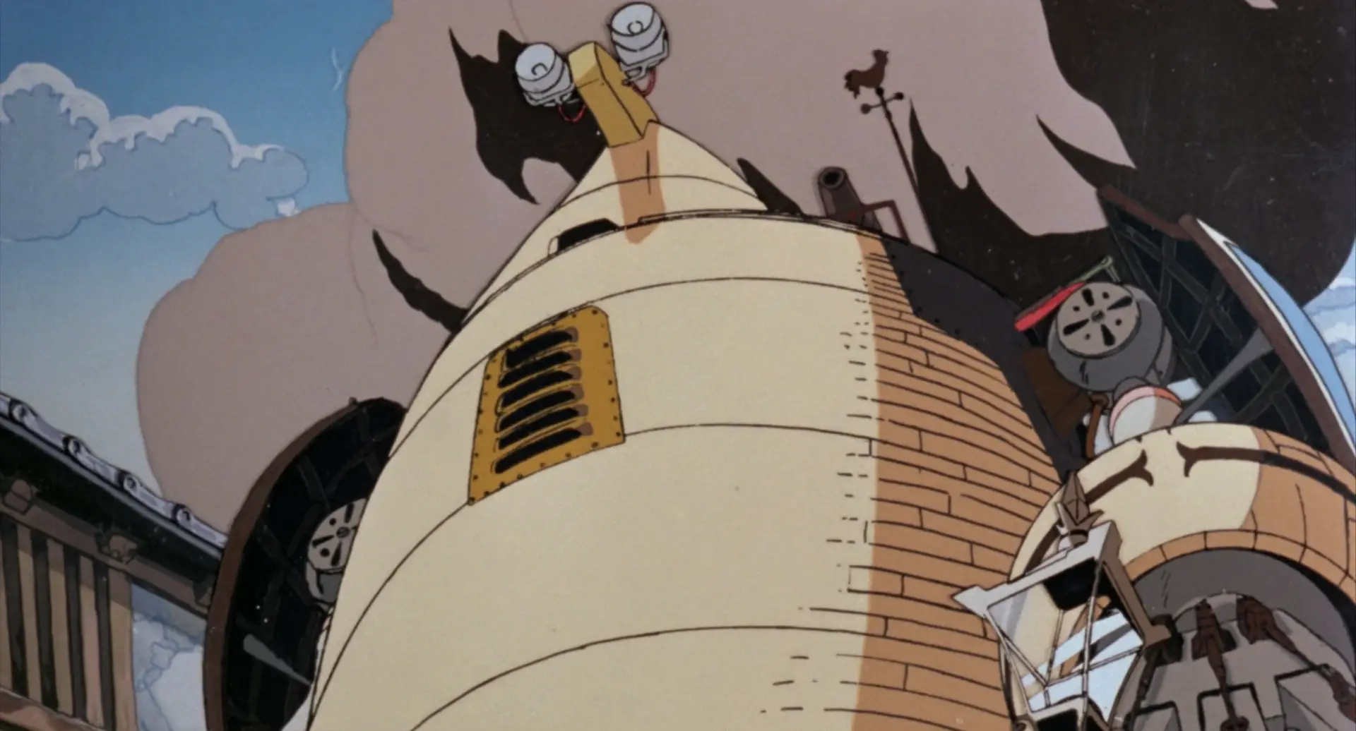
The Western robot has a curved shape, like a kiln, and appears to be made of bricks. A head piece with two lamps gives the whole thing a chicken-like appearance. On the shoulder is a weather vane and a cannon. Its shoulders are protected by knights’ shields (hard to see in this still).
sorta big barrel with little eyes on top? I’m not entirely sure what the deal is with this design!
That’s really not relevant to our story tbh I just think it’s a neat short.
Chicken Man and Red Neck, by Takashi Nakamura, features especially distinctive robot designs. The film is kind of a dream sequence in which a terrified drunk man witnesses the revels of the machines of Tokyo, transformed into robots; the robots are extremely shaped, moving through a world that is pretty much just pistons…
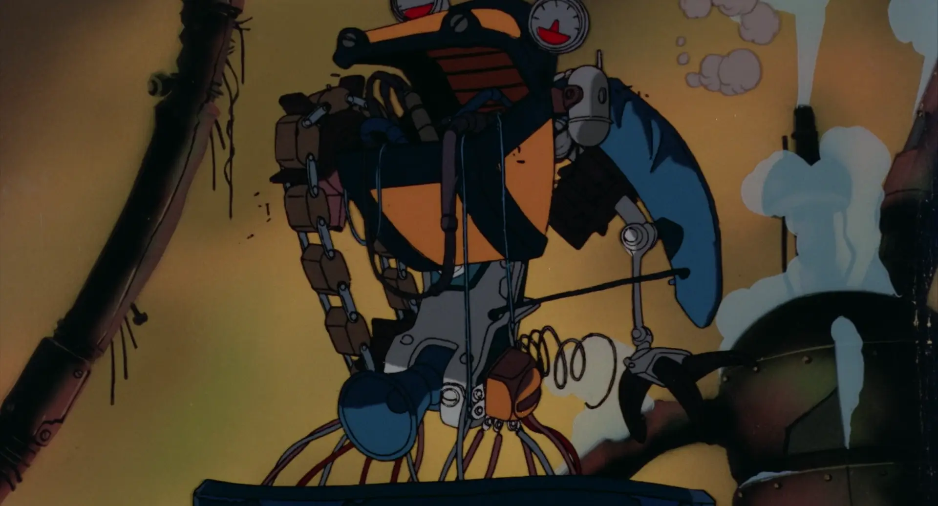
These robots call to mind the dancing demons in Fantasia’s Night On Bald Mountain sequence, or even Bosch.
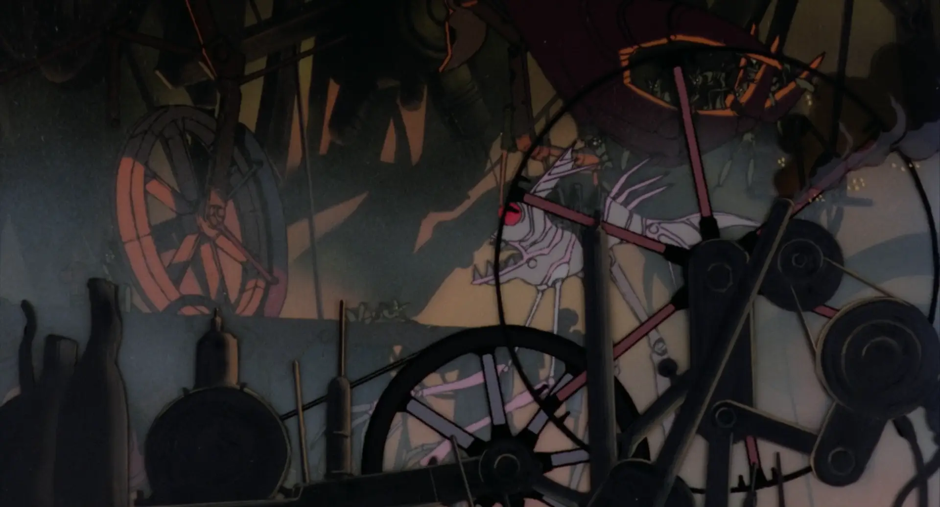
Otomo’s own segments feature the Robot Carnival itself, a vast mechanical structure built as… well some kind of entertaining spectacle, but which now drives around the post-apocalyptic wasteland dropping robots which explode as bombs. It’s cute.
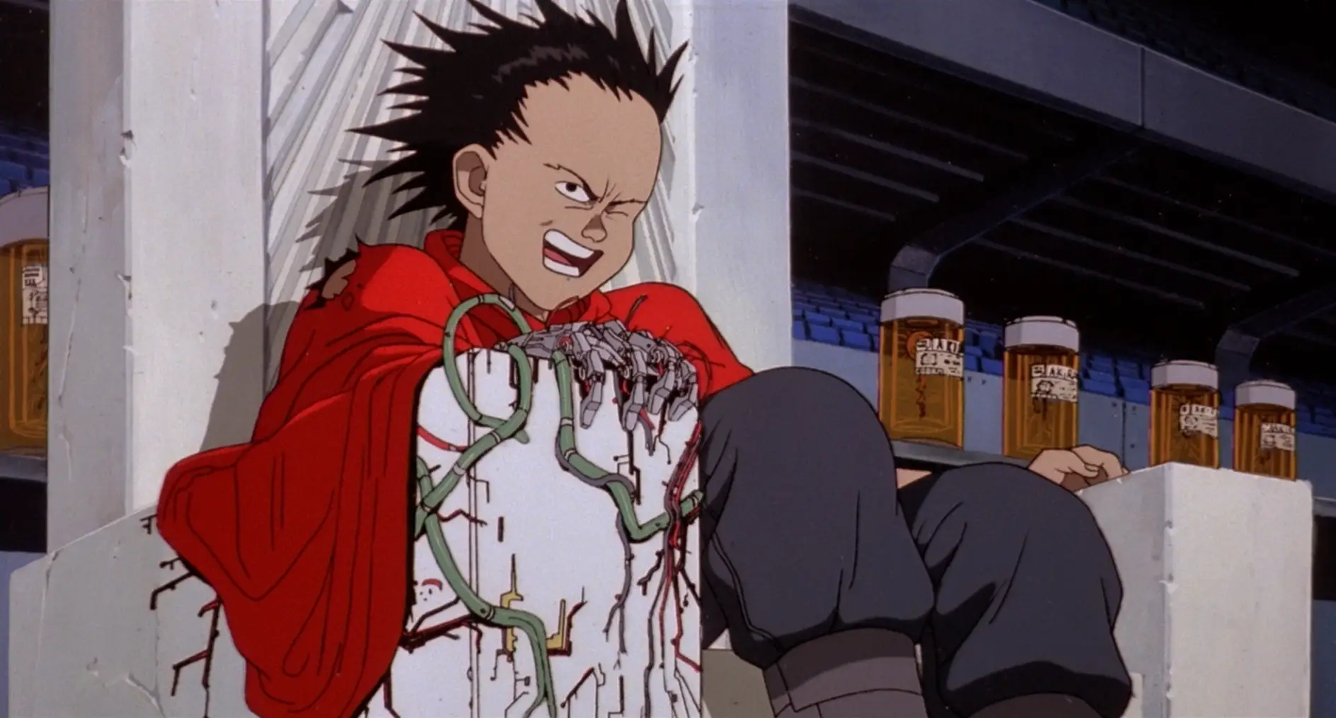
OK, to wrap up the 80s, we gotta cover Akira (1988) [AN34]! Akira has plenty of impressive mechanical animation of helicopters, hovercraft thingies, satellite lasers and of course the famous bike, but it doesn’t really feature robots as such - but what it does have is a blending of mechanical and biological forms in its climactic sequence where Tetsuo’s psychic powers go out of control. First, wires start to spread like the roots of a plant from his robot arm - less an actual machine and more something he assembled with his psychic powers…
He takes a bullet, and the mechanical wires and muscles start to blend together and spread out like a slime mold…
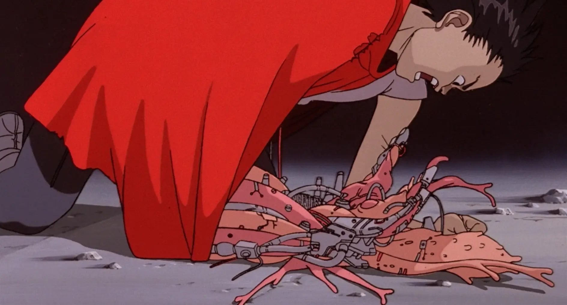
…which he can extend as essentially a giant tentacle.
When his powers fully go off the rails, he bulges out into big blobs of flesh which have both veins and wires running over them. These burst out of the metallic parts as well.
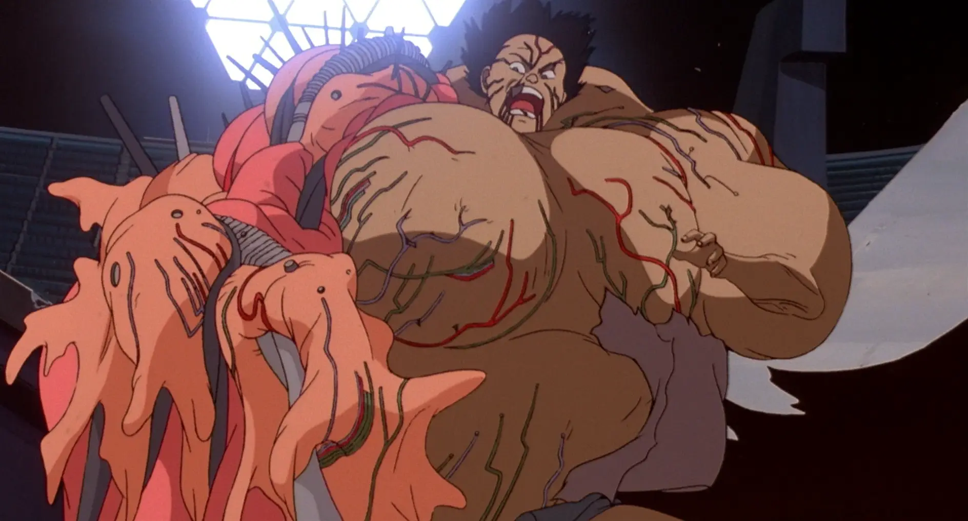
He turns into essentially a giant biomechanical baby.
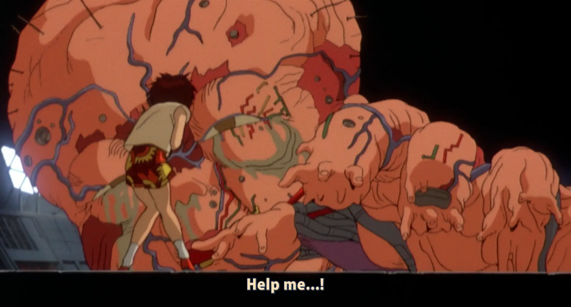
Did Akira invent these images of blending biology and machinery? No, but what can at least be said is that Otomo’s absurdly meticulous style could really sell it. Otomo was truly a god of perspective and detail; Akira the film was an enormous, prestigious production that threw ludicrous effort and resources towards realising his vision (which doesn’t mean it paid its inbetweeners much more…). A lot of the animators who worked on Akira would go on to be prominent in…
PERFECTION OF THE CYBORG: the nineteen nineties
So, the 1990s. If the 80s was dominated by the later Kanada School, the new movement of the 90s, at least as far as film animation goes, was ‘realism’.
But before we get onto that, let’s take a brief look at Gunnm (1990). Known as Battle Angel Alita in the West, this manga by Yukito Kishiro depicts a world in which most people are cyborgs; it was adapted to an OVA by Madhouse in 1993 and became wildly popular overseas. Its protagonist Gally, aka Alita, starts out the story as a wrecked cyborg body like this…
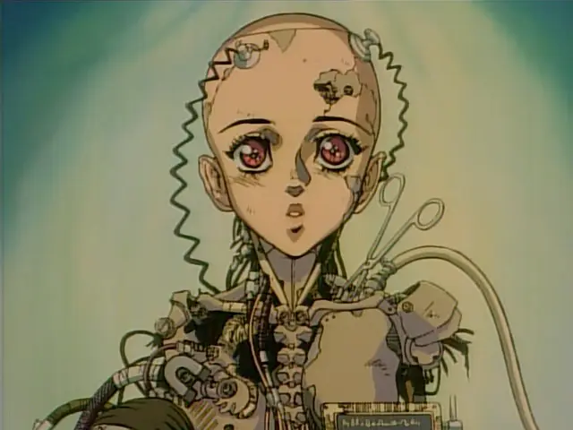
Looking at this design, you can see similar patterns as we have so far. We have metal clavicles, metal sternocleidomastoid muscle, metal pectorals, metal spine. There aren’t robot muscles, per se, but there’s a lot of attention to detail on mimicking biological shapes.
Before long she is rebuilt (twice in the manga, once in the anime). Her new body is like this…

…which is to say a skintight bodysuit in the middle, and metal arms. These arms, although designed in a way that indicates hard surface and with a hinge joint at the elbow, are designed in a way that mimics the flow of muscles in a human arm. By contrast, her sorta-love interest Yugo has a body like this:
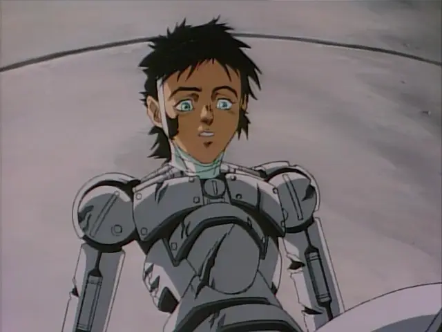
which gets mashed to pieces in the finale of the OVA. There’s a striking mechabare scene in which Gally catches Yugo, but leaves him hanging by a fraying arm, which snaps, leaving him to fall to his death. Compared to later iterations of the ‘robot arm torn apart’ device, this one’s relatively light on detail…
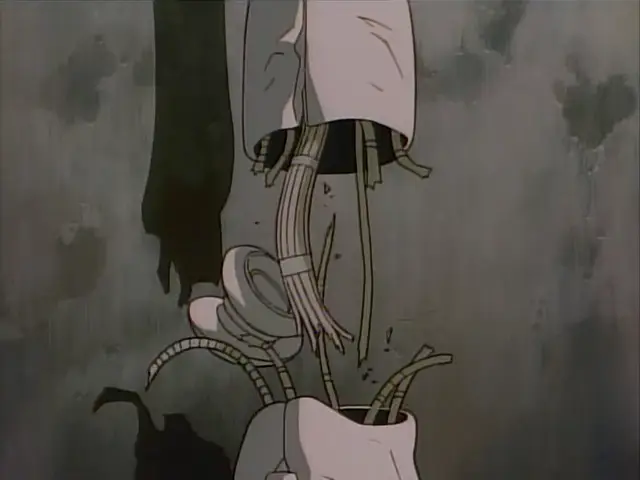
Cyborg bodies in Gunnm are used as a visual indication of character type. Gally has curves but also sleek robo muscles: she’s a Beautiful Fighting Girl, sweet but also extremely powerful. A huge ‘muscular’ cyborg with wide shoulders is likely to be a brute. Yugo here has much more plain, simple shapes with visible bolts, not precision pieces like Gally.
I don’t know how much of this originates with Gunnm. I’m sure the idea of cyborg girls was in the air long before, but this became an influential example on the tail end of the time of the 80s bishōjo. One device that is notable here is the idea of a ‘full body cyborg’, which is only human down to the brain (or perhaps not even that). Body swapping is a major theme in Gunnm, something that would be expanded on before long…
And if that was going out, what was coming in? Let’s look at Patlabor, which traces the evolution of the Headgear artistic collective and IG Tatsunoko into Production I.G.. This is about as down to earth as giant robot stories can get, with robots as just everyday machines used for work and by the cops. But where things really go nuts in animation terms is the opening to Patlabor 2 (1993).
Here you can see some of the most impressive sequences of mechanical animation ever drawn. We see pilot Noa testing out the robot, and especially notable are the scenes of the hand flexing and of walking. Enormous attention is paid to the articulation of joints. The robot’s hand can swivel 360 degrees, unlike a human; however, like a human, the articulation of the fingers seems to be controlled by hydraulics in the forearm (whereas in humans, the muscles and tendons in the forearm control our fingers). When the robot’s foot steps, it flexes like a real human foot, with believable joints, and a sensible arrangement of pistons to absorb force.
It’s not imitating a human’s muscles, but the attention to the details of the robot’s mechanical design serves precisely to draw our attention to the ways it’s like/unlike a human - the robot’s hand impossible motion immediately contrasted with its pilot shot from the same angle. And the perspective drawing is absolutely impeccable. The robot is made of purely rigid structures, and the way rigid structures articulate is not at all how a human’s joints articulate.
The sequence above was animated by Atsushi Takeuchi. But across the board, the bar was getting pushed for mechanical animation. For example, observe this cut from Mobile Suit Gundam: The 08th MS Team (1996-1999), in which the robot tears off its own arm and beats up another robot. The precision of the way the joints are animated and the way the robots move in space is just completely on another level compared to what Gundam had been doing a couple of decades prior.
Anyway, we’re here to talk about robot muscles, and we’re just a few years out from that now!
The year that robots got muscles, at least as far as anime is concerned, is 1995.
You can probably guess the next part. In 1995, we get Eva and GitS. Let’s start with Ghost in the Shell (攻殻機動隊, Mobile Armored Riot Police), to continue the Production I.G./Mamoru Oshii thread. The opening sequence of GitS, animated by - who else could it be? - Hiroyuki Okiura - has to be one of the most iconic segments of video ever drawn. Here’s a merely 720p youtube upload but go and find the place you have GitS stored on your hard drive and watch it in proper quality eh.
OK, yes, a lot of it is a naked lady floating around, sue me or whatever. But the sense of form. We see early on an appearance of ‘robot muscles’, here closely resembling real muscles…
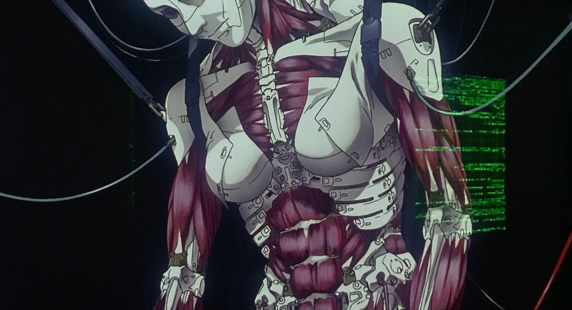
We can see from the way this is drawn that it’s made of a combination of artificial muscles, solid segments, and flexible, fabric-like panels. One of my favourite shots at the beginning shows the solid segments of the skull clicking into place. Here we have a very clear contrast between the angular, hard edges of the mechanical pieces against the organic forms of a human body.
Elsewhere in the film, we see various incredibly cool bits of ‘wouldn’t be fucked up if a body did this‘, like the fingers…
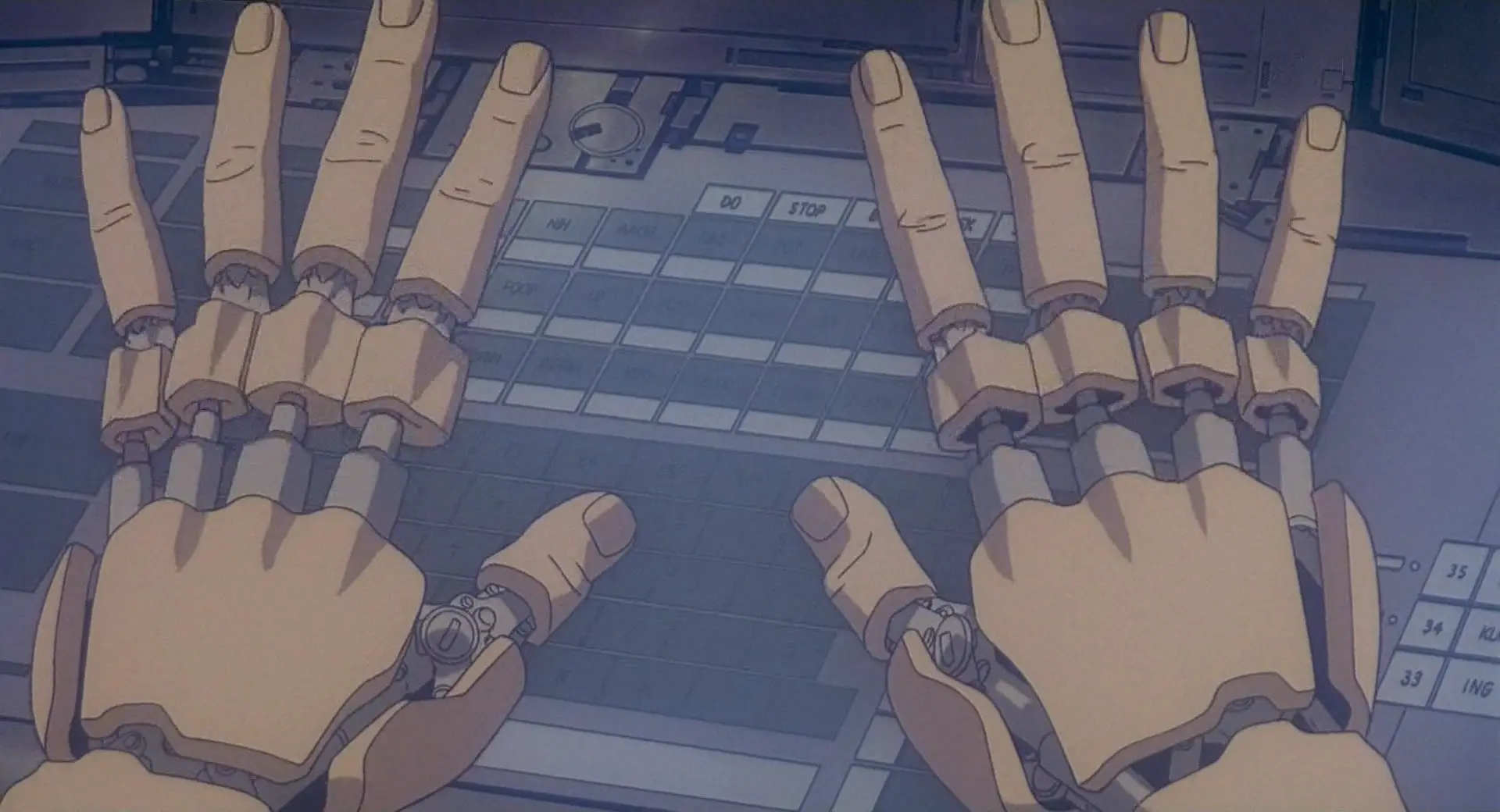
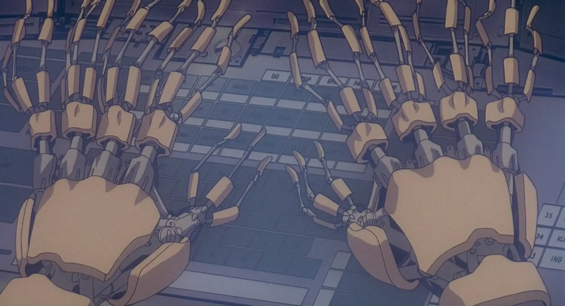
Here, what we expect to be soft biological fingers is contrasted with unexpected rigidity, mechanical joints under a shell.
Also in this scene we encounter a robot body that has been stripped of her arms, legs and hips but is nevertheless still alive…

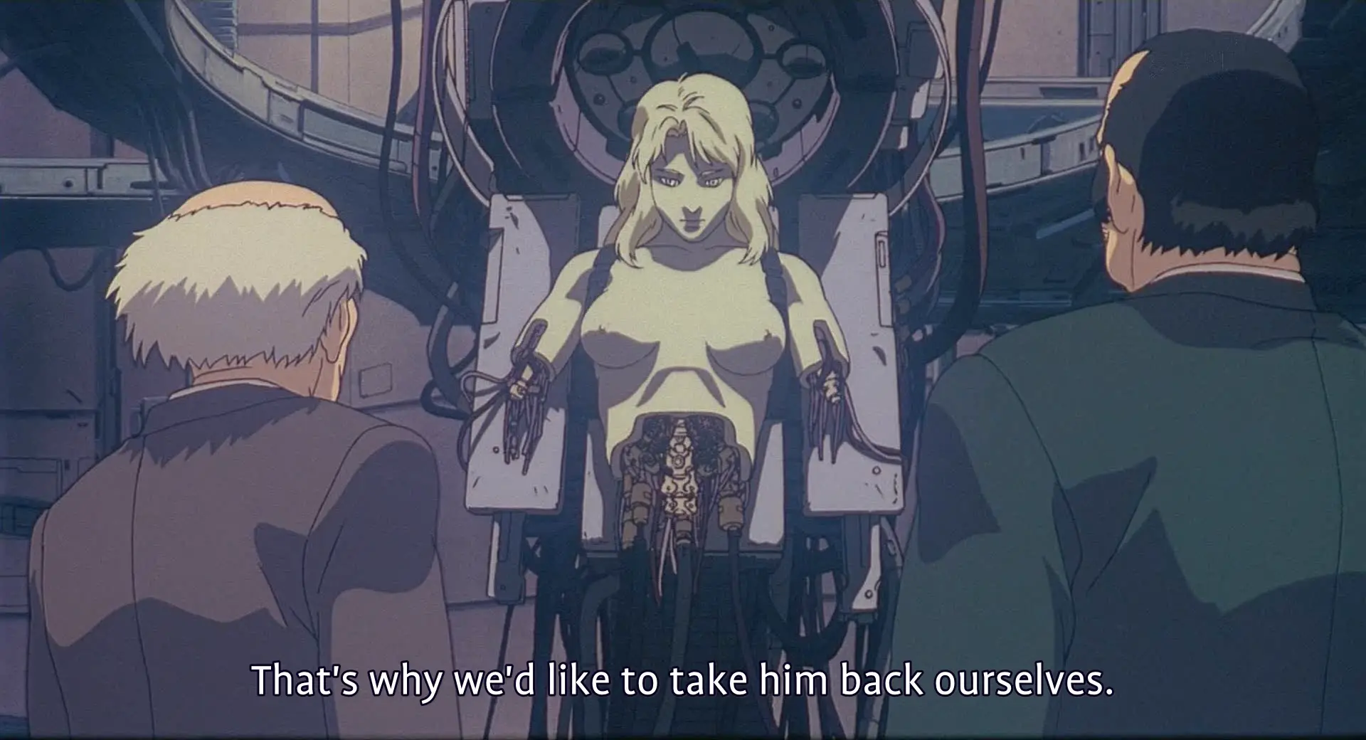
most extraordinary hacker in the history of cybercrime and you have your titties out and yet you still can’t get them to stop misgendering you, smh
For the Terminator, having its body smashed up and continuing to walk was a demonstration of its strength. Here, as would become perhaps an increasing motif, having a robot body is a source of vulnerability: people can do things to you that would kill an ordinary human but you keep going through it. Not surprisingly, ‘robot body maintenance’ is a recurring porn device. (One that GitS deploys in SAC s2).
But of course this all builds up to the all time classics of mechabare scene at the ending where the Major attempts to tear off the hatch of a spider tank. Muscles ripple individually under the surface of her skin, her arms bulge in exaggerated contraction, and then her arms fully tear apart under the force.
Here, we’re showing her as mechanical not by contrasting rigid forms with biological ones, but by exaggerating the biological ones to the point of doing something extremely unnatural. Human muscles do not generally flex in such an individual way, nor are they strong enough to tear the arm apart, but robot muscles? Yeah, they could do that. This sets up the next scene where the Major lies unnaturally still, but can still exert control through hacking through her union with the Puppet Master.
Robots holding onto something so hard their arms explode has become… if not a recurring image, then at least one that was called back decades later in Violet Evergarden.
The final scene of GitS brings back the image of robot-as-doll, with the Major’s consciousness now uploaded into a black-market robot body that resembles a child in a dress.
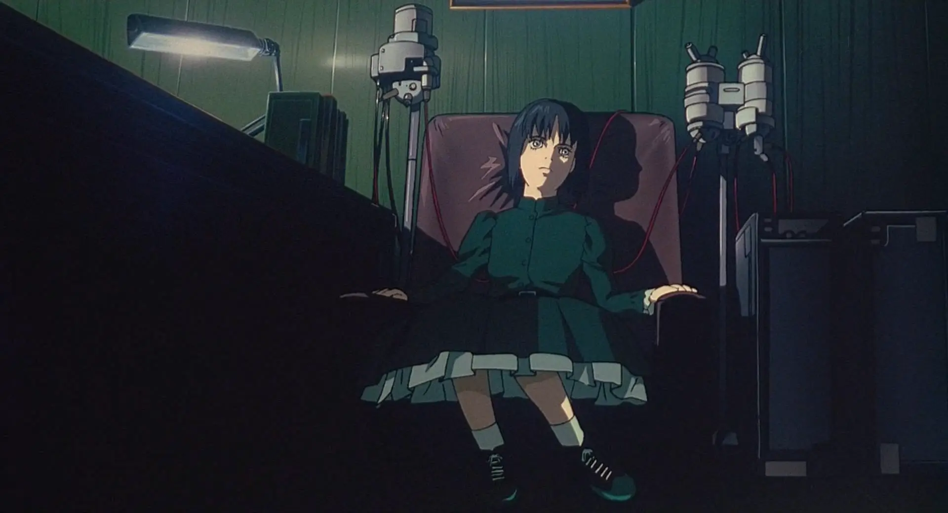
This is further expounded on in Oshii’s second GitS movie Innocence (2004), with its Ballade of the Puppets in the soundtrack as Batou and Togusa (and eventually, the Major) are attacked by essentially an army of ball-jointed doll gynoids. The puppets’ movements are extremely unnatural and erratic acrobatics, constantly flipping all over the place; when hit by bullets, panels pop open to reveal the underlying brass skeleton. It’s a very cool image. (The thing that lets the sequence down is the extremely dated CGI and aggressive digital compositing.)
It also has Donna Harraway as a literal cyborg!
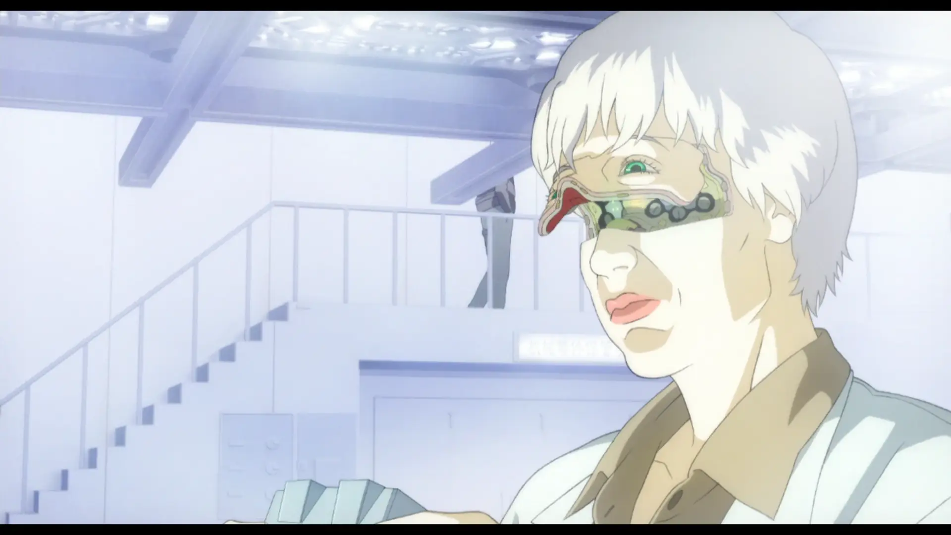
I’m sure she’d be thrilled.
Now, the GitS movies didn’t drop fully formed out of nowhere, but draw on the work of Masamune Shirow. The manga has a somewhat different design sensibility than the movie, distinctive and shiny as all Shirow’s art. It is more rounded and organic, less cold.
So, the basic design of a cyberbody originates with Shirow. You can see it on this page (unfortunately from a flipped version, translation Dark Horse):
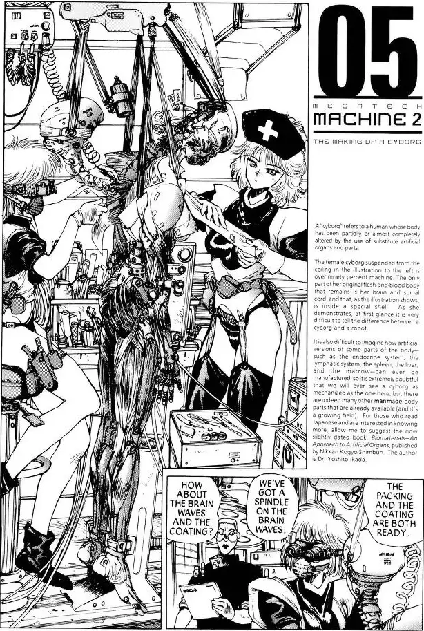
You might be able to determine from how the nurses are dressed that, yeah, the GitS manga is in significant part fetish porn. But really nerdy fetish porn, which is the best kind. This chapter is almost entirely dedicated to explaining how cyborg bodies are constructed in great detail, from the ‘sensory film’ (that’s what’s being applied in the opening to the 1995 film) to the hair implantation.
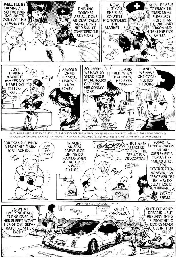
It’s interesting seeing how some of the more out-there designs of the manga, like Chief Aramaki, are transformed into the realist style of Hiroyuki Okiura. It’s Okiura, so it works great of course.
I don’t know if there are manga examples of such detail about cyborg bodies that predate Shirow.
Anyway, that’s just one of the two punches dropped in 1995. The other is Neon Genesis Evangelion. To the pedants: sure, the Evas are not actually robots, but they’re giant cyborgs that play the role of ‘robot’ in the story and they look like robots so I’m counting them.
Anyway, the thing about the Evas is they are incredibly lithe. They run, rip and tear and swing heavy objects around in a way that’s both weighty and distinctly biological. Their bodies are extremely flexible compared to prior mechs (look at how much the spines bend in that Iso cut from EoE!), but not without hard, rigid components such as the shoulder towers. Their jaws are bestial but feature mechanical-like components like interlocking hexagonal teeth and jet-like vents. They are in short a fantastic design that blends biological and mechanical features.
The impact of Eva on just about everything can’t be overstated, but as far as robot design, well. There certainly were works that leaned on the precedent set by Eva, as for example RahXephon, which also treats robots as something spiritual, prone to popping into a blob of weird little bubbles just like in Eva.
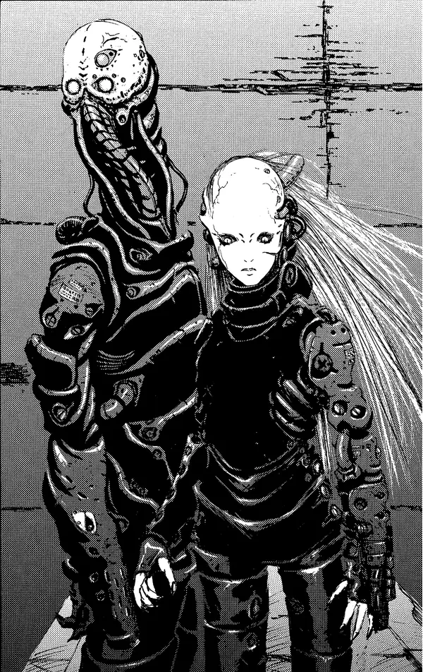
Two ‘Silicon Lifeforms’ from the first chapter of Blame!, showing the distinctive Nihei design style.
In 1997, Tsutomu Nihei enters the picture with his manga Blame!. A former architect, Nihei specialised in drawing cavernously vast mechanical megastructures inhabited by a huge variety of cyborgs, typically with spindly legs, wispy hair, white doll-like faces and black shiny body suits. In Blame! and Nihei’s other works, there is less focus on the precise details of mechanism seen in works like GitS—it is a world of technology that might as well be magic, with widespread transformation, teleportation and nonhuman forms of life like AIs and ‘silicon life’. It has its own internal logic, but it is purposefully alienating and rarely explains itself in detail.
Rather, the driving force of Nihei’s work is imagery. Something which he absolutely excels at: the flow of organic shapes, the use of contrast, the palette of mechanical bits are all fantastic. Some of Nihei’s designs look more human-like, others more insectoid. Later works of Nihei, like Knights of Sidonia, would go further with the direction of enormous biological lifeforms, but in Blame! everything has a technological quality, with screws and tubes and hard plates alongside the squishy bits. And while many cyborgs follow the human bauplan, there are some much more out-there designs with human elements mixed into machines…
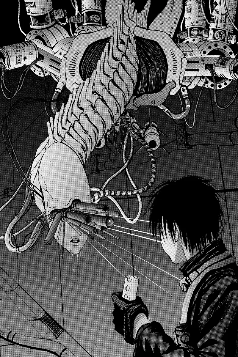
A more out-there cyborg from midway through the first volume of Blame!
Nihei’s style would evolve further in his future works such as Biomega. In general for him the line between biological and mechanical is effectively nonexistent. Rather than technology that merely mimics biology, they both come together to make something weirder and cooler.
There’s a great deal missing from this account. I am very focused on anime because I’ve watched a lot more anime than I’ve read manga or played games from this period. So I’m sure there’s major foundational works I’m missing here!
LOOK AT YOU HACKER: 90s videogames
The original version of this post talked very little about videogames, but I realised I can actually add a bit here. Cyborgs have always been a beloved theme in games, and depictions evolved quite a bit through the 90s.
In 1993 was Syndicate, an isometric strategy game in which the player acts as a corporate goon in a cyberpunk dystopian setting. The intro video, animated in CG, illustrates the premise, in which someone is kidnapped off the street and subjected to ‘biogenetic engineering’…
Visually, the trailer leans heavily on Blade Runner with its low light and hovering cars. The poly count and textures are too low to show the nature of the cyborg augmentations in detail, but the ‘replacement limb’ is achieved by replacing the skin texture with a vaguely metallic one, keeping the same shape of the original anatomy. Its sequel Syndicate Wars (1996) expanded on this, and here we see something interesting in the character upgrade screen…
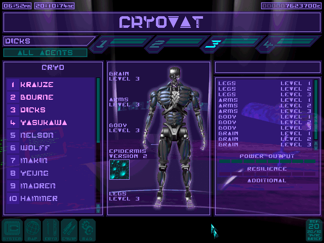
We see a metalic skeleton linked by blueish artificial muscles. Some of these follow the layout of real human muscles, although many groups are missing. So, in parallel with Ghost in the Shell, the idea of ‘robot muscles’ was beginning to appear in Western games as well. Though here, rather than the delicate doll-like bodies of GitS, we have a broad-shouldered frame designed to communicate strength.
Syndicate Wars could get away with such detail since it was using a pre-rendered sprite that fills most of the screen. The very first realtime 3D games also had plenty of cyborgs, but it’s harder to see what’s going on with them. In Doom (1993), you shoot a variety of demons, many of which have metal parts. In Sysem Shock (1994), you’re fighting a rogue AI called SHODAN, who has turned much of the crew into cyborgs. Here for example is a sprite sheet of one of the cyborgs in System Shock. The art, which had to be displayed at limited resolutions, depicted much more crude cyborgs, with big clunky metal parts intervening into an otherwise biological body.
Videogame graphics evolved very quickly from these ‘sprites in a blocky 3D world’ depictions to fully 3D characters, starting with Quake (1996). Half-Life (1998) made some moves in the direction of biologically styled tech in the alien world ‘Xen’, which contrasts with the human facility by featuring rounded forms and coral-like growths everywhere—though this is perhaps more to do with a parallel strand, the evolution of the ‘bug alien’ aesthetic.
Over in Japan, the long-running RPG franchise Final Fantasy moved in a cyberpunk direction in the seventh entry in its series in 1997. This led to the player encountering large cyborg constructs such as ‘Jenova’, appearing as a woman connected to surrounding machinery by massive tubes.
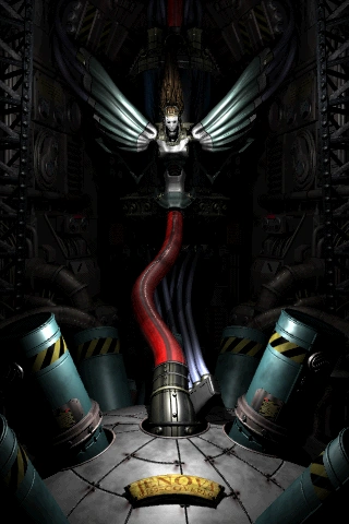
So this kind of imagery is really in the air in the 90s!
The end of the 90s brought some very novel designs. Oddworld: Abe’s Oddysee (1997) bases its whole concept around the sheer variety of weird creatures that would inhabit its dystopian factory. And I gotta give a shoutout to Septerra Core (1999), a Western JRPG-style RPG heavily inspired by Final Fantasy, with a really cool biopunk tech aesthetic - in case one other person has played that lmao
A NEW CYBORG MILLENIUM: the two thousands
When did the West start to catch up? eh that’s subjective - David Cronenberg was way ahead of the game! - but specifically in the sense of robots with mechanical muscles, I think the major points in the timeline go a bit like this.
In 1999, there’s The Matrix, which leans heavily on anime. This features a similar ‘robot takeover’ premise to Terminator, but here it’s biomimetic robots modelled after squids, with clouds of constantly moving tentacles that sweep behind them. After making a cool half a billion dollars, the Wachowskis decided to pay all their favourite anime directors to make short films, which was an opportunity for many of them to experiment with inventive new techniques. I’m not going to comment on every part of the Animatrix, since most of it isn’t really relevant, but I will point to this horrifying cut by Takeshi Honda in The Second Renaissance in which a robot woman has her clothes torn and then skin bashed off by a mob. The framing, motion, her expression of abject terror, and the ‘reveal’ of her ‘true’ nature, all viscerally call to mind a trans bashing.
Returning to manga, a big one to mention is Gantz, a gory nihilistic seinen manga which ran from 2000-2013. The characters in Gantz fight in special latex-like suits which take on the appearance of muscles while engaging superstrength, but can also sustain damage that causes them to drip fluids from ports located at the neck and become fatal to their wearer. Gantz was adapted to anime by Ichirō Itano in 2004, but I haven’t seen it so I can’t comment on any notable animation.
In 2000 came the game Deus Ex. The 3D graphics could only give a fairly approximate depiction of a cyborg body, usually just using a texture to indicate some wires running over a character’s skin.
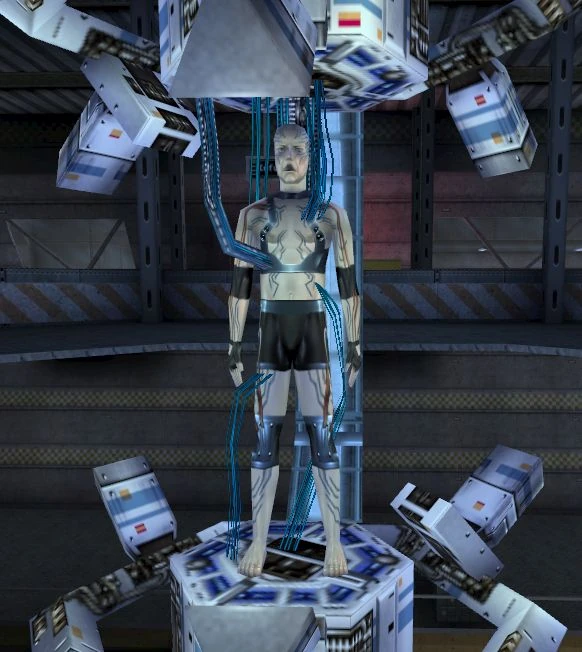
The story of Deus Ex revolved primarily around conspiracy theories, class division, pandemic—familiar cyberpunk territory. Its depiction of cyborgs is pretty much in line with other works, but I’m mentioning it to compare with DXHR later.
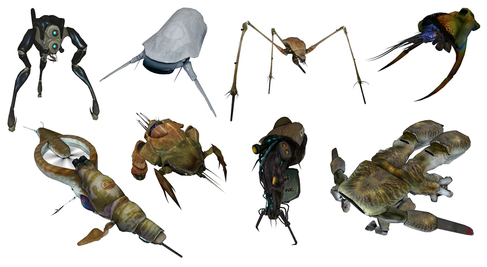
In 2004 comes Half Life 2, an FPS that managed to be as influential as its predcessor four years before. The game featured very strong art direction from Bulgarian Viktor Antonov, with austere constructivist alien architecture consuming a city, its alien faction full of cool ‘constructs’ designed after crabs and aquatic animals.
So, 2007, here comes Crysis to melt your PC! This is an FPS with the not-uncommon premise of being a supersoldier fighting (country America hates) and also aliens, but its gimmick was that you have a special exosuit that wraps around your body with artificial muscles, making you much stronger and manlier or whatever.
This is indicated by a visualisation that could be right out of a toothpaste ad, where tiny little balls drop into the character’s pores and somehow go straight into the bloodstream which is of course a void full of flying red blood cells. And so on. It sold the game, though! The ad there focuses almost entirely on the suit and not the character wearing it, who is basically an irrelevant soldier man. What it entailed in gameplay terms is that you have a mode switcher so you can have strength or armour or invisibility or whatever. But it’s cool military superscience, you see!
Anyway. Not like my preferred flavour of cyborg is any less stupid I guess x3
In the same year, Bayformers started. These films’ robots are honestly just visual noise, there’s so many moving metal shards going every which way that it’s next to impossible to discern any sort of underlying mechanical principle. A similar ‘overwhelming business’ visual effect would be applied the next year in Iron Man, kicking off the MCU. So mechanical muscles definitely weren’t the only expression of ‘hyper-advanced robot’ in Western visual media in the late 2000s.
I NEVER ASKED FOR THIS: the twenty-tens
In 2005, military robotics company Boston Dynamics starts developing a walking robot called BigDog. In 2010, a video of BigDog went viral, in which the robot is kicked around to show its ability to right itself. BigDog is just welded steel and hydraulics, but its limbs are covered by fabric which makes them look considerably more biological, and its semi-lifelike hopping movement style definitely brought to mind the idea that the future of robots is going to be in biomimesis. Reactions were split on whether the robot’s movement was endearing or uncanny. Ultimately, the US military rejected the noisy, expensive robot but its distinctive design definitely influenced sci-fi design principles.
In 2010, Eidos-Montréal attempted to create a Deus Ex from 2000 with their game Deus Ex: Human Revolution. In contrast to the original Deus Ex, its plot centred on the idea that ‘human augmentation’, replacing limbs with cyborg parts, would become a major social issue—embodied in its protagonist, who tragically has extremely cool and badass cyborg limbs which can pop out swords and let him punch through walls and all sorts of shit. A very memorable trailer invoked Renaissance scientific-revolution imagery and the Icarus myth, before having him utter ‘I never asked for this’…
This trailer marks a lot of major changes in how games are made and sold. Compare the Crysis trailer just three years before: now we’re trying to reach for all kinds of hefty themes around transhumanism. The influence of GitS and Blade Runner, now fully established as cyberpunk touchstones, is explicit and overwhelming. Panels slide around, and guns and swords come out of unexpected places. By this point concept art has become a serious industry in its own right and you can see the fruits of that in how the cityscapes and dropships and so forth are staged.
But also notable is the very visible change in technological aesthetics: all the ‘augmentations’ foreground the idea of artificial muscle. In contrast to Ghost in the Shell, where those cyber muscles are hidden away except in a situation of extreme distress, here they’re made a very visible symbol. Instead of the full-body cyborgs of GitS, also, we now have ‘augmentations’ that integrate into the existing human body with their shiny plastic surfaces.
If the trailer foregrounds a lot of the coolest cyberpunk imagery, and still holds up pretty well today as far as trailers go, it also brushes over the game’s weaknesses, like the weird racism lmao, or the shallow ‘extremely 2010s videogame’ plot. Its writing couldn’t really match the density of visual ideas thrown at us here. Nevertheless, this is pretty much a definitive statement of how modern videogames would come to present the idea of ‘cyberpunk’.
A little later in 2013 comes PlatinumGames’s spinoff of the Metal Gear franchise, the cyborg ninja character action game Metal Gear Rising: Revengeance, which is one of the greatest games ever made imo. While the Metal Gear series had frequently depicted giant metallic robots, and there were also occasional depictions of cyborgs with robot muscle starting with the low-res Gray Fox in MGS1 and Raiden’s much more detailed cyborg body in MGS4, MGRR went all in on the sort of DXHR-style depiction of artificial muscles. Full-body cyborgs are everywhere—the plot revolves around a bunch of brains in jars—and it features a fantastically designed rogue’s gallery of cool cyborgs, such as 12-armed Mistral, or magnets themed Monsoon whose body splits into a bunch of flying disconnected slices for… reasons after he delivers a long speech about meme theory. Of course, best known is Senator Armstrong, a huge muscular US Senator whose ‘nanomachines, jack!’ give him strength and a resistant shell. You also get a friend who’s a high-tech robot dog with a super-flexible tail.
Many of MGRR’s mechanics draw out a mechabare theme: you cut your enemy apart (which has some kind of clever engine for efficiently splitting geometry across along planes) and grab their spine for a quick heal. When you defeat the bosses, you generally dice them into tiny pieces—even the building-sized robots.
The tech here is basically magic, but it is highly biomimetic magic: most of the design elements are human limbs covered in shiny plastic and perhaps carbon-fiber like grids. There is some lore about it, e.g. some of the walking-tank enemies you fight are made using cow cells, which means they moo when they attack you. Like the other Metal Gear games, Rising is full of optional, long rambling conversations ripped from science magazines, but it’s art direction first. Being a cyborg is an excuse to let you jump off missiles and shit like that.
Five years ago arrived two games that are recent enough to really be ‘modern’, Horizon Zero Dawn and NieR Automata.
Horizon features a world inhabited by a large variety of robot animals, using the peak of AAA rendering techniques. The robots are designed to be biomimetic after both modern animals and prehistoric ones, and feature a combination of hard surfaces and softer biological muscles. For example, a robot horse:
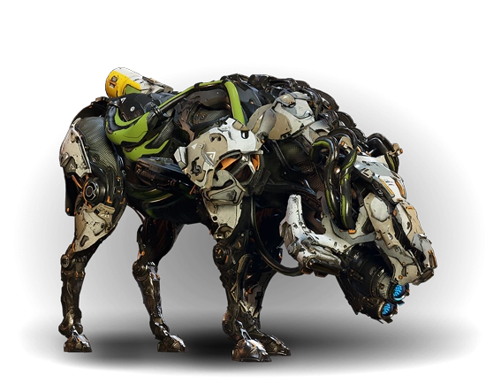
The discipline of making designs like these now has a name: it’s called ‘hard surface modelling’ and it involves boolean operations and bevels and other techniques designed to create a balance of hard edges on a surface against the smoother parts. The design language of Horizon says that the hard plates are white, the soft parts are very dark and may be patterned like a cloth texture, and there can be small colour accents here and there.
I think you can definitely see the influence of Boston Dynamics’s robots (and recent military tech in general) in these designs, iterated on through a decade and a half of increasingly intra-referential concept art. They are visually very busy designs, but there are a couple of recognisable features that draw attention by being inorganic, such as the cylindrical fuel tank at the back. Vitally, the silhouette is very readable.
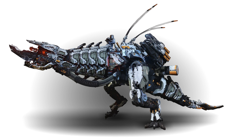
This robot T. rex for comparison serves as a world boss monster, and you can see it’s got a bunch of military looking attachments that look like radars and missile launchers and so on. As real tech evolved, so too did our idea of what a scary robot ought to look like.
So, that’s where this kind of design pattern has gone in mainstream games.

Now to finish, a brief comment on NieR Automata, also by PlatinumGames. Visually it draws a strong contrast between the Machine Lifeforms, who have inorganic shapes (spheres and cylinders) and very visible and plausible mechanical joints, and the doll-like androids, who might as well be human (although A2 provides some contrast in an android who is damaged enough for the underlying materials to show through) and wear gothic lolita uniforms. The mechanical nature of the androids is communicated by the acrobatic way they move and the interface elements, and dead androids you find in the field - and later when they start losing arms and stuff, it’s a whole thing. But just like humans in Yoko Taro Games, they’re capable of dying in a puddle of blood.
(I guess if you take one thing from this post it’s that if you’re a robot, don’t expect to keep your arms.)
Robot muscles gives you a chance to give both the ‘anatomy porn’ of drawing something very precisely right, with the added bonus of giving you a reason to draw the muscles écorché, and the chance to make it weird and defamiliarised by splitting it with mechanical elements. In short… they look cool!
In this whole post I’ve basically not touched at all on illustration. I can point to a variety of illustrations of robot girls, but in terms of periodising them, I just don’t think I know enough. Though it’s safe to say that cyborg bodies in various states of construction or disrepair are now a mainstream of concept art - and that Ghost in the Shell is usually cited as an influence. I don’t know if robot muscles ever truly became the mainstream way to depict a robot, but it does feel like they’re increasingly common.
One artist I will briefly mention (besides sukabu), mostly bc I think they’re neat, is Haruyo Megurimu, who draws these very intricate designs of ‘necrotech’ which is sort of very biological robots extending out of human bodies - limbs extended on long spindly insectoid strands, jaws splitting open, that kinda thing. Can’t say who influenced them or anything but it’s a compelling extension of the idea into a particular corner of aesthetic space.
And that’s all I’ve got I think. There’s definitely big gaps like. More recent sci-movies. Western comics. Nevertheless, that’s an arc.
If you’ve read this far: thank you for indulging my autism.
Comments
alex (14fd516996f0ad1f9053d633c8d74021)
interesting