Hi animation friends! Welcome to the ninety-seventh Thursday.
Earlier this week I caught up with Haruko Ichikawa’s fantastic manga Hōseki no Kuni, best known in English as Land of the Lustrous (but also Country of Jewels, Kingdom of Gems, that kind of thing!)… There are many ways to describe it, but the one that comes to mind currently is a dystopian tragedy based on Buddhist cosmology.
But it might be more informative to say that it’s a story about a world of immortal but fragile, androgynous gemstone people under the care of a mysterious Buddhist monk, who are frequently shattered and remade, caught in a seemingly eternal fight with the ‘Lunarians’ who manifest out of geometric, Rorschach-blot like patterns to smash them and take them away. The story concerns how the best intentions of one reckless young gem named Phosphyllolite interrupt this cycle; to say more would perhaps give away some of the major twists in an excellent story so all I will say is I heartily encourage you to read it!
Unfortunately, most of my writeup tonight has been lost to a Tumblr glitch. Since this is a long programme, rather than lose even more time trying to recreate it, I’m going to have to write some very brief things here and do a proper followup writeup after we watch it.
The manga by Haruko Ichikawa is a beautiful thing, full of stark and elegant compositions which make excellent use of negative space and geometric patterns along with Buddhist religious imagery. Ichikawa is a reclusive figure - there are no photos of her out there, just a little self-portrait drawing. Prior to Houseki she’d spent a couple of years writing one-shot mangas, which were eventually compiled in two books titled Insects and Songs (虫と歌 Mushi to Uta) and A 25 Hour Vacation (25時のバカンス 25-Ji no Vacances).
Tonight the plan is to watch the 2017 adaptation by Studio Orange (previously known for their work on Rebuild of Evangelion), which is unusual for being an almost fully-CG anime series that is actually extremely good on an animation level, taking advantage of the CGI to achieve images that would be almost impossible in traditional animation rather than treating it as a shortcut. Although it only covers perhaps the first third of the manga, this includes some strong storylines, and they do an absolutely stellar job of all the glittering and shattering, as well as capturing Ichikawa’s airy compositions and wide open spaces.
There is actually quite a lot of information out there on how it was produced, on Wikipedia drawing from interviews in Animate magazine, Sakugabooru, and a video from The Canipa Effect, and I hope before long I’ll get a chance to draw out some of those details for you. It’s also inspired a pretty rich vein of analyses, video essays etc. engaging with all its complex themes and allusions…
I will have a great deal more to say later, but for now we’d better make a start - so please, head over to twitch.tv/canmom where we’ll be starting very soon!
It is now “later”. Let’s talk more about Houseki no Kuni!
First up: the manga! I tracked down a translated interview with Haruko Ichikawa, in which she talks about the inspiration for the manga coming from her childhood at a Buddhist school. There, she studied the Buddhist monk Shinran ‘as other schools would study ethics’. In the course of these studies, she struck on an odd line in a sutra…
Well that must have been quite surprising.
Even in regard to lessons, in a normal high school I’d imagine you’d study ‘ethics’ but here we studied about Shinran as a part of Buddhism for three years. During these lessons, through Buddhist scripture I learned of the ‘Longer Sukhavativyuha Sutra (Muryo Jukyo)’. One line states ‘the Western Paradise is made up of gems’. The Western Paradise is apparently comprised of gems, you see.
– Could you talk about this in more detail?
‘Muryoju’ means an immeasurable amount of light. Whilst it teaches the basic principles of Buddhism, it also talks about just how magnificent and sublime the Western Paradise is.
Having been made to read these sutras throughout high school, I eventually began to think that even in a place like ‘Paradise’ where each and every thing experiences salvation, the gems can only ever be decoration.
From this, she started wondering - what if the gems in this story could be saved? And what about the people of the Western Paradise who treat them as decorative objects? She drafted a short manga around the premise, but put it aside to work on the stories that would eventually form Mushi to Uta.
Later, per another interview, Ichikawa became a designer creating architectural pamphlets, studying design at university:
Ichikawa: Quite so. As a designer, I receive photos or materials from architects and I have to come up with a clean and nice final product that reflects the subject matter as much as possible and myself as little as possible. Doing only that though can be rather tiring. It’s enjoyable in its own way, but it makes me fear I will forget how to create my own things. I attended the Visual design laboratory attached to the Fine Arts section of the Hokkaidou University of Education in Sapporo and it was quite an unrestricted school, with students doing what they liked, like anime and so on. I also wanted to do what I liked, so I decided to draw manga. That is why manga and design are two completely different things for me.
Ichikawa’s earlier manga definitely shows the beginning of the elegant simplicity that would characterise Houseki, but it’s definitely a little rougher (an encouraging sign for people who admire her work but are far from that level!). the stories though… wild. perhaps the idea of gemstone beings who interact like schoolgirls while fighting an existential war against buddhist heaven (without even getting into all the complicating reveals later), mixing cuteness with absolutely bleak tragedy, will seem p natural when you consider her prior stories! Which I can’t really discuss without big spoilies so you’ve been warned…
The first collection, Mushi to Uta, comprises four stories written from 2006 to 2009, each about 50 pages long. The first to be written, also called Mushi to Uta, is placed at the end for greatest impact. So…
The first one in the collection and her second story, Star Lover (星の恋人 Hoshi no Koibito), involves a pair of ostensible siblings, actually plant/starfish beings who can reproduce through, what else, removing limbs and letting them regrow into new people. the plants include a teenage boy, a young girl, and eventually an even smaller girl who grows from a cutting of the latter; the second of these acts as a kind of simultaneous mother/wife/daughter figure to the adult man ‘father’ who created the plants, and she creates the cutting to perform a similar role for her ‘brother’. I feel like the bald figure of devotion is a kind of prototype of Kongo/Adamant Sensei in Houseki.
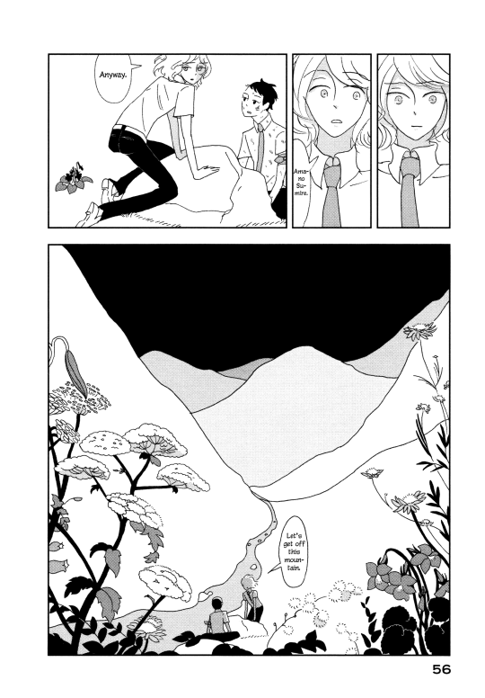
The second story, Violight (ヴァイオライト Vaioraito), sees a pair of plane crash survivors lost in the mountains. As much as Ichikawa may see design and manga as separate, you can see how the expert sense of negative space and balancing detail against simplicity informs her compositions, along with allusion to classical Japanese art. As the story develops, it turns out that one of the two boys, Sumire (Violet) is actually a kind of anthropomorphised manifestation of the lightning which destroyed the plane and then, feeling guilty, constructed a body out of sugar and glass; he leads the survivor Mirai to safety with attendant sexual tension but as they near the safety of a lighthouse Sumire starts to fall apart, leaving a blinded Mirai to tumble off a cliff, leaving him to be seemingly captured by Sumire and burned up… sinking another ship in the process, and once again rescuing a survivor (I think! The last few pages get a little confusing to follow!)
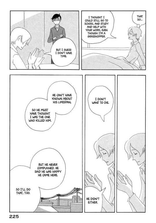
The third story, The Kusaka Siblings (日下兄妹 Kusaka Kyōdai) follows the relationship between an injured baseballer and a strange entity that starts constructing itself when he breaks an antique chest of drawers, soon forming a kind of humanoid girl which takes to calling itself Hina. Hina turns out to be a shooting star, bound to give a wish, and this being a Haruko Ichikawa manga, doing this involves her exploding into pieces and incorporating herself physically into the body of her ‘brother’ to repair his shoulder. It’s actually really sweet!
Finally, Insects and Songs (虫と歌 Mushi to Uta), her first published manga… this one’s amazing. It introduces us to, once again, a group of siblings, who work on making 200:1 replicas of bugs. They’re abruptly introduced to ‘Shiro’, a kind of winged bug boy, and it turns out that the eldest brother Kou has been experimenting with creating bugs capable of mimicking the appearance of humans. The family - particularly Uta, the younger brother and our viewpoint character - rapidly take to their new bug-sibling, but it turns out Kou was not able to give these bug people a long lifespan and Shiro dies, still thanking them for his brief existence. The twist is, inevitably, that all the siblings except Kou are bug people; Uta also will soon die, and there have been many more before them. Despite this, the tone is bittersweet…
So we can identify a few themes perhaps in Ichikawa’s work. Most obviously, have ephemeral relationships, extreme devotion to father figures (often bald), and bodies breaking down in various ways. There’s the blending of human characters, whose interactions are often cute but observed with a certain quiet distance, with inanimate or nonhuman things, imagining how their specific qualities (brief lifespans of insects, cuttings in plants) might shape more human relationships. Stories often build to a reveal which recasts our perception of everything that came before.
There is also a great fascination with objects, of all sorts; while human characters are pared down and outright minimalist, immense attention to detail will be lavished on everyday objects, architecture, plants. This interview sees Ichikawa comment about her approach in some detail, e.g.:
Ichikawa: I think the difference between me and Takano is that she seems to love the movements of living things, while I love objects. That is why I draw people similarly to objects. My formation as a designer also makes me strongly prioritise the layout. I prioritise balance over significance even when it comes to the contrast between light and shadow.
I won’t summarise the second collection of four stories in such detail, since I’m a little tired to read them right now..! Let’s move on to Houseki no Kuni itself.
Naturally, it is a much longer serialised work, with many story arcs, which changes the approach a bit… but there is still the pattern of gradually unfurling perception of the situation, the recontextualising reveal. When Phos finally arrives on the moon, they discover the Lunarians’ motivations are nothing like what they imagined, and indeed altogether more disturbing, and the compromises they end up making to prevent the suffering of their people prove in many ways catastrophic.
But Houseki no Kuni is also a heavily character driven story, and one of the major themes is the impossibility of ‘saving’ someone. Early in the story, a very young, naive and scatterbrained Phosphophyllite fixates on a taciturn outcast gem, Cinnabar, who constantly emits mercury making them a threat to the other gems. Phos promises to find a less isolating role for Cinnabar, without realising that all Cinnabar really wants from them is simple companionship. But at this point in the story, Phos is absolutely incapable of meeting their promise; they gradually get transformed and traumatised and loses more and more friends while setting their ambitions higher, but this process pulls them away from Cinnabar and sets up a path which will eventually put the two in lethal conflict.
Ichikawa comments on this theme in her interview:
– The protagonist Phos also has another motivation. The wish to save Cinnabar, who lives isolated and away from everyone else. This wish was something I felt connected thematically well with your previous works.
The act of saving someone is incredibly difficult. Expressing support; providing them something to help may only cheer them up temporarily, but saving someone by completely turning their life around is probably something no one can do.
– Yes.
Then just what is salvation? Can someone in the truest sense save another? But people, for some reason, can’t let go of this mysterious feeling of wanting to be of help to others. I have always found this to be very mysterious. It’s mysterious, and it’s for this reason that I want to know.
– So you’ll only be able to find this by continuing to write ‘Houseki no Kuni’?
That’s right.
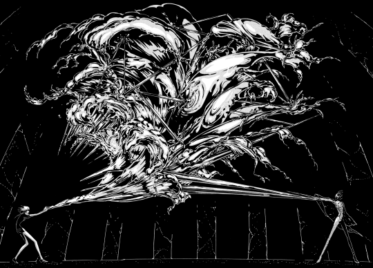
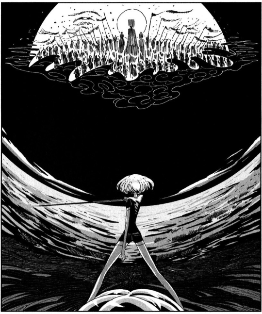
I think one of the hallmarks of really good, meaningful writing is confronting themes which the author themselves finds immensely important, but also they are unable to answer. It’s interesting that there doesn’t seem to necessarily be a grand plan for Houseki, but despite that it retains a strong thematic coherence, and a good balance of lighter character interactions and even humour with all the pain and smashed bodies. Ichikawa’s approach to action is very much driven by composition and aesthetic, which leads to some absolutely incredible splash panels later on, with an incredibly intricate sense of how to use shadow shapes, light and texture.
The later chapters of Houseki are also remarkable for their constant reinvention; for a story about a society that remains static for thousands of years, it is very dynamic. Phos becomes an immense force for change, and actually achieves much of what they set out to do intentionally and not, but the cost they bear for it is catastrophic; even the happier antics take on an increasingly sinister tone as they come to represent essentially a genocide of the gems. Then there’s the whole Buddhist angle; the story engaging with a sceptical eye with the ideas of Pure Land Buddhism. (This last part coming from this video, from someone who knows a bit more about the Buddhist side than I do.)
So, faced with such a definitively unique manga, how would you go about adapting it to animation? Someone with, perhaps, their own distinctive, idiosyncratic approach to animation…
…which I’m going to have to write about tomorrow, because it’s quite a long story, so enjoy this part for now and we’ll get into the backstory of Studio Orange and Eiji Inomoto sometime tomorrow~
Oof, it’s already been a week, and I still haven’t finished up my writeup of Houseki no Kuni. Still, the day is yet young! Let’s tell the story of Studio Orange, director Takahiko Kyougoku, concept artist Yohichi Nishikawa, star animator Yoku Kuno, and others who made this anime so cool.
I mentioned above in the original writeup that Wikipedia had a bunch of information from Animate magazine; well, this interview actually has been translated by (who else?) Sakugabooru, and it may be read here.
The impetus for this adaptation came when Toho’s Katsuhiro Takei approached Takahiko Kyougoku in 2015, while Kyougoku was working on the anime Gate. They both agreed that the material would be best adapted using a novel mix of 3DCG and traditional animation - one attempt at a kind of ‘best of both worlds’ approach that increasingly seems to be the future of animation.
Takei was firm that he wanted the studio Orange to create the CG. Orange is a project of Eiji Inomoto, a passionate believer in the yet unrealised potential of 3D animation in anime, a story told in detail here:
To summarise this video: Inomoto studied economics and began at an electronics retailer, but quit after a month of boredom; he spent some time as an assistant mangaka before being enticed towards 3DCG by the works of Davakan. He got his TV debut in something called Zoids, and soon established a major presence in early efforts towards integrating CG and traditional animation, notably being a major part of the tachikoma team on Ghost in the Shell: Stand Alone Complex (Animation Night 39). Frustrated with the frequent (and often justified) disdain for CG animation among anime fans, he set himself the mission of showing the potential for CGI, and founded Orange in 2004 with the long term ambition of creating a full 3D anime. (If you read Japanese, there’s an interview with him here.)
Their early years mostly involved outsourcing work for other studios, but starting in 2013 they started having large roles in their own projects, usually in collaboration with other studios such as Doga Kobo and Kinema Citrus. You can find a fairly full list of things they’ve worked on at Anime News Network.
Curiously, this list doesn’t include the work that convinced Katsuhiro Takei cites as good preparation for Houseki - the CG animation they contributed to Rebuild of Evangelion. Here’s what he had to say:
Orange’s crew has always been good at action, having worked on Rebuild of Evangelion and so on, so I knew they would be able to pull it off. My instructions didn’t amount to much. It was along the lines of, “Have the camera come in from the right and move to the other side, and cut it there.” Of course, that was written in the storyboard as well. And before I knew it, the camera would be spinning all over the place, as they’re known to do.
Of course, it takes more than just an unusually talented CG studio to realise an adaptation like Land of the Lustrous; you also need great visual design and a director bold enough to make meaningful decisions about how to translate the manga into a new medium. The former in this case can be credited in significant part to Yoichi Nishikawa, the concept artist whose paintings formed the basis of many shots.
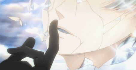
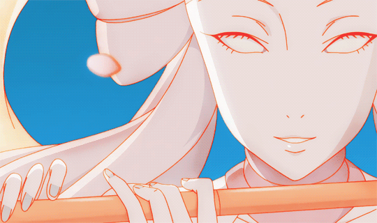
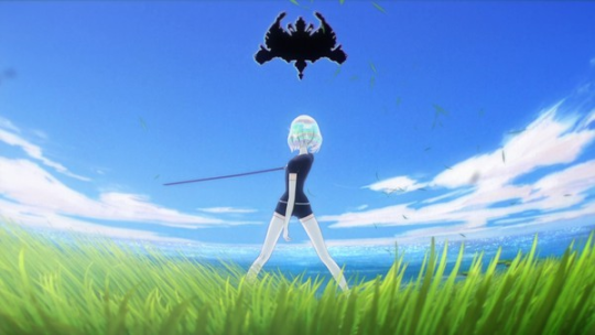
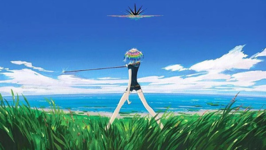
Here’s an iconic image from the third chapter of the manga. First, we have the splash panel by Ichikawa:
Then, here’s the concept painting by Yoichi Nishikawa. I think this one’s fully a painting, but some of Nishikawa’s concepts were described by Kyougoku as straight up photobash which created a surprising sense of cohesion:
— What would you say the most memorable scene from episode 1 is?
I would say the scene at the beginning where you see the swaying grass, and then Phos’s head, crystalline hair and all, pops onto screen. We had someone who used to work at Studio Ghibli [Yohichi Nishikawa] do the hand-drawn concept art. One of the pieces he made has the main character looking cel-shaded with the exception of their photorealistic head, and in front of them, some CG grass that looked like it came out of a photograph — a jumble of stock materials. But when all of the parts look so different, it paradoxically creates a sense of cohesion, and I felt we could create something that feels like nothing that’s come before it. It’s left a mark on me as a piece that shows everything I want to accomplish with this series.
The final render ended up extremely close to this concept. Kyougoku continues, talking about a similar process in episode 1:
But I was met with doubt from those at the studio as to whether it could work. Having the first thing that we’d unveil to the world be so striking, to put it in a good way, or less kindly, an eyesore… It made us fear that we could just end up alienating the viewers. But luckily, once we saw how beautifully it came out, the mood changed to one of, “Hey, this could work!” The first few cuts took many months to draw, but it feels like once those were finished, the rest of it began to go smoothly.
Along with Nishikawa, kVin notes the contributions of a number of other artists creating the distinctive direction in this article.
Now, while Land of the Lustrous definitely makes far heavier use of CG than most anime, it is not a fully 3D work, and indeed according to kVin, just about any closeup is actually 2D; you can definitely tell to some degree but they do a startlingly good job compositing the elements. Houseki was also well ahead of the game when it came to integrating 2D effects animation into CG, and honestly it tends to look a lot better than their 3D fluid effects which suffer from a noticeably low grid size resulting in blobbiness, and of course the lack of the clear shapes that 2D animation brings.
(There’s a slightly amusing premonition in the replies to this tweet about 2DFX in 3D, where someone hopes Riot would also double down on using this approach to integrating 2D and CG… well, they sure did do that and, given the success of Arcane, I’m sure we’re going to see a lot more of this.)
Of course, the most striking advantage of the CGI is how it allows incredibly complex shading in the hair, which I think is a clever blend of actual raytraced refraction (allowing the caustic effects on the gems’ shoulders which apparently took months to perfect) and the use of fixed, stylised highlights painted into a texture. I’m sure they do some kind of Guilty Gear-style normal-editing to get the shading to look consistent as well.
What really struck me last week was how much the 3D adopts some of the stylistic shorthands of limited 2D animation, such as ‘cheekmouth’. Given the drawn mouths are not actually be part of the 3D model, perhaps this is for the same reasons - it is more effort to change the outline than to animate a shape on top! I wasn’t able to find it just now, but there are some fascinating shots where the camera rotates around a character and the mouth smoothly moves around their face.
The process for key scenes typically seems to involve a kind of twist on the usual anime process; many scenes will be first key animated in 2D, then the 3D elements will be animated to this (taking the place of 2nd key animation which would nail down the forms and lines), and finally the 2D-in-3D elements will be drawn over the top.
In fact, contrary to what I assumed, many of the striking images of gems being shattered to pieces are actually hand animated. Massive praise to the compositors to making me think it could be otherwise!
The other way the show’s CG takes after 2D animation is the limited framerate - a technique later made famous by Spider-Man: Into the Spider-Verse. The framerate is pretty universally on 2s (12FPS), which is actually quite a high framerate for anime which often works on 3s or even sometimes 4s, but noticeably low for CGI - such that I actually saw people complaining about it in the comments on Nyaa. There is also absolutely no use of motion blur. This gives the 3D motion something of the clarity of traditional animation - it’s a really interesting illustration of how a higher framerate isn’t always necessarily artistically the best option.
Underlying this are some really excellent storyboards. kVin points out how often the lighting and mood are adjusted to reflect the feelings of the characters - for my part, what I noticed was the abundance of very geometric, central compositions symmetric compositions. Apparently a lot of these great boards are due to Kenji Mutou, who had spent a few years in the MAPPA mines after creating a striking and stylish bit of student animation.
Another unusual aspect of this production is heavy use of pre-scoring. The excellent soundtrack - both voice acting and music - would be made in advance of animation, allowing the animators to time their acting and cinematography to the performances much more like the process at Disney. By contrast, most TV anime record voices after animation is mostly complete, with voice actors doing their best to fit the cadence of dialogue to what’s been animated.
Then there’s the OP and ED. The ED is actually entirely the work of rising star Yoko Kuno, praised here on Sakugabooru. She’s known for her work in music videos, and on rotoscoping, including The Case of Hana and Alice (Animation Night 65); she has an incredible grasp on how to move the camera in 3D space and blend stylisation and realism.
Airy Me with its near constant camera movement and background animation, brings to mind the work of John McCloskey (Animation Night 79) to me, but its approach is to strip away most colour and value to leave the clarity of pencil animations and large areas of white and yellow colour, but still with small areas of pencil and watercolour texture. It depicts a patient at a hospital transforming into a morphing monster of constantly changing organs and fluids and plantlike forms, pursuing the nurse, only for this horror sequence to turn into a moment of affection.
The singer Cuushe was understandably absolutely delighted, and continued to hire Kuno to make more art for the album, and then a music video for a second song Spread which seamlessly blends from precise rotoscopy to much more stylised 2D which goes through a whole series of transformations.
Kuno would end up directing an episode as well, on episode 11, although she did not draw the storyboards - doing a great job of translating some of Ichikawa’s more abstract compositions into motion.
As for the OP, with its gorgeous geometrical tunnel of coloured panels, this was actually animated at different companies, the main one being Kayak employing Morie for 3DCG, with Kiyoyuki Amano directing. Kayak do not normally work in narrative animation, instead primarily making branding materials and VR - a surprising choice but it paid off since they had a really great design sense, with Kohta Morie coming in to guide Amano on actual animation. (The Canipa Effect here provides a time that Morie animated two T-Rexes fucking for uh… some kinda science thing lmao.) The result was a very compelling and unconventional opening.
To make a good adaptation, it is vital to be conscious that you will inevitably change the source material. To his credit, Kyougoku is very conscious of this; he talks about how, knowing the ambiguity of Ichikawa’s manga wouldn’t work in TV, he emphasised certain elements of the characters through devices like repetition:
That may be the appeal of (Haruko) Ichikawa-san’s work, but at the same time I realized how difficult it would be to convey this in animation with a single airing run. A manga can be read over and over, so there’s room to depict things more subtly. But an anime needs to relay who the protagonist is and what drives them at first glance to whoever may watch it, so there are parts in the first episode where we had to be creative with the direction.
To go into more detail, we took steps like giving the main character more close-up shots, or having them intentionally repeat important lines. It may not seem like much, but when you watch it, you can tell which character had the most presence and what their goals are. The text of the material is left the same, but we can control what impressions are left upon the viewers with the use of recognizable iconography and clear direction.
A fair bit of thought went into how to portray Phos, in particular:
A human who’s lived for 300 years would be positively geriatric (laughs). The large gap between their appearance and mental maturity is what defines them, but there’s no one like that on Earth, so I felt it might be hard to empathize with such a character. But if we could pull it off, we’d end up with something quite unique, so I made sure to focus on that aspect.
To be more specific, Phos has a wide range of emotions and you see them angry or sulking, but they’re never terribly serious about it. Even when they ask Master Kongou to be placed in battle, they’re surprisingly lax about it. In creating them, I’ve put forward all I can before pulling away, so it’s less that I’ve put myself into Phos, and more like I’m standing far away from them.
I think this shows in the anime, but even now, it’s hard to try and put it into words (laughs).
In general, the gems tend to show a bit more emotion in his vision; He’s full of praise for Tomoyo Kurosawa’s voice performance in the role. Another challenge in adaptation was in the pace: creating a sense of flow between Ichikawa’s striking, but often fairly standalone illustrations.
Hopefully that serves as a pretty good survey of the existing Houseki lit ;p I need to get on with the writeup for this week, so let me finish up with one other video:
UtS does a good job of breaking down the cinematography and relating it back to the manga panels with a well-edited video, so it’s worth a look.
Animation Night this week will be announced shortly!
Comments